This is summary of COVID-19 trends today, by countries, US states, and California counties.
Summary
| Daily Cases | Daily Growth | |
| World | cold (27 DCPM) | warm (2.2% and warming) |
| United States | warm (145 DCPM) | hot (5.9% and warming) |
| California | warm (115 DCPM) | warm (3.5% and warming) |
Graph of the Day
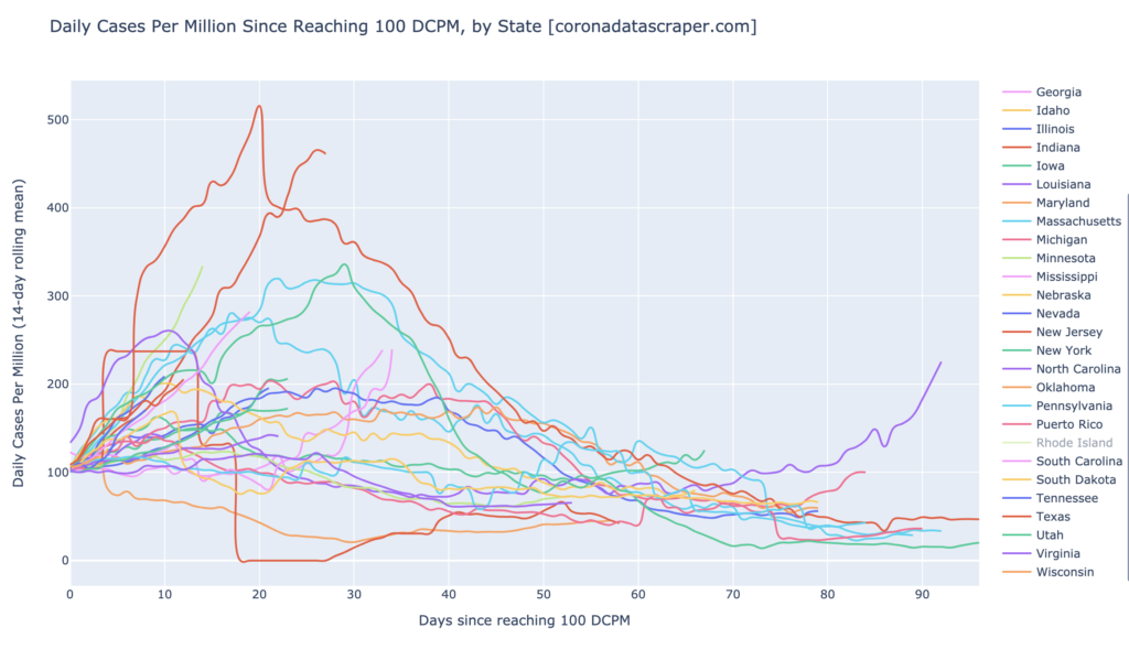
This State Trajectories graph shows that a typical trajectory of COVID-19 in a state is that after it becomes a daily cases warmspot, it rises for about 30 days, peaks, and then falls below into cool territory in about another 30 days; and it does not return to warm again (no second waves, at least so far).
Countries of the World
Interactive source graphs, where you can select regions, zoom, etc., are here.
Country Hotspots
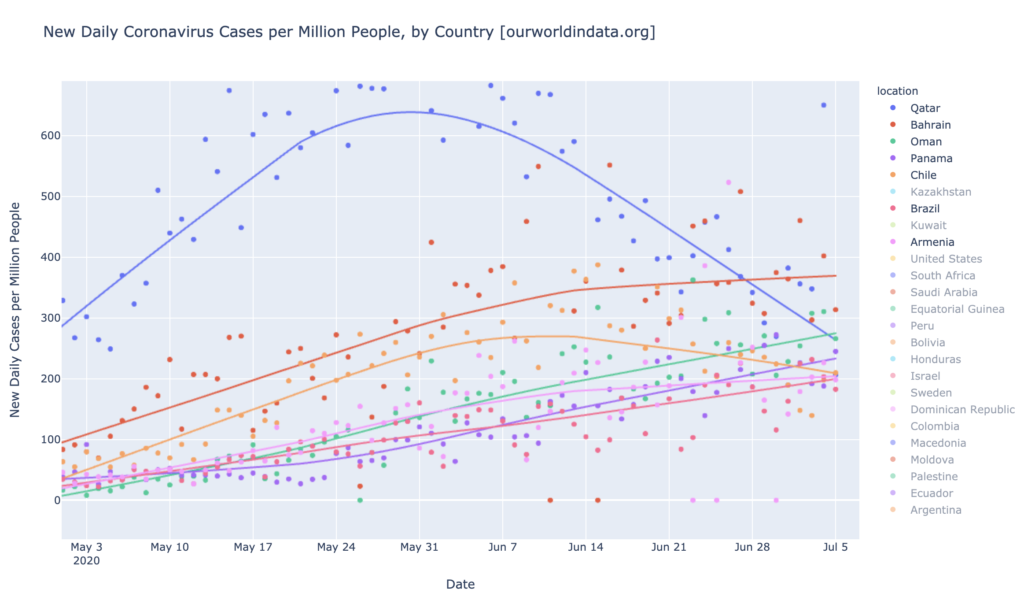
The only daily-cases hotspots are Barhain, Oman, Qatar, Panama, and Chile, Armenia, and Brazil. Brazil and Armenia have recently joined this list, and Oman has just passed Qatar, which is declining. Other than Brazil, then, there are no large countries in the world which are daily-cases hotspots—and Brazil is just barely a hotspot at 200 DCPM. Seven other countries are daily-cases warmspots, including the United States, solidly warm at 145 DCPM.
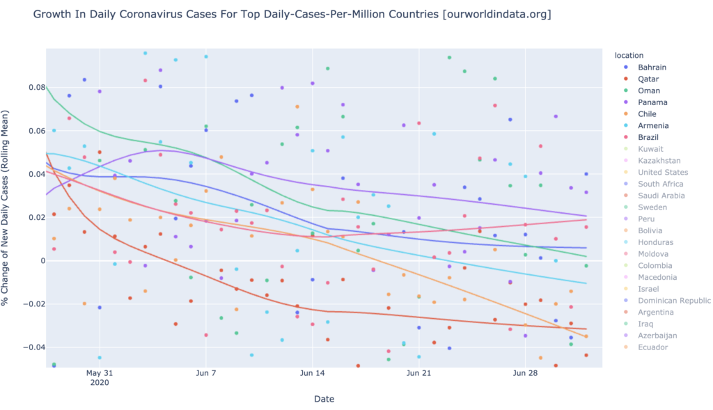
All of the daily-cases hotspot countries except Brazil are improving. Three of them (Armenia, Qatar, and Chile) are below zero in the following graph, indicating that they are dropping in new cases each day; these three are also accelerating downward. The other three are still rising, but their growth rate is falling. Brazil alone is rising in new cases, and also slightly accelerating. That recovery trend in Brazil, was short-lived, and never really took hold.
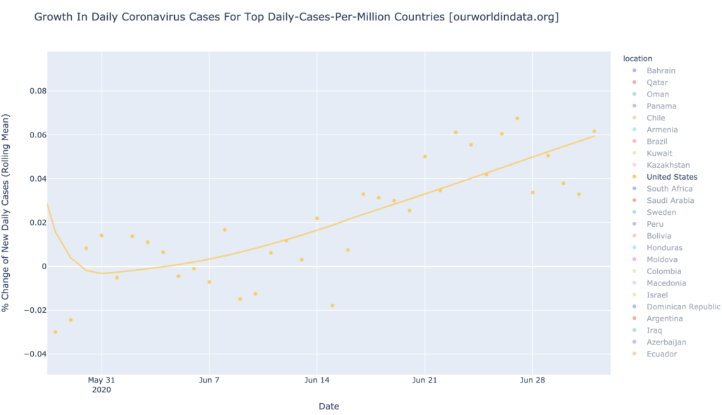
The United States Is Warm and Getting Warmer
The United States become a daily-cases warmspot around June 20, and is now at 145 DCPM. This is not yet a huge number of cases, after adjusting for population (it is not yet a daily-cases hotspot), but it continues to rise:
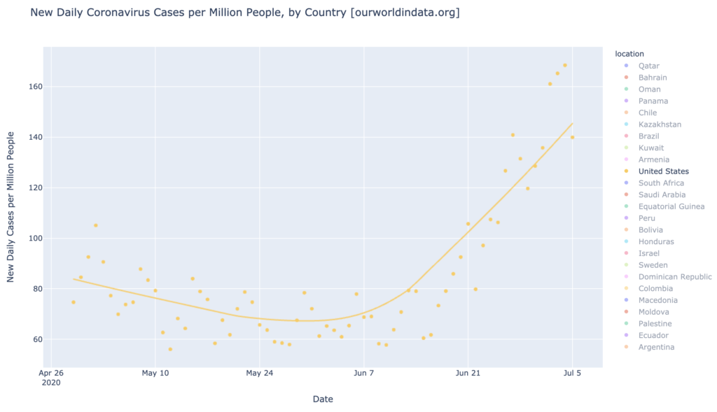
Indeed, the rope chart shows a very high 5.9% growth in daily cases, making the United States a growth hotspot. Furthermore, this growth rate continues to climb:
States of the United States
Interactive source graphs, where you can select regions, zoom, etc., are here.
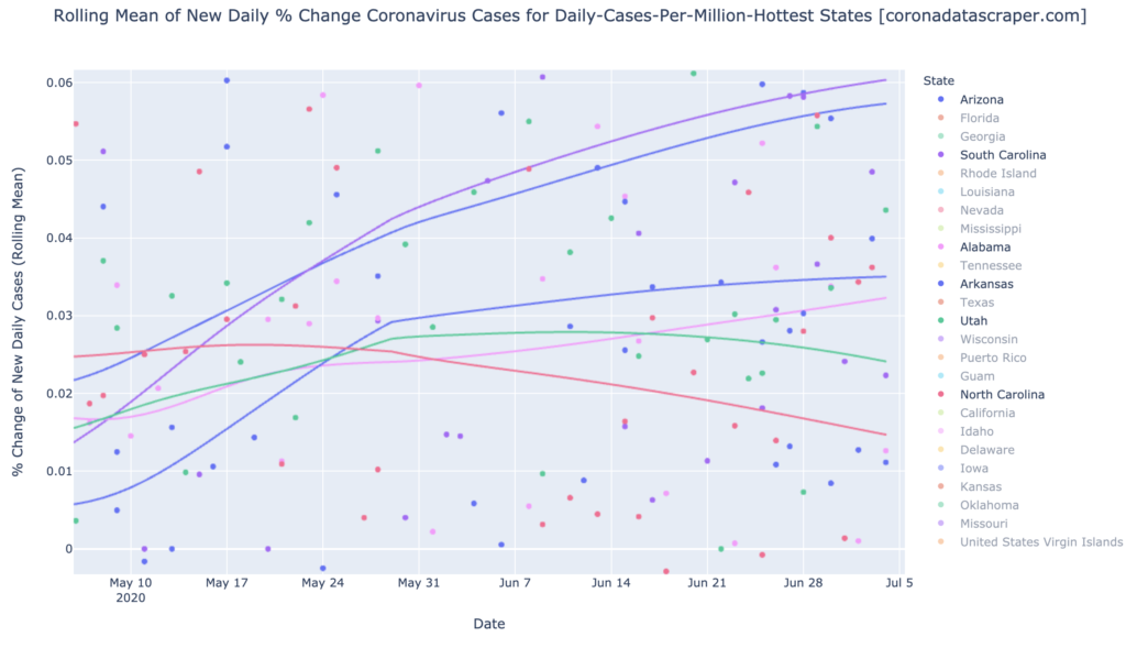
The Gang of Six Is Doing Even Better
The Gang of Six (in order of the graph below, from the top, South Carolina, Arizona, Arkansas, Alabama, Utah, and North Carolina), are no longer the biggest news, but I’m going to emphasize them to point out how state trajectories typically go. Here is their growth graph, which is looking better and better; four of them have now peeled away from the main group and two are pointed headed downward (Utah and North Carolina). The other four are still at least slightly upward, but the graphs are visibly bending toward a peak. Once they peak, they will begin pointing downward and heading to zero; once they reach zero, they will start seeing fewer and fewer new cases each day. North Carolina, the bottom line, will take something like six weeks to peak at this slope; but as the slope has been pulling downward, it is likely that its actual peak will be sooner than that.
States Have Been Following A Predictable Trajectory
The following graph shows the trajectory of all states that have ever been daily-cases warmspots; all trajectories are overlaid starting on the day they first reached 100 DCPM. The pattern here is that once a state reaches 100 DCPM, it continues to rise for a few weeks until its peak, then it peaks and begins to fall, and drops back below 100 DCPM a couple months from when it first hit 100. After completing its first wave and dropping below 100 DCPM, it does not see a second wave. There are two exceptions to this “no second wave” rule: Louisiana (purple at the right) is hot again now after having recovered, and Delaware (red at the right) is barely warm now after having recovered, so there may be second waves coming in some other states as well. But so far, that has seldom happened. If second waves really are typically easily handled by the metaphorical immune system of the region, built up during the first wave, then once all states have seen a first wave, there will be no more fuel for the epidemic, and the United States will begin to decline in total cases again. If Louisiana and Delaware are bellwethers of what other states will do, however, then other states will begin seeing a second wave about 90 days after their first wave. Which one it is, will become clear in the next couple months.
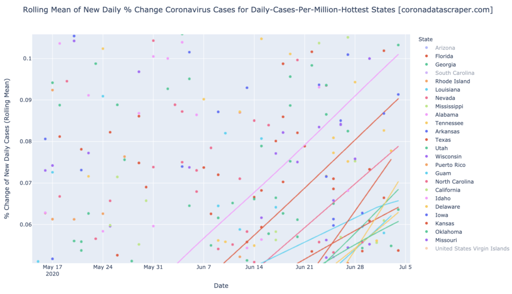
The Gang of Six Has a Lot of Competition
The graph below shows the growth rates of all the growth hotspot states, among the top-25 warmest states in DCPM. None of these are member of the Gang of Six; and all of them are hotter in growth than even the worst of the Gang of Six. So as the Gang of Six begins to peak toward recovery, these are the new growth hotspots: 5% to 10% daily growth in new cases. From the top, they are Idaho (10%!), Florida (9%!), Nevada, Kansas, Delaware, Georgia, Guam, Texas, Tennessee, Louisiana, and Oklahoma. At a 5% daily growth rate, the number of daily new cases doubles every two weeks; at a 10% daily growth rate, the number of daily new cases doubles every week. These are alarming growth rates:
California Counties
Interactive source graphs, where you can select regions, zoom, etc., are here
Daily-Cases Hotspots: Imperial, Kings, Tulare, Riverside, San Joaquin, Los Angeles
Just like last time, these six counties are the only daily-cases hotspots in the state. There has been a little shuffling around the cluster at 200—Tulare and Riverside have just passed Kings, which drops to 4th place—but Imperial is still the big one in DCPM. Given the enormous size of Los Angeles, however, being a daily-cases hotspot is a very big deal in terms of the number of total cases:
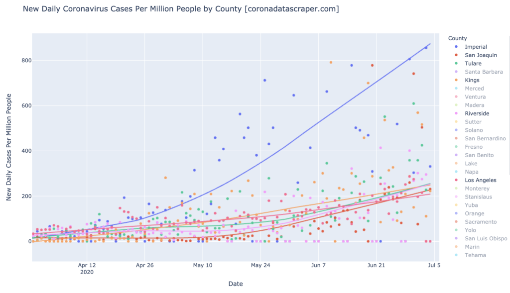
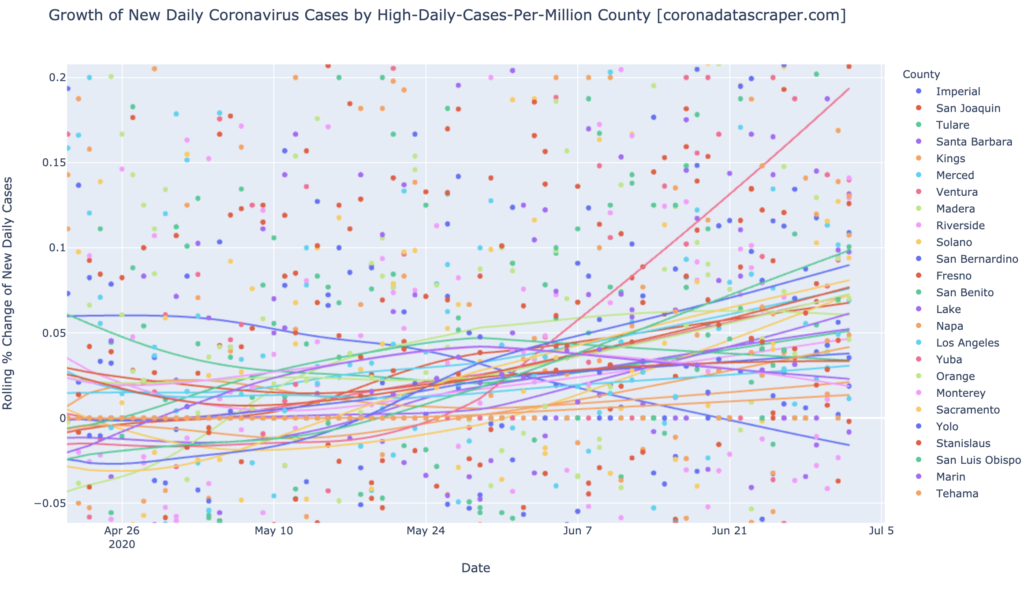
There’s no news in the growth rates either; as it has been for many days, almost all California counties are growing in new cases, and accelerating. Imperial alone among the top-25 daily-cases warmest, is shrinking:
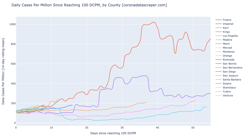
I do have a Counties version of the trajectories chart, below. But since California wasn’t even warm for a long time, there are no counties that have yet reached the “60 days since warm” mark that tends to be the recovery point for states. Kings, purple, is showing a trajectory similar to a typical state. Imperial looks like its curve, though broadly falling, will probably not make it back to 100 DCPM at the 60–70 day mark, so it appears to have an unusually long trajectory to recovery. And at the bottom, we can see Los Angeles, Tulare, and Santa Barbara, all pushing the daily-cases hotspot line, after a month or two in warm (the rightmost point of each line, is the point for today):
Definitions
| DCPM | Daily cases per million |
| Daily-cases warmspot | >100 DCPM but <200 DCPM |
| Daily-cases hotspot | >200 DCPM |
| Growth warmspot | >1% daily growth in new cases |
| Growth hotspot | >5% daily growth in new cases |
2 replies on “COVID-19 Trends, July 5, 2020”
Excellent information! I live in CA and am monitoring the numbers. Your graphs make the stats & data easier to digest. I will continue to follow for updates. Thank you!
Thanks, Tricia. If you know anyone else who might fine these reports useful, please pass them on. I’ve put a lot of time into their design, and I’d like to see wider distribution of them.