This is summary of COVID-19 trends today, by countries, US states, and California counties.
Summary
| Daily Cases | Daily Growth | |
| World | cold (22 DCPM) | warm (2.2% and rising) |
| United States | warm (168 DCPM) | hot (5.9% and rising) |
| California | warm (127 DCPM) | warm (3.3% and rising) |
Graph of the Day
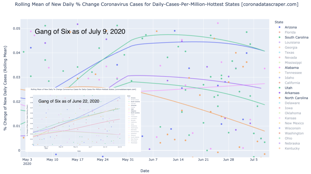
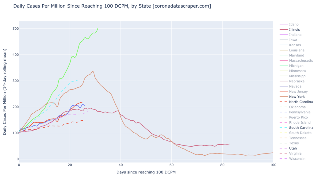
The Gang of Six (Alabama, Arkansas, Arizona, North and South Carolina, and Utah), trending toward recovery in growth rates.
Countries of the World
Interactive source graphs, where you can select regions, zoom, etc., are here.
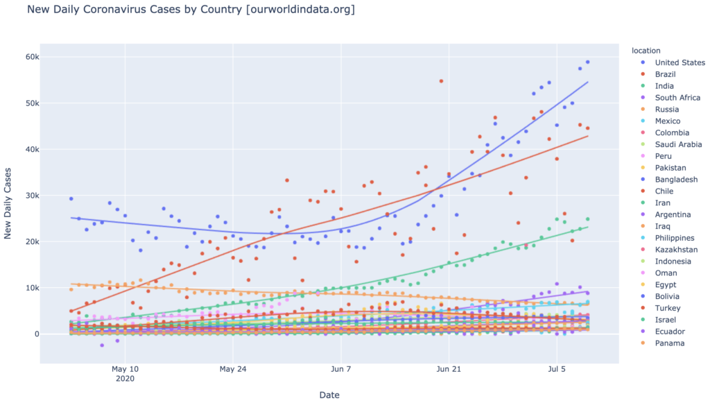
India is Rising
I don’t usually focus on total cases, but India is worth at least a moment, because of the sheer number of cases. Though its DCPM numbers are still very low (17 DCPM), making it very far from a daily-cases warmspot, its total numbers are still very large due to its high population. India is solidly in third place worldwide in total cases, behind the United States and Brazil, and continues to grow in daily new cases. (See the interactive graphs to differentiate the smaller countries at the bottom of the graph).
Daily-cases Warmspots and Hotspots
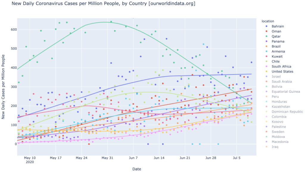
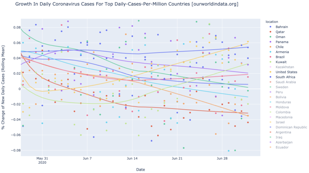
About ten countries are either daily-cases hotspots or almost-hot and rising: Bahrain, Oman, Qatar, Panama, Brazil, Armenia, Kuwait, Chile, South Africa, and the United States. The epicenters, then, are the America, Middle East, and Africa; but only in the Americas is there a truly widespread outbreak. Africa has mostly been spared so far; the Middle East has mostly been spared so far; but each has a few major hotspots:
These same ten aren’t looking bad in growth, though. They’re roughly split around the zero line, with half of them growing in daily cases and half of them shrinking or steady. Most of them are seeing their growth rate dropping, indicating initial trajectory toward a recovery. Only two countries, United States and Kuwait, have all three red flags indicating full-fledged epidemic: (1) they are daily-cases warmspots, (2) they are growing in daily cases, and (3) they are accelerating.
The United States Still Isn’t Hot In Daily Cases But Is Headed There Fast
The United States, yellow line above, is arguably the worst in the world right now. Though it’s not yet a daily-cases hotspot, it is solidly a daily-cases warmspot (170 DCPM); and it is a growth hotspot at 5.9% growth in daily new cases; and its growth rate is still accelerating.
States of the United States
Interactive source graphs, where you can select regions, zoom, etc., are here.
The Gang of Six Have Turned Toward Recovery
The Gang of Six (Arizona, Arkansas, Alabama, North and South Carolina, and Utah), are no longer the big news; there are at least ten states doing worse than them now. But I’m putting them here at the top anyway because they provide more evidence for something important: even the worst states follow a predictable trajectory toward recovery. It’s been about three weeks since the inset graph for these six, which showed some very alarming numbers (Arizona was above 9% growth in daily new cases!; four of the six were at or above 5%! Four of them were accelerating rapidly!). But as we have seen in nearly all cases, it’s just a few weeks—about six, typically—from the time the state really starts to grow, until it peaks. Then it’s another six weeks or so until it is mostly recovered. The media alarms (dire headlines) start to go off perhaps two weeks into the rise, and it’s about four weeks from the time that everyone notices that, say, Arizona is in big trouble, until it peaks in daily cases. Now, Arizona hasn’t actually peaked yet, but it will peak when that blue line hits zero; and at this point we can clearly see that it’s headed in that direction. In one sense, Arizona and the other five have peaked already: in growth rate. Growth rate is clearly dropping for all except maybe Alabama, which is still slightly upward.
If we compare the trajectories-since-100-DCPM of the Gang of Six with a couple of fairly typical recovered states (New York and Michigan), it doesn’t immediately jump out that the gang of six are doing very well. All of them have been rising in new cases, and continue to rise in new cases. But at this point in the trajectories, the two other states (and many like them, not shown) were also rising. The rope chart above suggests that these six are starting to slow down, and it is entirely plausible that these six will peak and fall as the other recovered states have, and along roughly the same timelines. Arizona is exceptionally hard hit, and might take longer than the rest to recover; but my guess is, we’re going to see this same trajectory repeated for these six in the next couple months.
The Next Wave
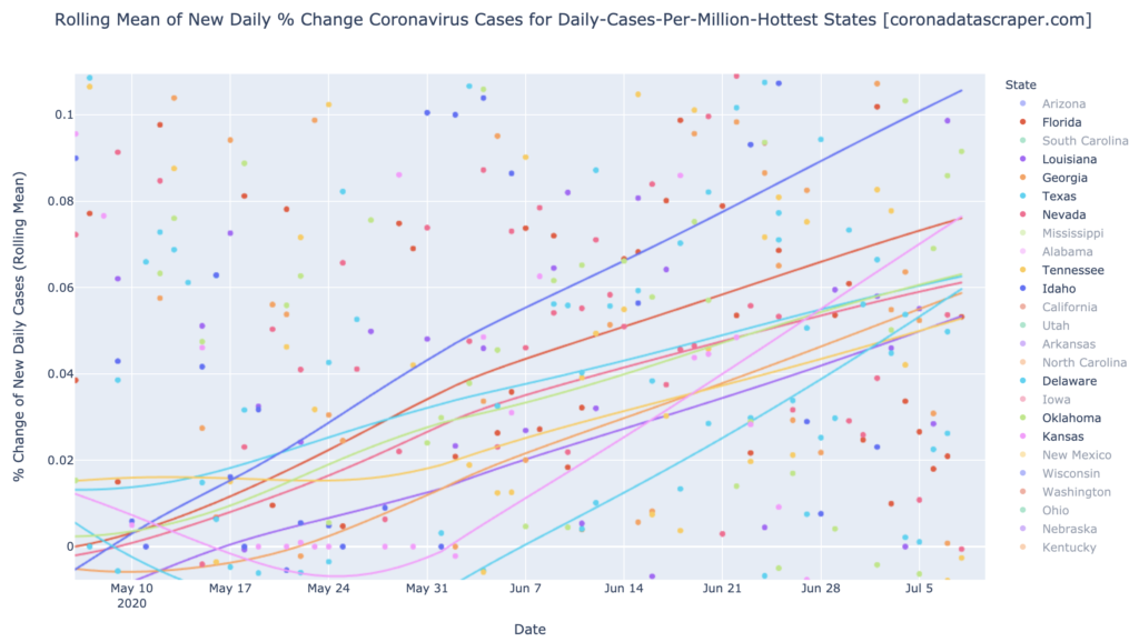
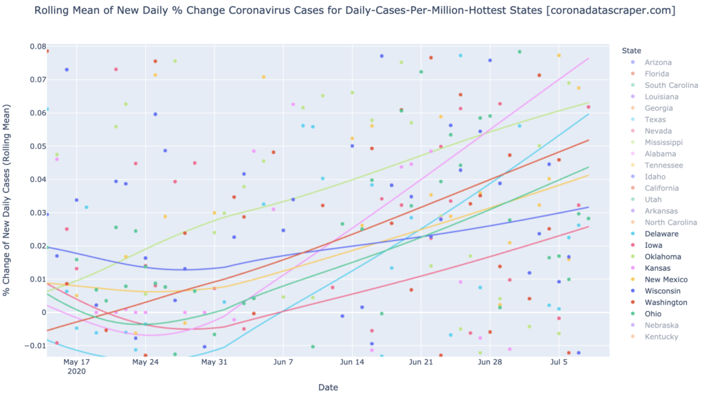
As I mentioned above, the Gang of Six are not the problem. They are still getting a fair bit of press, and the trajectory graph above suggests some of why that it: they are all still rising. But their growth rates have dropped to less than 5%, and are falling, so at least they are visibly headed toward recovery in the “rope chart.” The same cannot be said of our new up-and-coming wave: Florida, Louisiana, Georgia, Texas, Nevada, Tennessee, Idaho, and Oklahoma. (California, by the way, sort of fits in the crack below this wave; it’s not quite bad enough to qualify for this wave). All these have the triple-whammy of being daily-cases warmspots, being growth hotspots, and having rapidly accelerating growth. You might think these were headed for a complete catastrophe—but remember that the Gang of Six were right here a month or so ago, and started to show signs of recovery in a few weeks, and are looking very different, and much better, now. I think it likely that these, too, will start to turn downward in a month or so.
A cautionary note. Let me take a moment to speculate (reiterate) about the reason hard-hit regions so far have recovered. It’s probably not just something that naturally happens to defeat the virus without any steps taken by the populace. I think it happens because the media and government notice that a region is in terrible trouble, and they start to inform an warn the populace, and to put lockdowns and restrictions in pace. The populace, with or without government mandates, starts to see the news reports about how bad it is right there where they live. They also start to see some of their friends sicken and die, and are driven by very-much-justified fear to take their own extreme precautions. And that is why the epidemic wanes: because of the behavioral changes of the populace. So please don’t read this as anything like permission to do nothing and wait for it to blow over in your hard-hit region: I believe it blows over because the residents take extreme measures for a few months.
The Next, Next Wave
I get the distinct sense that there is another wave now coming, not yet very strong but likely to follow this current one (which in turn followed the Gang of Six, which followed Michigan/Illinois/Louisiana, which followed the East Coast). Delaware, Iowa, Oklahoma, Kansas, New Mexico, Wisconsin, Washington, Ohio: these are all showing as growth hotspot or growth warmspots, even though they don’t yet have that many cases (California is somewhere in there too, though still somewhat tepid and unremarkable, without all that many cases or all that hot a growth rate).
History suggests that these states will get many cases soon, through the mechanism of being a growth hotspot. And then, like the other waves, it will pass in a couple months. And that might be it. Because at that point, there are precious few states left still to catch it (Kentucky? Hawaii?). Maybe where will see a few final, smaller waves through the remaining few states. But eventually, every state will have had it, and will have recovered, and the epidemic will be out of fuel. If my theory about the “metaphorical immune system” of regions is correct, few if any of states will get it again badly, for a long time; or if a vaccine is developed, maybe forever.
California Counties
Interactive source graphs, where you can select regions, zoom, etc., are here
The Counties Are a Mess
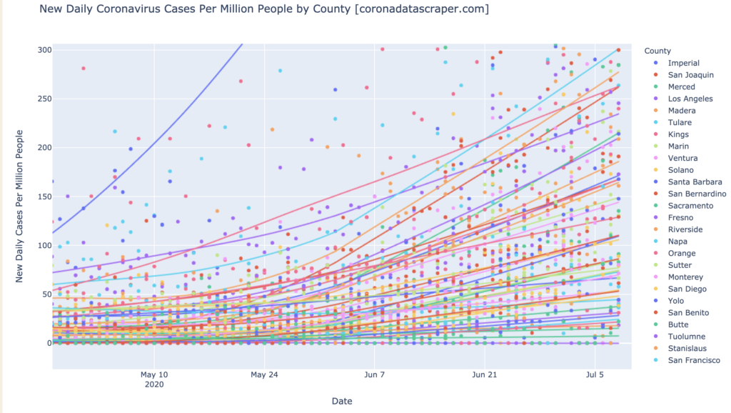
The graph below is very messy because the state of California is very messy. If you want to pick out a particular line, use the interactive version. It used to be that the counties were split nicely into certain leaders and a bunch of less-hit noise below. No longer: we have an even spread of the counties across the range of DCPM here, with no clear clumping except our usual off-the-charts Imperial. One consistent feature is that they are all still growing. There are so many daily-cases warmspots right now that it’s not even worth listing them; let’s just say half of the counties are warm. Even for daily-cases hotspots, there are a lot: Imperial, Tulare, Riverside, Kings, San Joaquin, Los Angeles, Merced, Fresno. As always, it is a big problem that Los Angeles is a daily-cases hotspot: that’s a about half of the state’s daily cases right there:
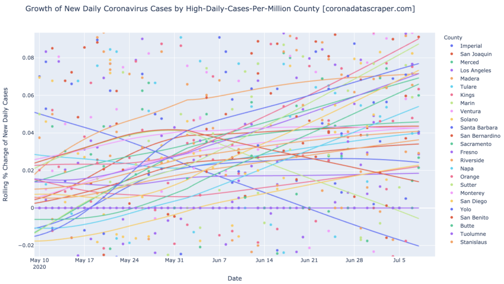
The rope chart for California is looking mostly has it has for weeks now: almost all counties are growth warmspots. Many of them are growth hotspots: Orange, Sutter, Yolo, San Diego, Madera, Fresno, Merced, Butte, and Napa are all growth hotspots with daily cases growth over 5%. Some of those are pretty big counties too, so this is not going in a great direction. There may be just the touch of a turn toward recovery in that we have at least four counties now trending downward in growth rates: Imperial and Marin (both actually shinking in daily cases, after having a hard time of it a while ago), San Benito, and Santa Barbara. If these counties do anything like the Gang of Six at the state level, we’ll see more and more of them bend downward in the next couple weeks; but California hasn’t followed the trends of other states very well so far, so that’s even more speculative than usual.
Definitions
| DCPM | Daily cases per million |
| Daily-cases warmspot | >100 DCPM but <200 DCPM |
| Daily-cases hotspot | >200 DCPM |
| Growth warmspot | >1% daily growth in new cases |
| Growth hotspot | >5% daily growth in new cases |