This is a summary of COVID-19 trends today, by countries, US states, and California counties.
Summmary
| Daily Cases | Daily Growth | |
| World | cold (49 DCPM) | cool (0.7% and warming) |
| United States | warm (150 DCPM) | hot (2.3% and warming) |
| California | cool (82 DCPM) | cool (-0% and cooling) |
Graph of the Day
Europe is the new epicenter, and it’s much worse this time than it was in April, and it’s getting even worse, quickly, in a few European countries:
Countries of the World
Interactive source graphs, where you can select regions, zoom, etc., are here.
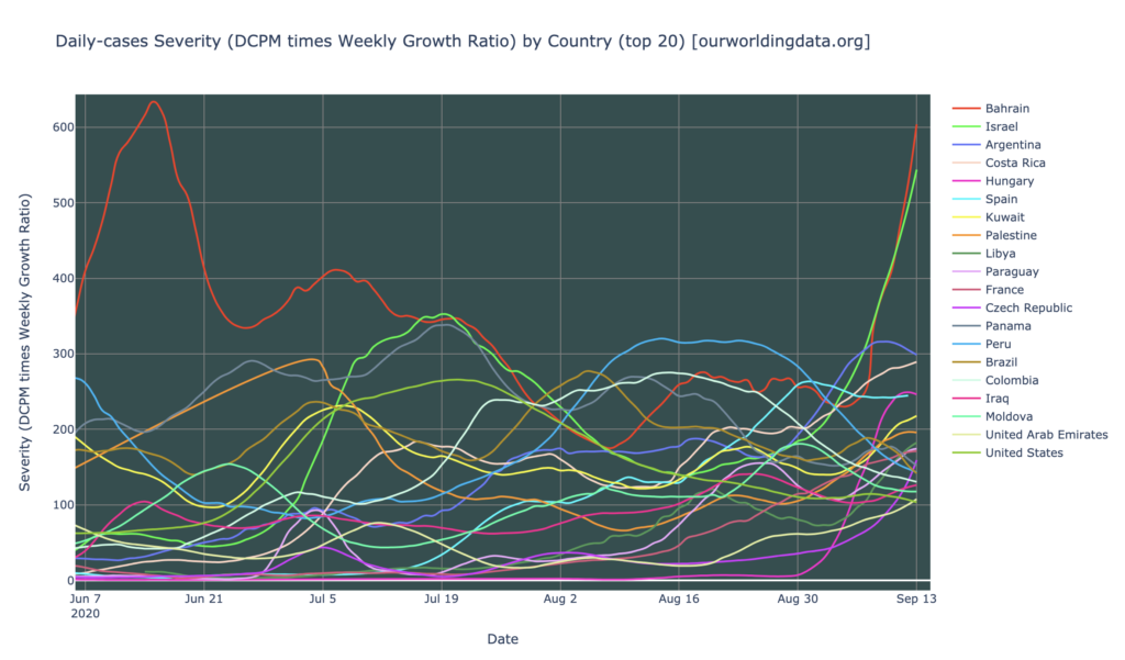
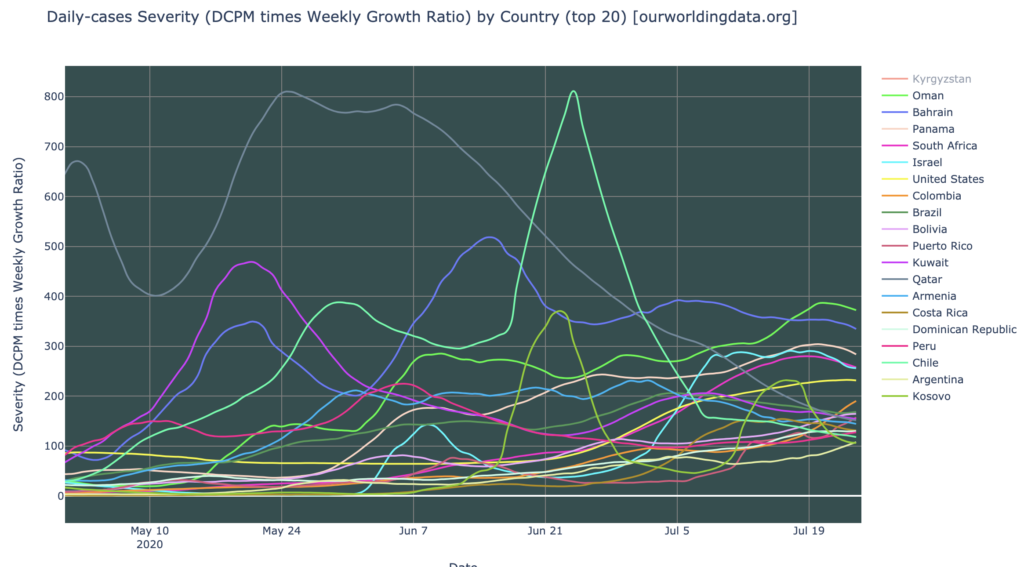
Countries Severity
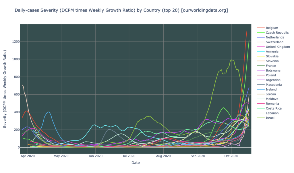
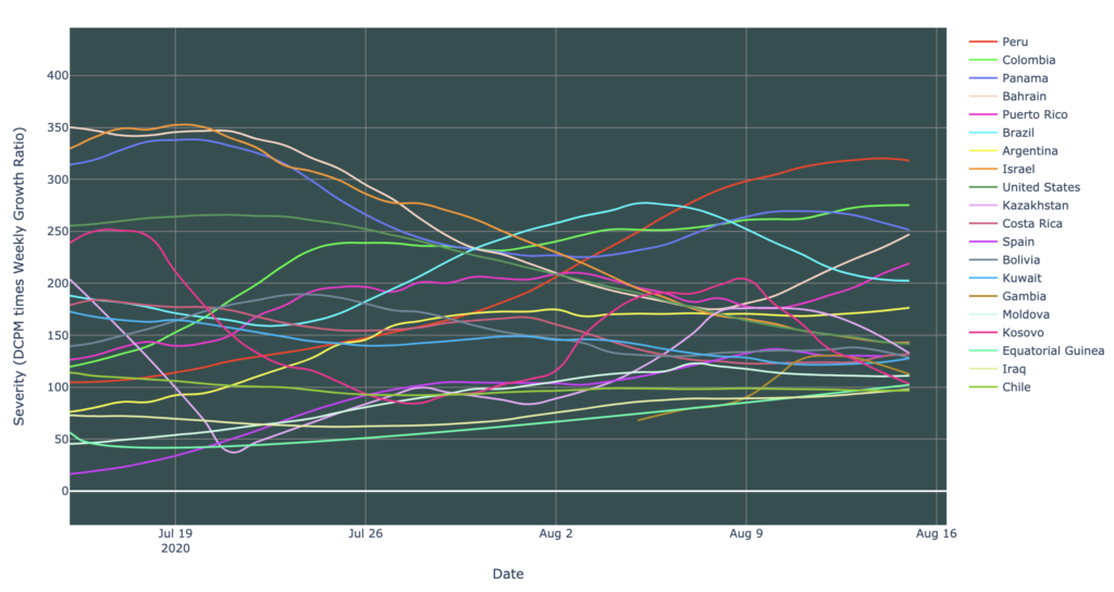
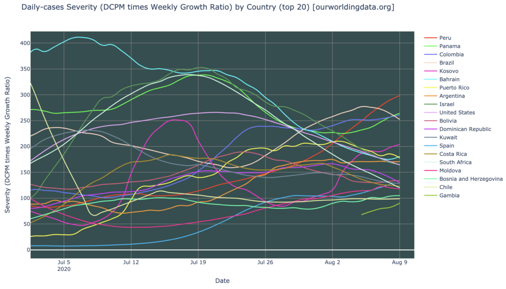
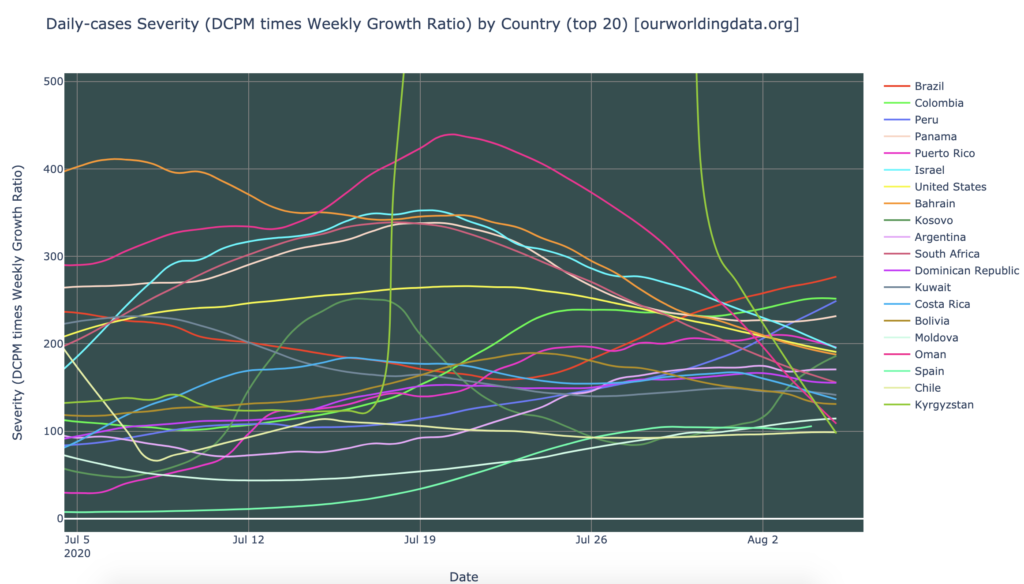
It’s been a few weeks since I’ve written a blog, and things are really starting to change on the world scene. The graph above shows the twenty most severely-hit countries (“severity” is a metric that combines daily cases per million, and growth rate). All of these are severity hotspots, though on the bright side, that means that most of the rest of the countries of the world are not severity hotspots; most countries of the world are doing OK.
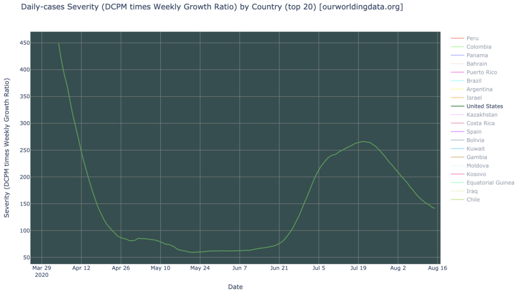
It is worth noting that the United States is not in this list of severity hotspots. The Americas in general have mostly recovered from a month or two ago, when they were the COVID-19 epicenter (especially Central/South America). We still see Argentina and Costa Rica on the list, but Brazil, for instance, is gone. These have been replaced by a new wave in Europe, far more severe than the first one.
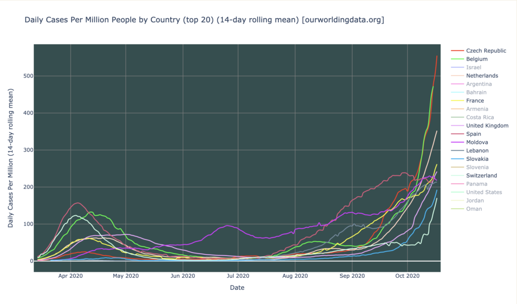
Daily Cases: Europe is in Bad Shape
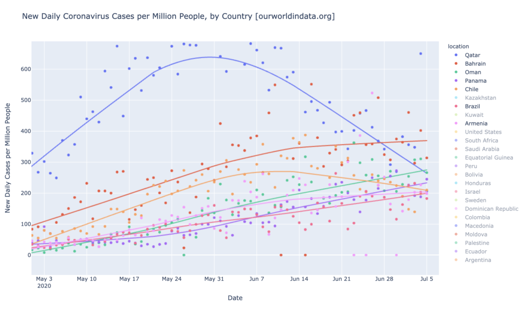
Looking at DCPM (above), Europe also leads the world; half of the worst-hit countries in DCPM, are in Europe. And remember how we thought Europe was having a bad wave back in April? It never even hit daily-cases hotspot territory then (see that little bump at the left? That was its April “wave”). But as of today, we have five European countries which are daily-cases hotspots. The Czech Republic, Belgium, and the Netherlands are the worst right now, over 300 DCPM—and the Czech Republic has exceeded 500 DCPM, a level seldom seen elsewhere. For comparison, we have occasionally seen DCPM each 1000, for instance in Qatar, so Europe hasn’t quite reached epic historical levels yet.
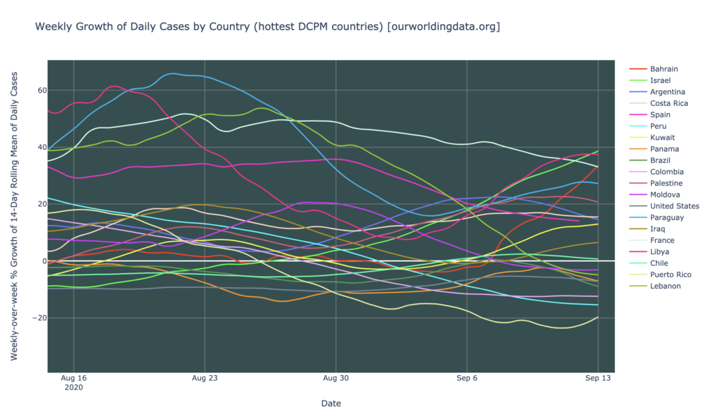
Counties Growth Rates
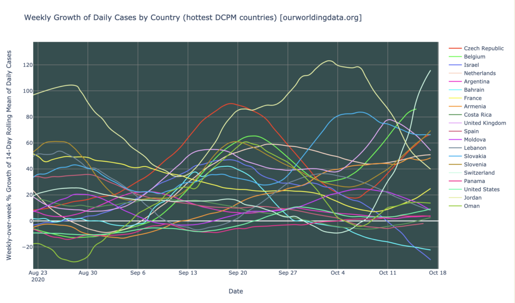
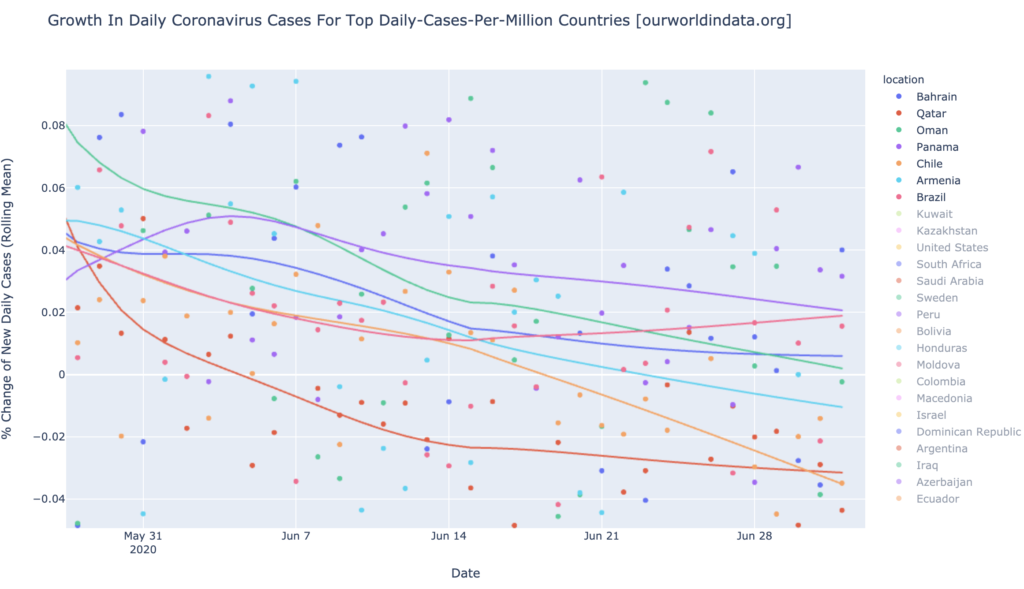
The graph above shows the weekly growth rates in daily new cases for the hardest-hit (in DCPM) countries. I generally consider anything above 20% to be a big problem, and the world has a lot of big problems right now. Switzerland is growing at an astounding 115% per week, and accelerating. Nine other countries (the top ten in the legend at the right above), are growing at above 20% weekly. There is no clear pattern as to the trend of these growth rates: Switzerland, Slovenia, and the Czech Republic are accelerating, but Jordan, the United Kingdom, Lebanon, and Moldova, to name a few, are decelerating. Europe, broadly, is accelerating, but there are exceptions. This is certainly not a good-news graph, but several of these hardest-hit countries are shrinking, and the general pattern is still that only about twenty of the world’s countries are really hard-hit right now, which mean that about 175 countries do not currently have a serious problem. The pandemic is severe, but only in a few red-hot spots.
States of the United States
Interactive source graphs, where you can select regions, zoom, etc., are here.
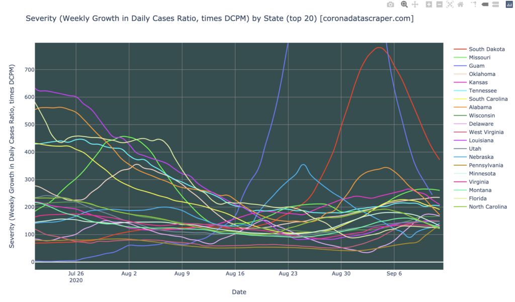
US States Severity
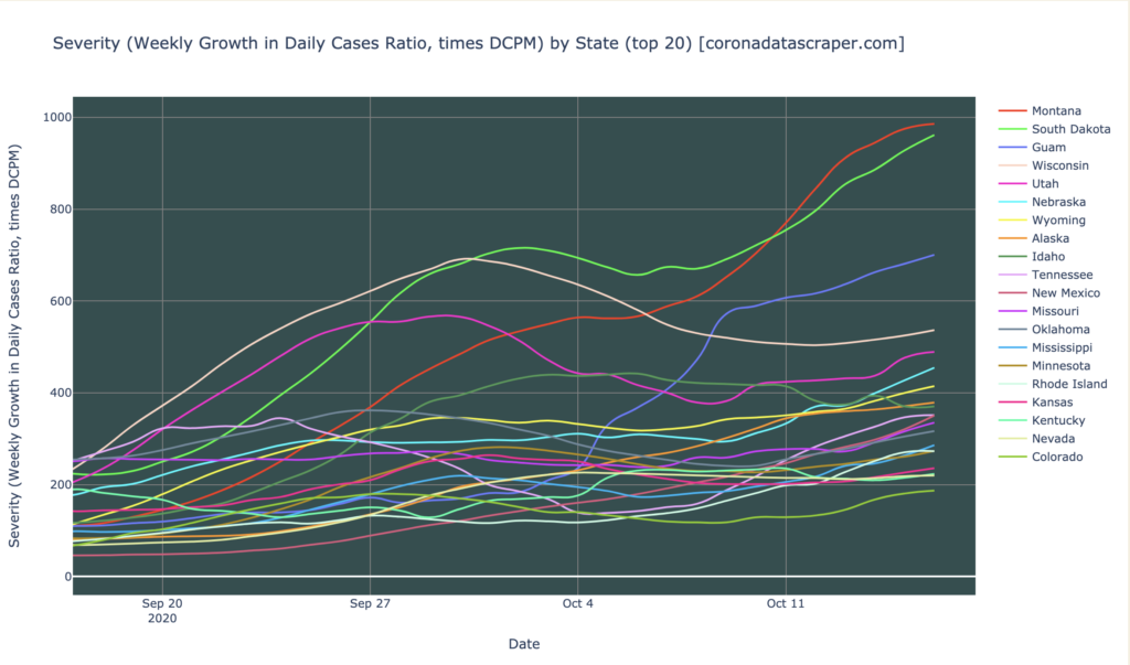
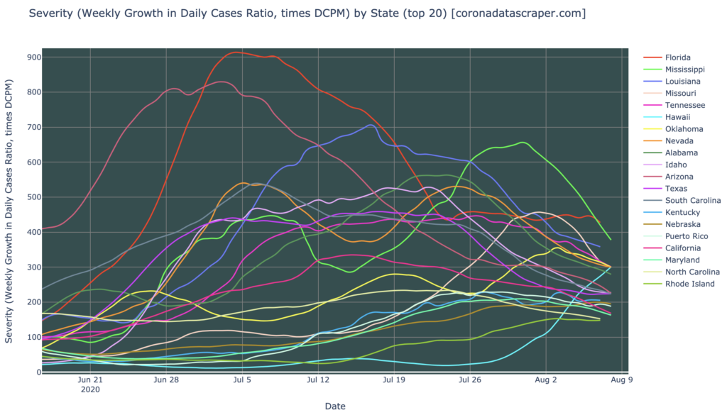
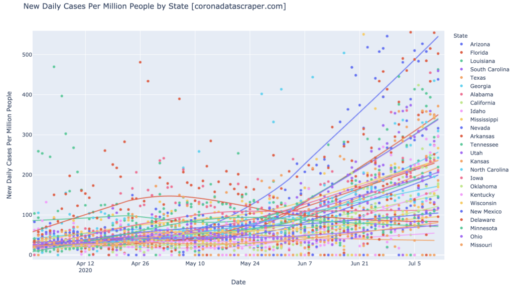
As noted in the Countries section, the United States is not one of the hard-hit countries right now. It used to be the worst, but now it’s gotten a lot better. But like the world, its recovery is very uneven. Most states that have seen a bad wave earlier in the year, have not seen another bad wave, but there are a whole flock of new hotspots arising in states that never had it very bad before, especially the central-north states: Montana, North and South Dakota (for some reason, probably a lack of volunteers, coronadatascraper.com does not collect data on North Dakota, but its trend is similar to South Dakota), Wisconsin, and a bunch of others. The east and west coasts remain relatively stable and are not experiencing a significant wave—but they haven’t fully recovered from their previous wave yet, either.
This is not a happy graph; almost all of the top-20 states in severity, are severity hotspots. This is much worse than it was a month ago. A few bright spots, though:
- Nineteen severity hotspots means that 31+ states and territories are not currently severity hit.
- Those who have been following me for a while will notice that almost none of these states are the ones that were severe in the March, May/Jun, or July waves. So the places we’re seeing strong surges, are places that haven’t seen strong surges in the past: we’re not seeing new waves in New York, Louisiana, Arizona, Florida, etc.
- These are generally low-population states, so their surges do not contribute much to the total country numbers. This is why we have continued to see the United States as a whole look pretty good, in spite of these local spikes. This is small consolation to those who live in the central-north, though.
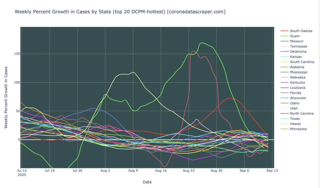
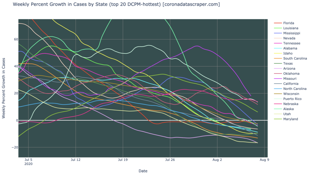
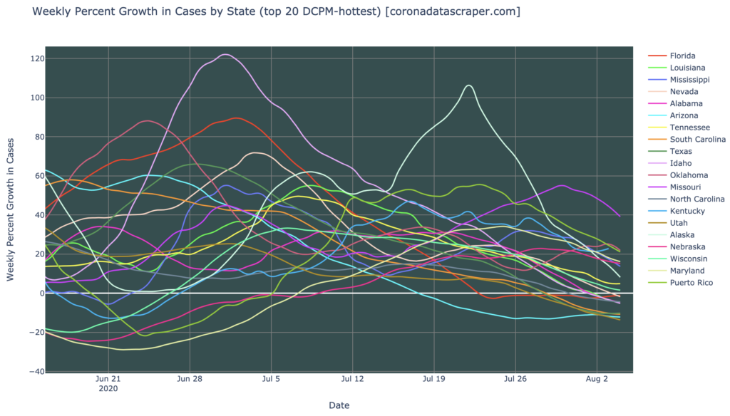
US State Growth Rates
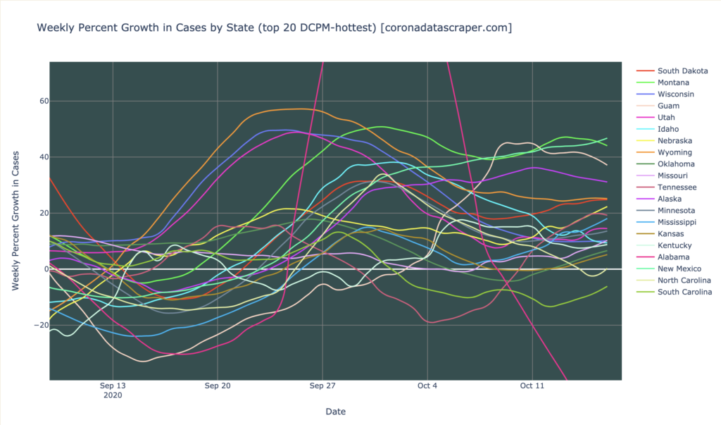
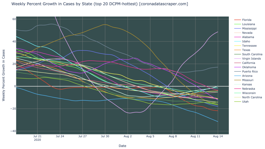
The graph of growth rates for US states, for the top-twenty in DCPM, above, is pretty bad. I consider 20% weekly growth to be a problem, and seven states exceed that. Of the rest of the top twenty, most are above the zero line, indicating that they are still growing. The one saving grace is that none of them are accelerating upward: the cases are growing, but the growth rate itself has stabilized. This typically indicates that we’re about halfway to the peak. When those lines turn downward and cross the white horizontal zero line, we will have reached the peak of these regional waves. It is not clear from this graph when that will occur; they have been fairly steady for a couple weeks now, with no indication of the downward turn we would expect. But at least they aren’t heading even higher, as we see in the worst cases.
California and Colorado Growth Rates
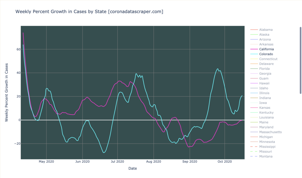
In a nod to the fact that I live half in California and half in Colorado and tend to have more readership from there, the graph above shows the growth rates for both. California has had an extended period of shrinking daily cases (line below zero), though in recent days it has crept back almost to zero; still, this is much better than half the country, as California is at least stable, and arguably shrinking. Colorado, which is surrounded on three sides by hard-hit states, has partly avoided being pulled into the mess that most of the center-north states are in, but with a current growth rate at 20% and recent growth rate consistently above 0% and sometimes alarmingly above 40%, it is not in great shape, and it is entirely plausible that Colorado is just late to the party, and will soon catch the wave that has plagued its neighbors. Or maybe not: we’ll keep an eye on it. Either way, right now Colorado is a borderline growth hotspot.
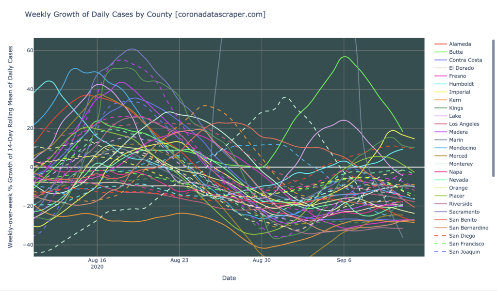
California Counties
Interactive source graphs, where you can select regions, zoom, etc., are here.
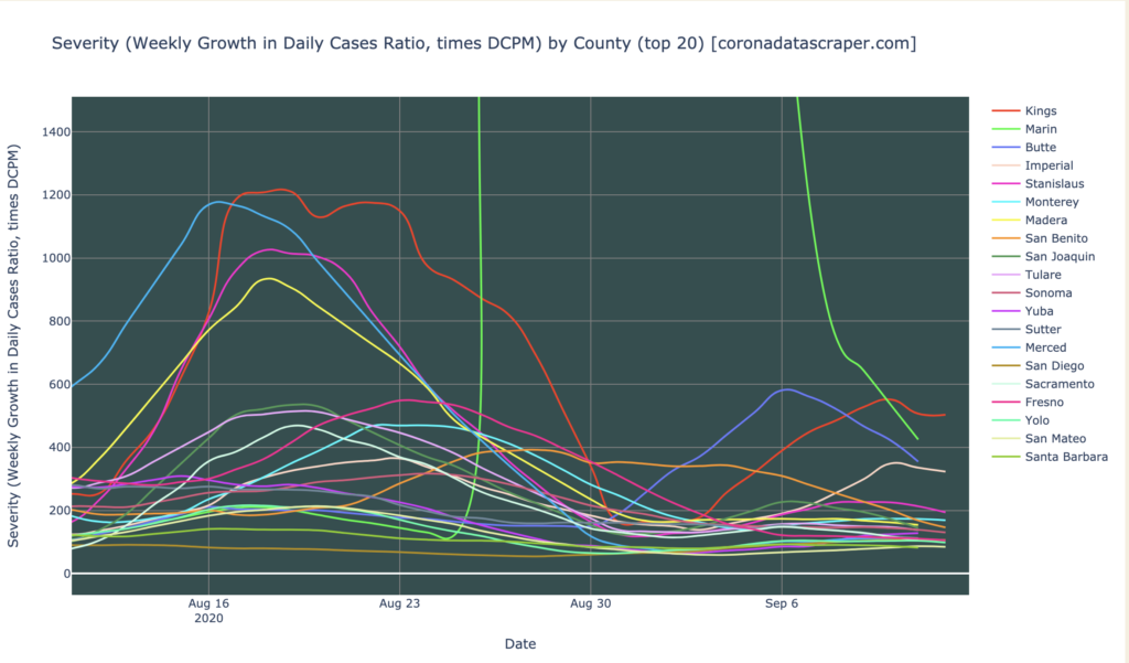
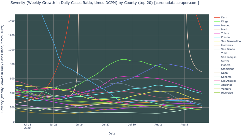
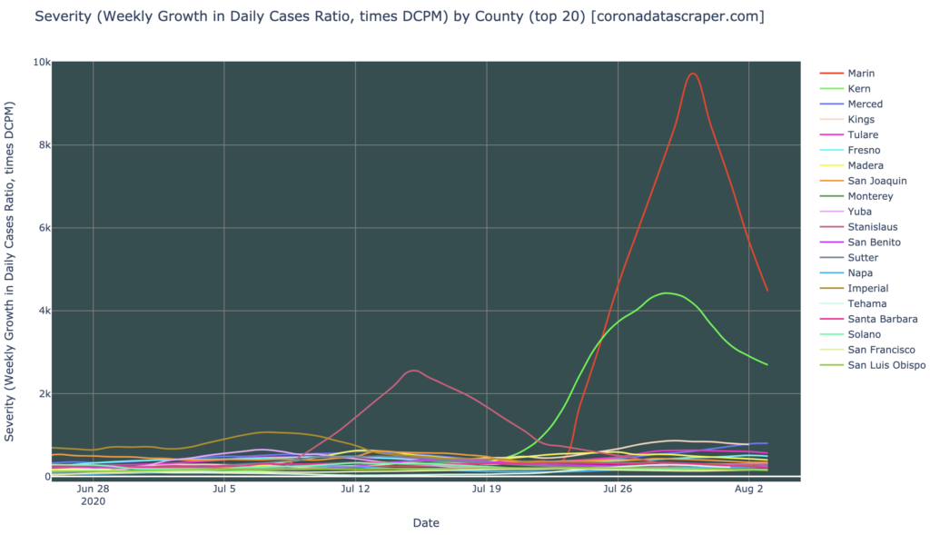
Counties Severity
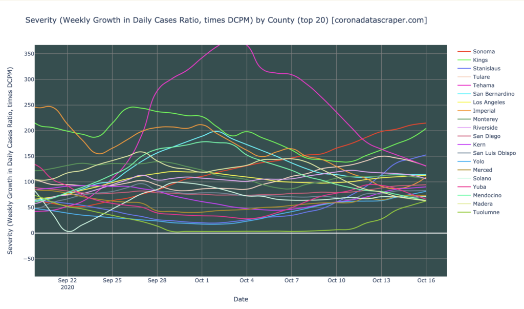
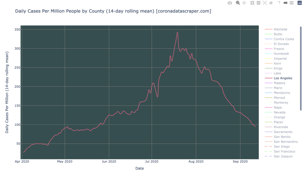
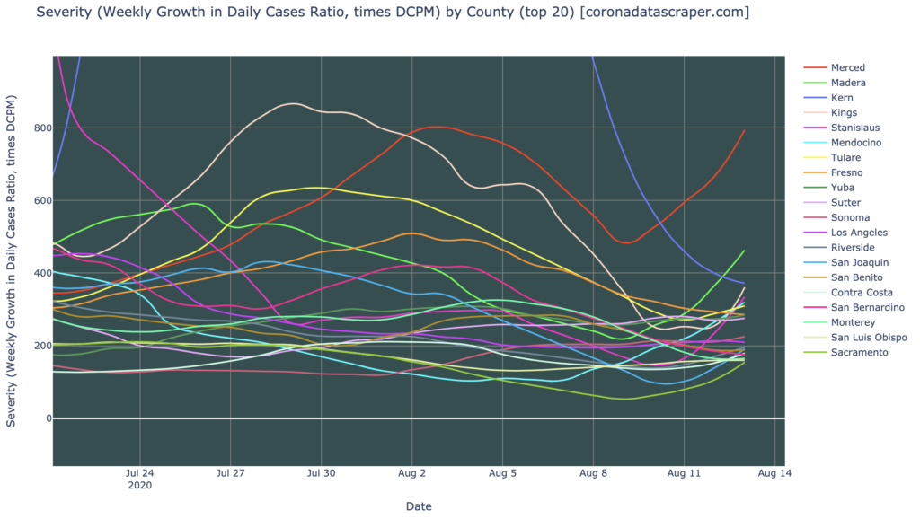
California is in relatively good shape, and unlike the world and the United States, it doesn’t even have regional hotspots. Even these twenty worst-hit counties (above) are at or below 200 severity (Sonoma and Kings are just barely above). Also, the trend lines are generally horizontal, so there is little evidence here that things are going to get worse in the short-term. This is still an epidemic—it is no time to relax—but relative to the hard-hit half of the country, California is golden.
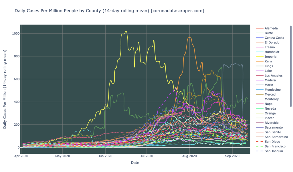
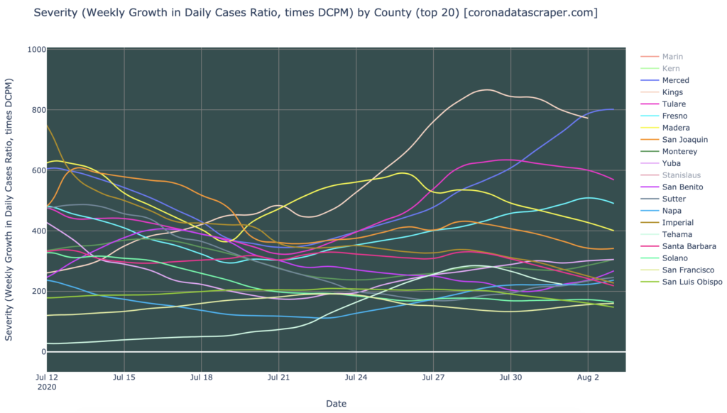
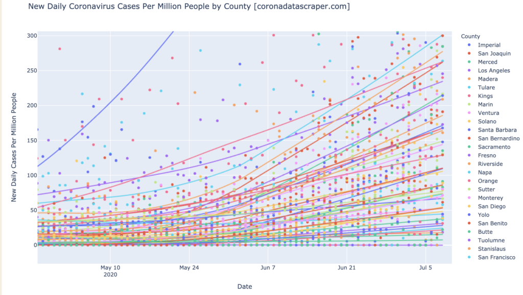
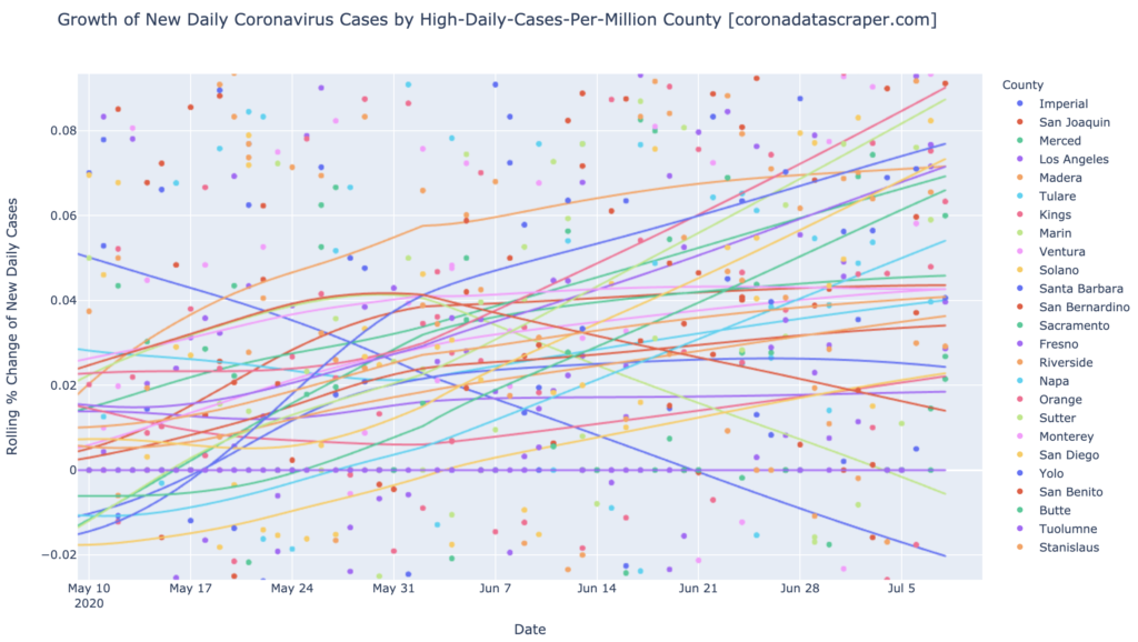
Counties Growth
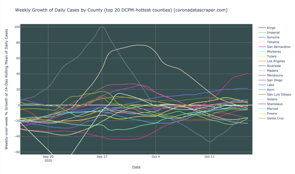
The growth graph by county, above, is similarly fairly good. These are the worst counties in DCMP, and of those most are shrinking. Only Stanislaus and Sonoma are really problematic, at 40% and 20% weekly growth and rising. The rest are below or fairly near zero growth rate, and roughly horizontal. Overall, California continues to shrink in daily cases, and though the shrinkage rate isn’t as fast as it was a few weeks ago, it’s still below zero, with no really problematic counties.