This is a summary of COVID-19 trends today, by countries, US states, and California counties.
Summary
| Daily Cases | Daily Growth | |
| World | cold (37 DCPM) | cold (0% and warming) |
| United States | warm (115 DCPM) | cold (-1% and steady) |
| California* | warm (103 DCPM) | cold (-4% and cooling) |
* California data is currently unreliable due to a computer system problem
Graph of the Day
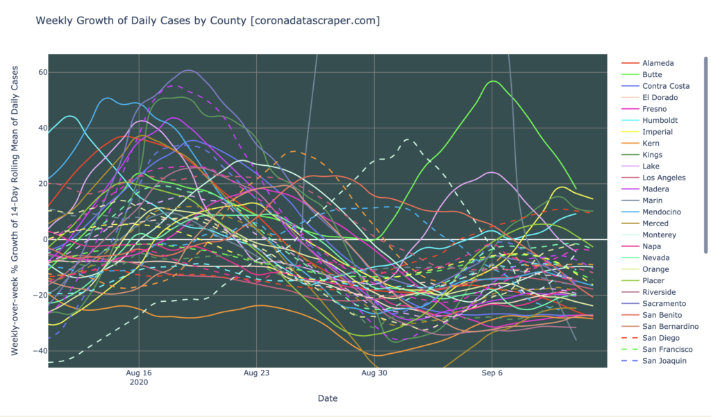
The counties of California, graphed as a weekly growth rate of new cases. Almost all of them are shrinking in daily new cases, many of them very quickly.
Countries of the World
Interactive source graphs, where you can select regions, zoom, etc., are here.
Countries Severity
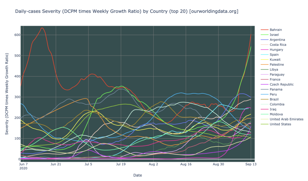
The countries of the world are looking mixed in severity, maybe a little worse than they have been, but not terrible. Severity hotspots are Bahrain (again), Israel, Argentina, Costa Rica, Hungary, Spain, and Kuwait. Only Bahrain and Israel are really severe, and even those are not as bad as other countries have been in the past. Also, those two countries are only recently severe, so there is some hope that those will turn out to be brief spikes or even data anomalies. So, there are no really bad country severity hotspots, but there are still 15+ which are warm or hot in severity:
Counties Growth Rates
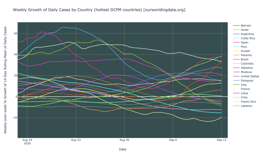
Looking at the growth rate of the twenty hottest countries in DCPM, things look a little better. Though most of these are still growing in daily cases (they are above the horizontal white zero line), most of them are also flat or trending toward zero in their growth rate, so at least they’re not accelerating. Only three countries—Libya, Israel, and Bahrain—have the triple-whammy of (1) being in the top 20 in the world in DCPM, (2) having a positive growth rate, and (3) having an accelerating growth rate:
The United States
Looking at the United States, the news is very good. The two graphs below (daily cases, and growth rate) show that (1) the United States continues its strong decline from the daily-cases peak of late July, and (2) its growth (shrinkage) rate is fairly steady, and has been for many weeks, at -10% per week. The United States is barely even a daily-cases warmspot anymore.
I got a little worried about a week ago when it seemed like growth was leveling off and maybe even headed back toward zero, but it remains below zero and is now trending back toward the 10% mark. Given the large numbers of upward pressures on this metric—Labor Day, return to school, impending winter—it wouldn’t be surprising if we saw an upward bending. But so far, this has not occurred. The downward pressures (mitigating factors like physical distancing, lockdowns, school closures, and the now almost-universal mask-wearing) appear to be up to the task of resisting the upward pressures and keeping our metric dropping, so far.
India
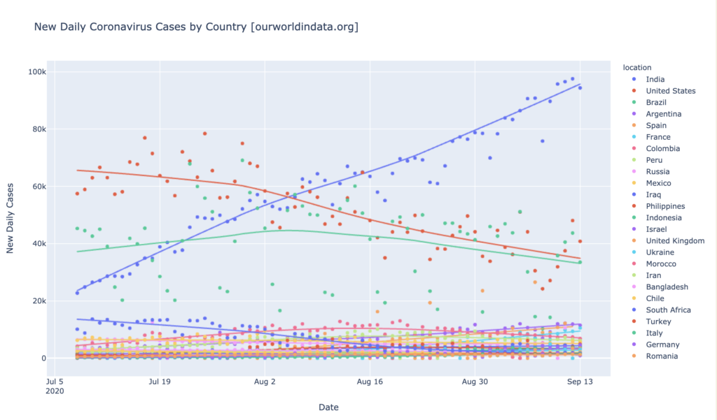
I’ve brushed off India for months now saying, yeah, the trend doesn’t look great and the potential for explosive epidemic is there, but they have very low DCPM and are not yet worth worrying about. Well, India is now worth worrying about—their long slow rise has finally taken them within striking distance of 100 DCPM, i.e. daily cases warmspot territory, and due to their immense population, that’s a lot of cases. Not adjusting for population but just looking at raw numbers (as I seldom do), India is news, as it now has far more daily cases than the long-declining Brazil and United States:
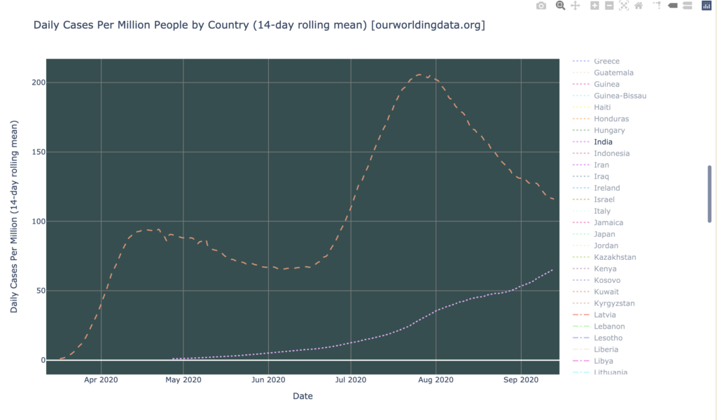
More significantly for comparative purposes, India has risen to 65 DCPM (the dashed orange line is the United States, dotted pink is India). That’s not yet a daily-cases warmspot, but it’s closing in at a pace that might get it there in a few weeks:
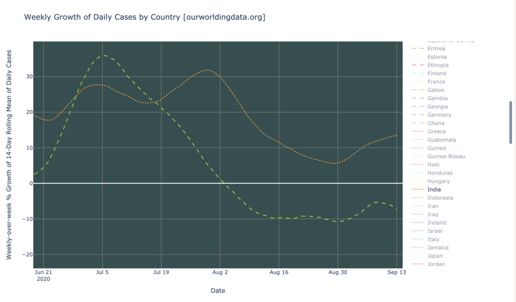
In growth rate, India has also been consistently positive for a long time, and at the moment, is around 10%+ and recently accelerated from 5% to near 15% (for comparison, dashed-green is the United States, dotted-orange is India). Its grown rate is a little lower in recent weeks, but still positive. In summary: India is looking problematic, and there is currently no end in sight of its epidemic:
States of the United States
Interactive source graphs, where you can select regions, zoom, etc., are here.
US States Severity: Still A Lot Of Hard Hit States
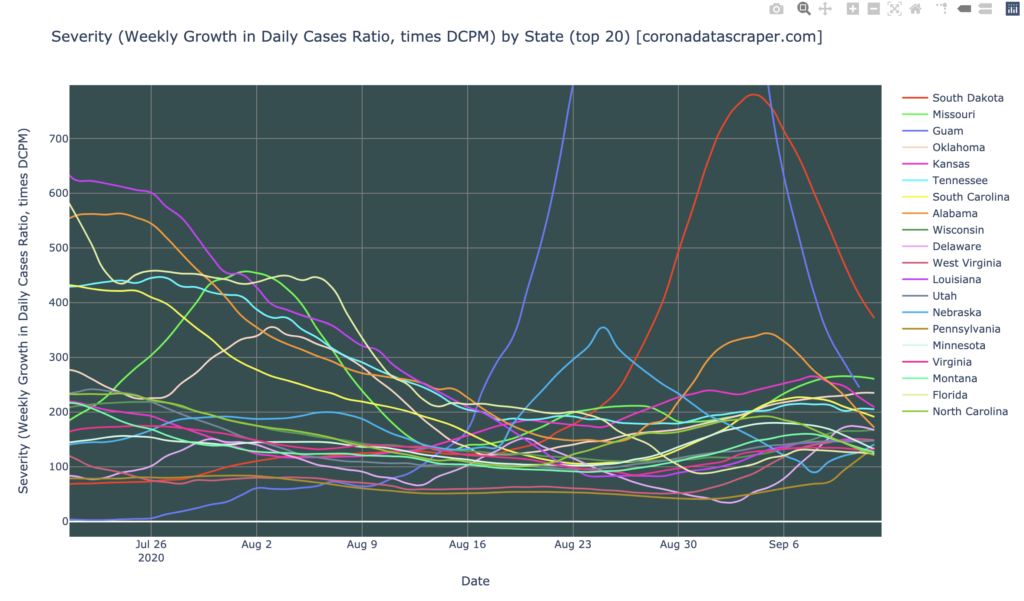
The states of the United States, are not out of the woods yet. There are still five severity hotspots: South Dakota, Missouri, Guam, Oklahoma, and Kansas. South Dakota and Guam were particularly hard hit recently, but are quickly recovering. The rest of the top 20 are severity warmspots, but appear still to be trending upward:
States Daily Cases
Looking at the DCPM graph, the news is moderately good, mostly because the news was so bad in July that today looks good in comparison. The July peak is long behind us, and all states that were hard-hit then, have come a long way toward recovery. We do have a few new “fourth wave” states/territories, notably Guam and South Dakota, but those also seem to be headed toward recovery. Looking at this graph, it is easy to see why the United States as a whole has been declining in daily cases since that July peak. But still, all of these top-20 states, are daily-cases hotspots or daily-cases warmspots, so the United States is far from recovered. We’d really like to see almost all states below, say, 10 DCPM, before we can really relax and resume something like normal life, and right now there are still a lot of them over 100:

Here’s New York, by the way. This is what a successful recovery looks like. It’s worth noting that New York can’t seem to get below 35 DCPM either, maybe because it continues to have a influx from all the other infected states. But it is at least holding steady at a reasonably low daily-cases number, far below warmspot territory. We’ll see how the school openings, and coming winter, and Labor Day fallout, affect it:

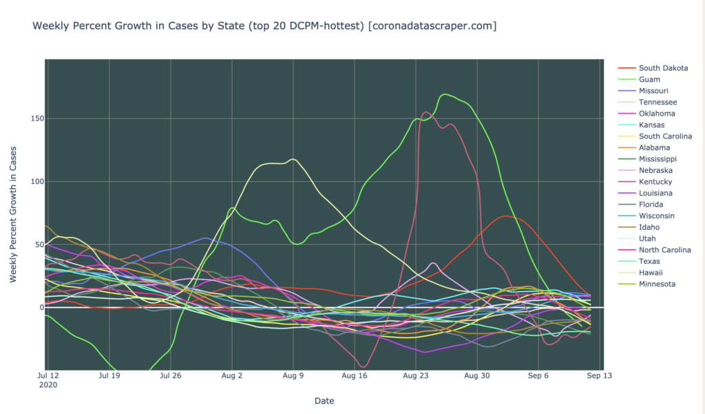
States Growth: Trending Firmly Toward Recovery
The best news for the states is the graph below, showing that nearly all of the DCPM-hottest states, are declining in daily cases (below the zero line), or are decelerating toward zero. Nothing here is above 10% weekly growth, which isn’t too bad (I think of 20% as “bad”). There remain a few which stubbornly hold on to a positive-but-low growth rate, but there’s nothing here remotely like a triple-whammy (top 20 DCPM, high growth rate, and accelerating). Really, only four states look remotely bad in this graph: Missouri, Wisconsin, Oklahoma, and Utah, all with slight and steady growth:
The Metaphorical Immune System Hypothesis Lives!
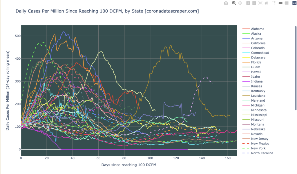
Notice how when I talk about the hardest-hit states, I’m never talking about the states I talked about months ago? New York, New Jersey, Rhode Island, Michigan, Illinois, Louisiana, Arizona, Florida: these are nowhere to be seen in the latest top-20. This is evidence for my still-standing hypothesis, expanded at length in my Medium article, that once a states gets a strong wave, it does not get another one in the medium term. This is because it develops metaphorical “antibodies” at the social level, which fend off new waves. One of my favorite graphs, below, is the state trajectories graph, showing what happened to each state after it reached 100 DCPM.
Almost invariably, states’ peaks clump at the far left, following the pattern I’ve repeatedly pointed to in the past: rising for about 30 days, peaking, falling for about 40 days, and never rising again. Three apparent exceptions to this are Louisiana, Mississippi, and South Dakota; the latter two can be easily explained because they never really got their peak until they had hovered at 100 for a while, pushing them to the right of the graph; their trajectories really do follow the pattern. Louisiana is not so easily explained, but one way of looking at it is that it had a small first wave that was just New Orleans, then the rest of the state caught it much later and gave it its “real” wave.
In any case, the trend is clear that almost all states had their large wave, got over it, and never rose again. Now that all states and territories have had their wave, and no second waves have appeared, I again predict that the United States will not have a second large wave in the next three months. And with the likelihood of a vaccine in the next three months, I predict that the United States will never have another wave like the July wave. In the metaphor, every state has built metaphorical immunity to such waves, will keep it for months to come (until the metaphorical antibodies wear off, in the form of fatigue and growing popular non-cooperation, or premature official lifting of restrictions), and actual individual biological immunity in the form of a broadly-taken vaccine will prevent a future large wave.
California Counties
Interactive source graphs, where you can select regions, zoom, etc., are here.
California Counties Severity
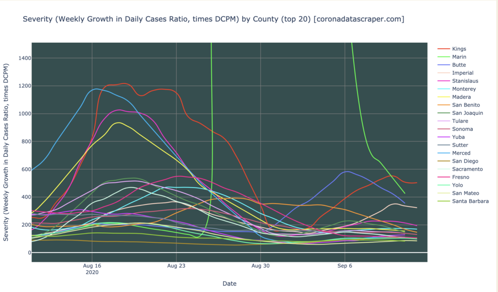
California counties are looking better. Only four counties are hotspots: Marin, Kings, Butte, and Imperial. Marin is literally off the chart below, but after discussing this with the data source provider, I conclude that it didn’t really have a terrible spike and fast recovery, but that the data provider just switched from the county data to the Johns Hopkins data, which led to a sharp jump in reported cases (JHU says there are twice as many cases in Marin as Marin Country Health says). Though this discrepancy is odd, it’s not extreme, and it doesn’t change most of my analysis, which is mostly around growth rates. Marin’s growth rate does not seem to be exceptional. It will take a while for it to settle down to see where its DCPM really is, so we’ll return to Marin in a later episode. So the top 20 are all hotspots or warmspots, which isn’t good, but there are no really extreme cases, and most counties seem to be declining:
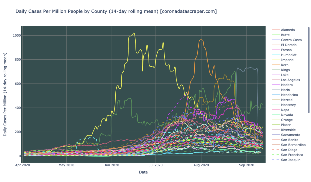
The entire history of all counties in DCPM shows a pretty good trend too: there are few daily-cases hotspots, and though there are still a lot of warmspots, the trend seems to be toward recovery, as shown by a higher snarl in the middle of the graph, than the snarl at the right:
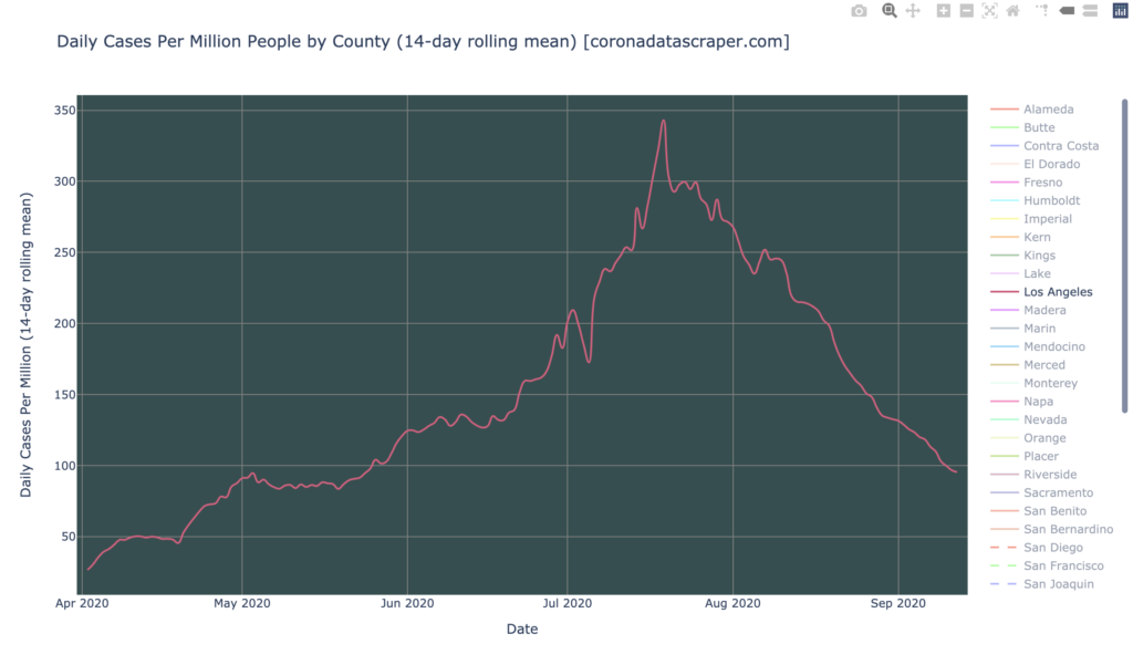
Remember Los Angeles?
Los Angeles, once the dominant force in California COVID cases, has recovered sharply and is not even a warmspot anymore. This probably accounts for most of the recovery of the total California numbers, so we might now worry that California numbers will not decline as much, now that Los Angeles has given back most of the daily cases it had to give. But with the apparent downward trends of most counties, it seems likely that the state numbers will continue to drop even now—but maybe more slowly than recently:
County Growth Rates: The Best News Today
The really good news is in growth rates by county. The graph below shows that nearly all counties are shrinking in new cases (below the white line), many of them rapidly (20% per week or faster). Only Butte, Imperial, Kings, San Diego, and Humboldt are growing, and of those, only Humboldt is accelerating. This is what we like to see in a growth graph:
Definitions
| DCPM | Daily cases per million |
| Daily-cases warmspot | >100 DCPM but <200 DCPM |
| Daily-cases hotspot | >200 DCPM |
| Growth warmspot | >1% daily (>7% weekly) growth in new cases |
| Growth hotspot | >5% daily (>35% weekly) growth in new cases |
| Severity | A metric combining DCPM with growth |
| Severity warmspot | >100 Severity but <200 Severity |
| Severity hotspot | >200 Severity |