This is a summary of COVID-19 trends today, by countries, US states, and California counties.
Summary
| Daily Cases | Daily Growth | |
| World | cold (37 DCPM) | cold (-0% and cooling) |
| United States | warm (166 DCPM) | cold (-2% and cooling) |
| California* | hot (235 DCPM) | cold (-1% and cooling) |
* California data is currently unreliable due to a computer system problem
Graph of the Day
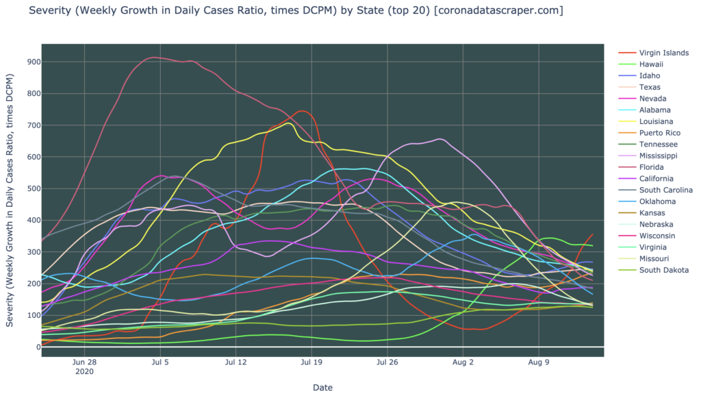
The top twenty hardest-hit states are all shrinking in daily new cases now; but we’re seeing strong growth in the Territories:
Countries of the World
Interactive source graphs, where you can select regions, zoom, etc., are here.
Countries Severity
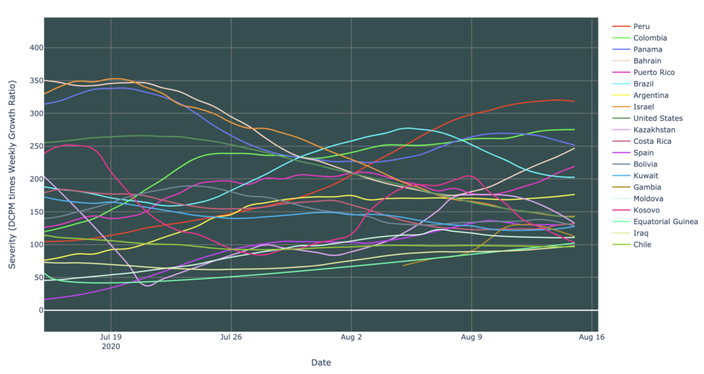
Several countries continue to be severely hit, with severity above 100, for the worst twenty countries. Five countries are severity hotspots: Peru, Colombia, Panama, Bahrain, and Brazil. The rest in the graph below are severity warmspots. All other countries are not even warm. Most countries of these top twenty, however, appear to be rising slightly in severity (as we’ll see below, growth rates are dropping, so this is due to cases continuing to rise for those countries which have not yet peaked, especially in Central/South America):
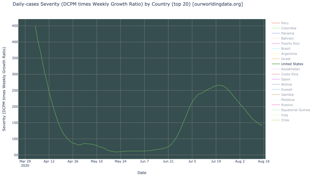
The United States is going in a very nice direction. With 140 severity, it’s still a severity warmspot, but falling sharply:
Countries Growth
As we’ll see below, the world is actually lagging the United States in recovery now: states growth charts look even better than the chart below. But still, at the countries level, the news is pretty good. Of the hardest-hit (highest-DCPM) countries, most are now shrinking in daily growth, and almost all are seeing their growth rates declining. Growth hotspots are Peru, Colombia, Argentina, Moldova, Kazakstan, and Costa Rica. Note the Central/South America epicenter, still worst in the world. But note also the downward slope of growth rates in most of those countries, signaling a peak there in a few weeks:

The United States, once the worst in the world on almost all metrics, is doing much better, having peaked a week or two ago, now with a growth rate of -10% weekly; i.e., each week sees 10% fewer new cases than the week before:

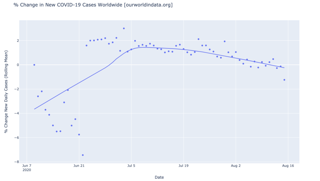
The world as a whole has also now peaked and is declining in daily cases, and also declining in growth rate of daily cases, continuing this pleasant descent it has been on since early July:
States of the United States
Interactive source graphs, where you can select regions, zoom, etc., are here.
States Severity: Looking Better Except Hawaii and Territories
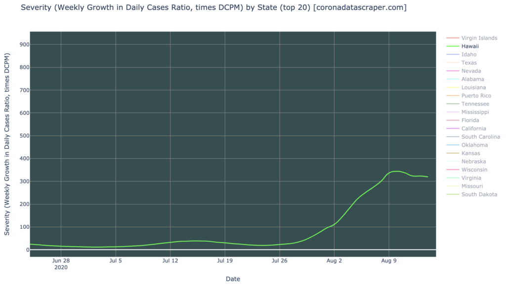
In severity, the states are looking much better than they were in July. Though the top 20 most severe states all remain severity hotspots and severity warmspots, the worst of the non-territories (territories tend to have more extreme numbers due to their small populations) is Hawaii, at 320 severity:
Hawaii is by far the worst of the states right now, clearly finally experiencing its first wave:
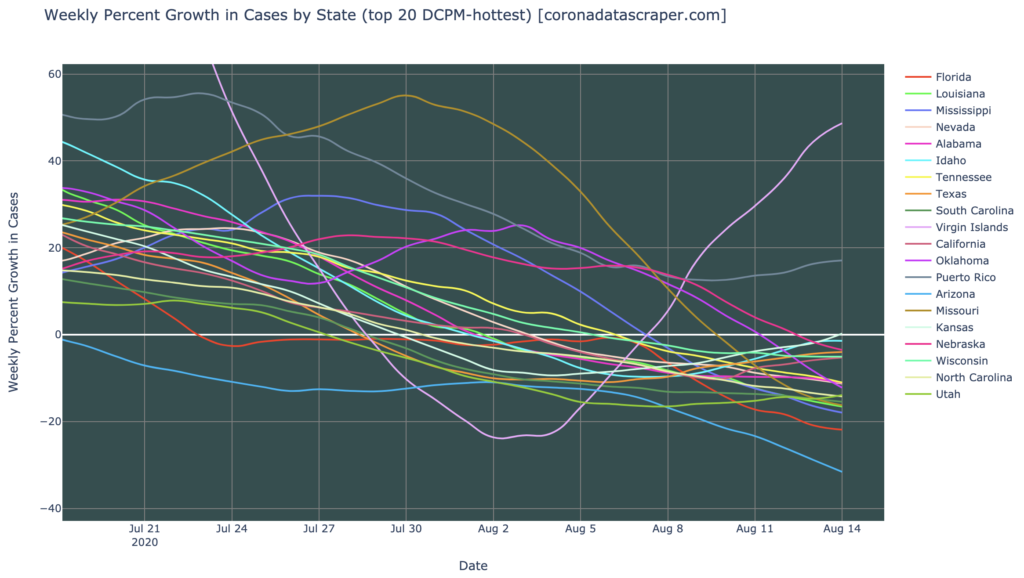
States Growth: All Hardest-Hit States Are Shrinking
The growth rate of states is looking very good now, with all of the hardest-hit (highest DCPM) states now shrinking in daily new cases. Puerto Rico and the Virgin Islands, like Hawaii, are far worst than the States, but do not affect the total US numbers much due to their small population. Nevertheless, these are not the places to visit right now:
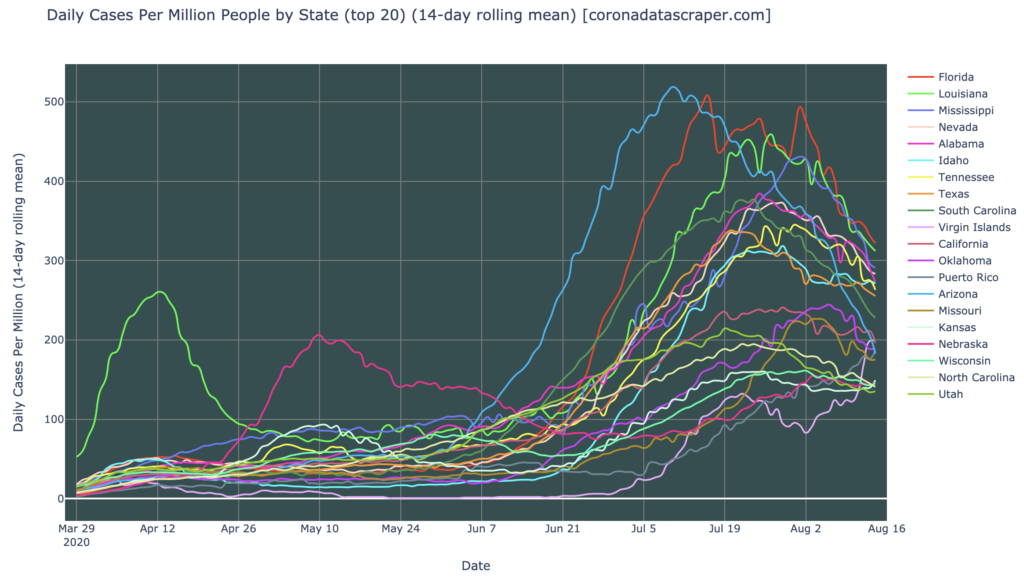
Daily Cases Remain Very High In Most States!
But it’s not time to relax! Not yet. In terms of daily cases the top 20 states are still DCPM hotspots or warmspots. Though the daily cases graph is showing strong recovery (almost all states bending downward toward zero), the number are still very high across the country. Whatever it is we’re doing (masking, social distancing, staying home), is working, and if we keep doing these things, these graphs will probably continue to improve. If we stop doing these things because the trends are looking good, the situation may degenerate again. There is an end in sight, a couple months from now perhaps, when some of the difficult mitigating steps we’ve all been taking can be relaxed, but not yet:
California Counties
Interactive source graphs, where you can select regions, zoom, etc., are here.
Counties Severity: Reporting Glitch Causing Short-Term Upward Trend
The short-term severity trends for California counties is not looking good, with most of them rising. However, as we’ve discussed in past livestreams, this was expected, and does not necessarily indicate a rise in actual recent cases. California had a computer system problem which resulted in a backlog if 300,000 test results not being recorded; this has now been fixed, but all these results landed in the past few days, artificially driving up the total cases, and total tests, and even more, the growth rate, which is a major component of the Severity metric graphed below. It will take a few days, maybe a week, before this gets averaged into the medium-term trends of these graphs, so at this point, the California daily-cases, growth, and severity graph trends can’t be trusted to correlate at all with the underlying infection rate:
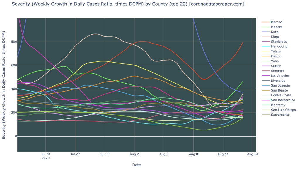
Because of this data problem, we don’t know what’s actually going on in California today, so I’ll stop here and wait for the data to settle down from this artificial spike.
Definitions
| DCPM | Daily cases per million |
| Daily-cases warmspot | >100 DCPM but <200 DCPM |
| Daily-cases hotspot | >200 DCPM |
| Growth warmspot | >1% daily (>7% weekly) growth in new cases |
| Growth hotspot | >5% daily (>35% weekly) growth in new cases |
| Severity | A metric combining DCPM with growth |
| Severity warmspot | >100 Severity but <200 Severity |
| Severity hotspot | >200 Severity |