This is a summary of COVID-19 trends today, by countries, US states, and California counties.
Summary
| Daily Cases | Daily Growth | |
| World | cold (36 DCPM) | cold (0% and cooling) |
| United States | warm (180 DCMP) | cold (0% and cooling) |
| California | warm (190 DCPM) | cold (0% and cooling) |
Graph of the Day
The states continue their recovery, with most of the hardest-hit states now showing negative growth of daily cases:
Countries of the World
Interactive source graphs, where you can select regions, zoom, etc., are here.
Countries Severity Hotspots: Not Many
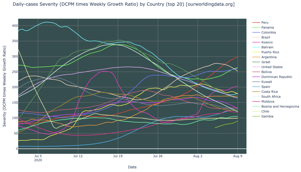
Only a few countries remain as severity hotspots: Peru, Panama, Colombia, Brazil, and just barely, Kosovo (note the Central/South America cluster). None of these is over 300 severity, so not super hot. There are less than 20 severity warmspot countries in the world. These top-20 most severe countries are mixed in whether they’re getting better or worse; those which were most severe in July have universally been getting better, but there are a number of countries rising in severity, most notably Peru, Panama, and Colombia (Brazil is looking a little better than those in the short term):
Countries Growth: Looking Good
The “severity” metric includes the number of cases actually reported (daily), as well as the growth rate of cases, so it counts countries as severe even when the cases are dropping, if they are still high. For a pure look at growth, we have the countries growth chart, which picks the hottest countries in DCPM, but then graphs just their growth rates. This chart is looking very good these days, with the vast majority of hardest-hit countries showing a negative growth rate in daily cases (fewer cases every day), and those that are still growing, showing a strong trajectory toward zero growth:

States of the United States
Interactive source graphs, where you can select regions, zoom, etc., are here.
States Severity
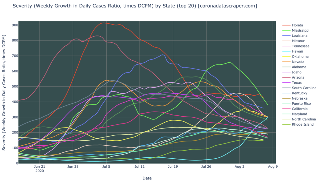
There continue to be many, many severely-hit states in the United States. On the bright side, the last time I did this blog (four days ago), all twenty of the top-twenty were severity hotspots, and now six of them have dropped into severity warmspot territory. In general, these most-severe states are visibly getting better, as their severity lines trend downward, but at this rate, it’s still looking like a couple months before they all drop down into the teens, where we can really say their waves are over. Note that Hawaii, light blue, one of very few states which have not yet had a wave, is now having a wave, an has reached a very severe level of 300:
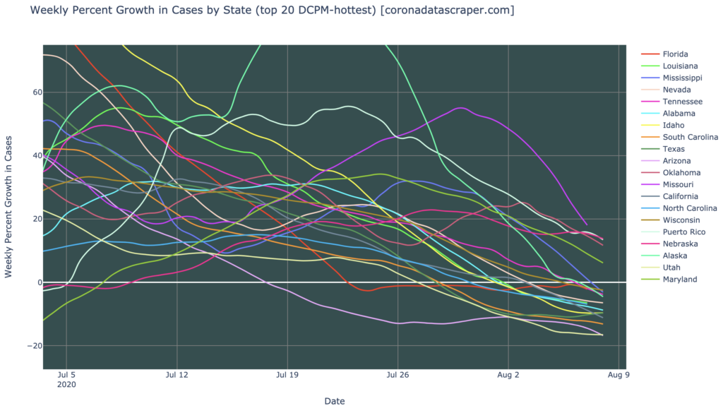
States Growth
The growth rate graph by state looks even better, with most hardest-hit states now shrinking in daily new cases, and the rest of the top twenty clearly trending downward to zero growth:
States Testing: The Are Problems Here
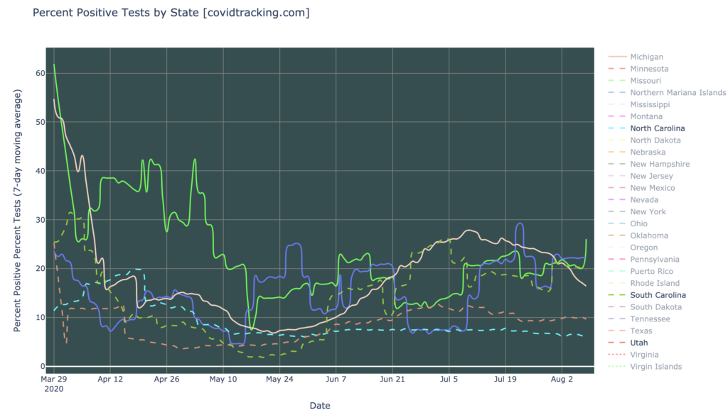
Returning to the Gang of Six, the center of the May wave of states (Alabama, Arkansas, Arizona, North Carolina, South Carolina, and Utah), here are their positive test ratios. A number like 8%, is around the cutoff to be considered good; and we’d really like to see 2% or better; anything above 10% is pretty bad. We can see below that these six states are still experiencing high test percentages, even though we’ve seen that their cases have been dropping for a while. This is part of a recent trend where, for various reasons, fewer tests are actually being performed, and tend to be done on those who are sickest, hence higher positive test rates:
California Counties
Interactive source graphs, where you can select regions, zoom, etc., are here.
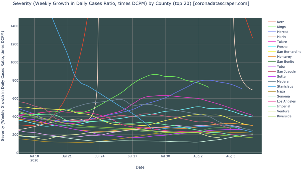
Counties Severity
The top-20-most-severe counties are still pretty severe, with most of them as severity hotspots. Kern and Marin were extraordinarily high recently, but they quickly dove back down toward the pack, so those may have just been data anomalies. We know there have been testing backlogs and reporting infrastructure problems in California lately, so none of this recent information is particular reliable. But if we do choose to believe it at face value, most hard-hit counties are currently trending downward in severity:
Counties Growth: Heading In The Right Direction
Similarly to countries and states, the growth chart for counties of California is looking much better than a month ago, with about half of the hardest-hit counties shrinking, and most of the rest trending toward zero. The trajectory toward a recovery continues:

Definitions
| DCPM | Daily cases per million |
| Daily-cases warmspot | >100 DCPM but <200 DCPM |
| Daily-cases hotspot | >200 DCPM |
| Growth warmspot | >1% daily (>7% weekly) growth in new cases |
| Growth hotspot | >5% daily (>35% weekly) growth in new cases |
| Severity | A metric combining DCPM with growth |
| Severity warmspot | >100 Severity but <200 Severity |
| Severity hotspot | >200 Severity |