Note: I didn’t post a blog here on gregferrar.us last week because as I started to write it, I decided that Medium would be a better, uh, medium. Last week, the United States was clearly reaching another peak, so I took the opportunity to package that up for popular consumption (as I did on Medium in the first US peak in early April) together with my hypotheses based on my “metaphorical regional immune system” theory. That the US has peaked in the short term, is uncontroversial. My more-controversial hypothesis is that it will not peak again this high in the medium term. My even-more-controversial hypothesis is that it will never peak this high again. I wrote this all up in a much-longer-than-my-usual-blog Medium story, and it’s gotten a lot of attention. So here’s last week’s story, published on Medium. Now, back to our regularly scheduled blog.
This is a summary of COVID-19 trends today, by countries, US states, and California counties.
Summary
| Daily Cases | Daily Growth | |
| World | cold (30 DCPM) | cool (0.6% and falling) |
| United States | warm (192 DCPM) | cold (-1.8% and falling) |
| California | cool (85 DCPM) | neutral (0% and falling) |
Graph of the Day
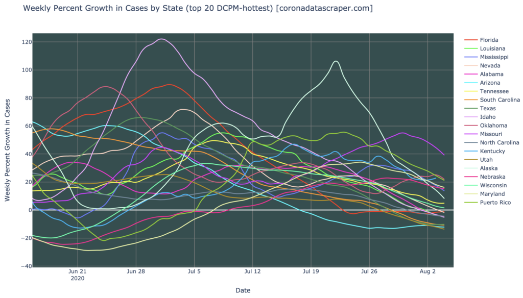
Of the hardest-hit states in DCPM, half have peaked (daily growth rate below the thick white zero line), and are seeing fewer new case each day:
Countries of the World
Interactive source graphs, where you can select regions, zoom, etc., are here.
Country Severity: The United States Is Not Hot Anymore
There are no super-hot countries right now, but there are four severity hotspots: Brazil, Colombia, Peru, and Panama. Here we clearly see the Central/South America epicenter, and it is notable that the United States is not listed; the United States is no longer a severity hotspot, having dropped to 190 in severity. However, there is no clear trend downwards for the top-20-most-severe as a group (as there has recently been); these seem broadly to be holding stable, not getting worse, but not getting better either:
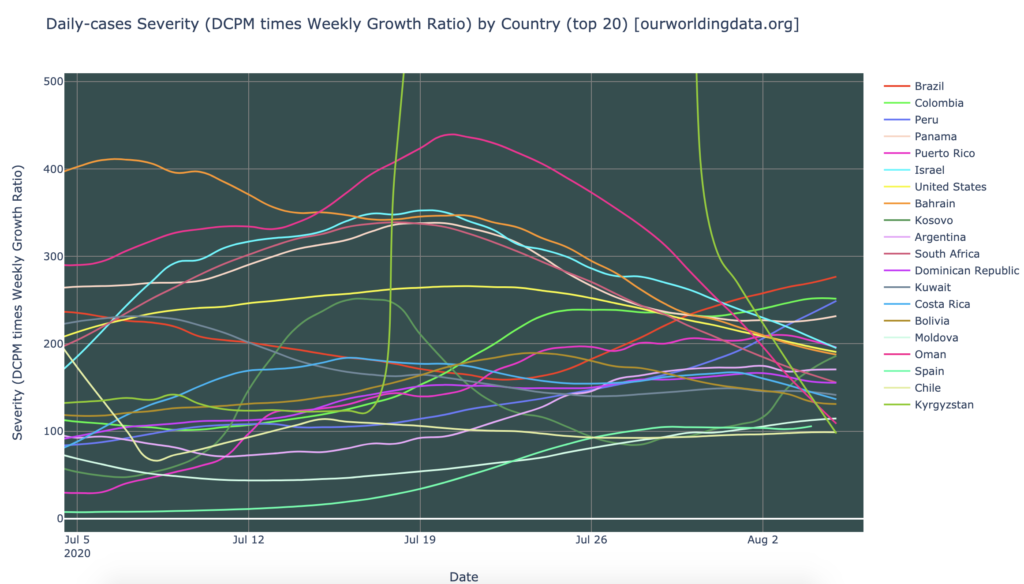
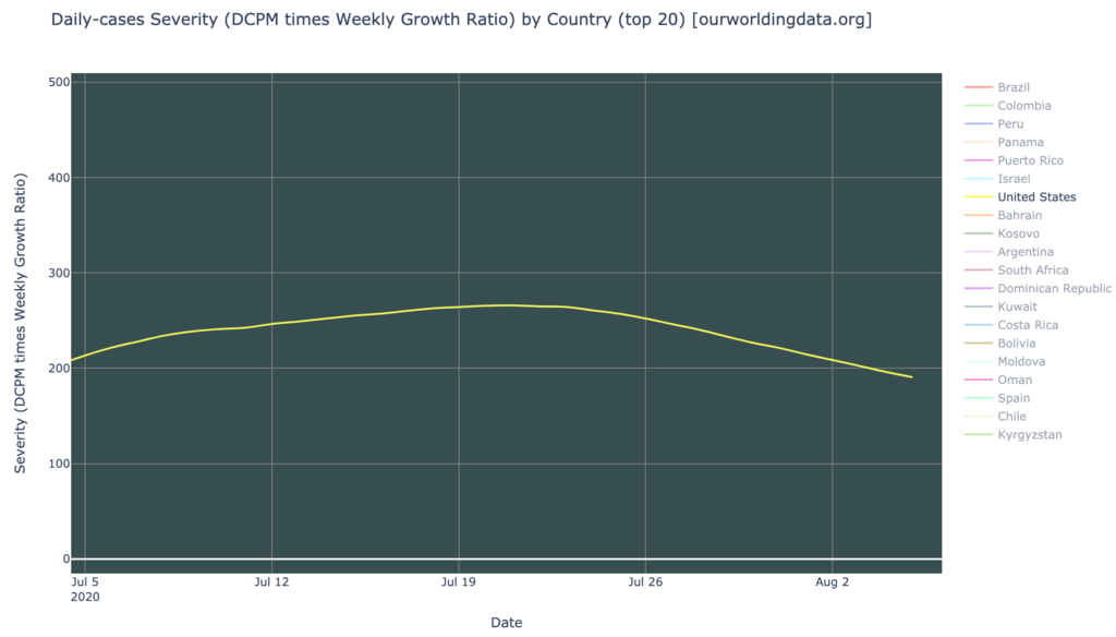
But the United States, still the largest source of cases, is getting better in severity:
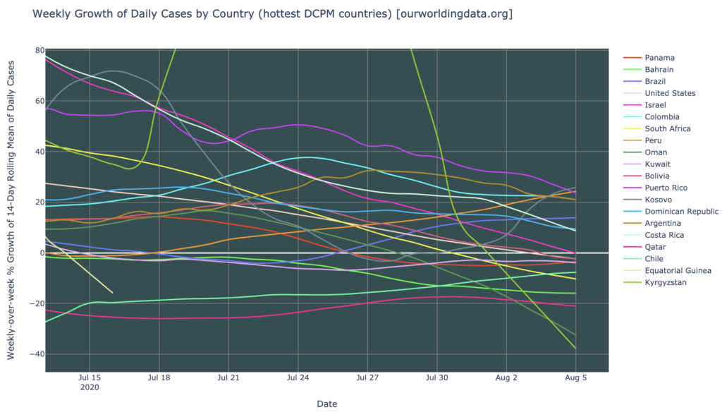
Looking at the growth rate graph for these highest-DCPM countries, however, we can see that the trend is leaning toward the positive. Only seven of the top 20 are growing in DCPM (above the thicker white zero line), and most are trending downward in growth rate. So the other thirteen, have peaked in daily cases and are now declining. Only Kosovo and Peru show a slight upward trending growth rate, and even those are only around 20% weekly, which makes them just a growth warmspot. There are no growth hotspots.
States of the United States
Interactive source graphs, where you can select regions, zoom, etc., are here.
States Severity: Improving
In severity, the states of the United States look much worse than the countries of the world; there are still a lot of very severe severity hotspots; in fact, almost all of the 20 most severe states are severity hotspots. On the bright side, most of these are noticeable trending downward toward less severe. Only Hawaii, the bottom line, is showing a really bad trend right now, as it has recently and sharply turned upward and is nearly in hotspot territory (from the Medium article: Hawaii is one of just four states that have not yet had a strong wave, and might be expected to join together in a fourth wave of states soon):
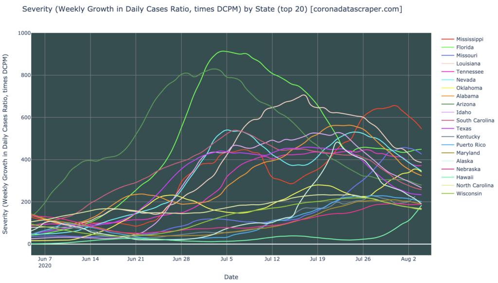
States Growth: Half Of Hardest-Hits Are Shrinking
But, the growth rates of the states continues to point in a very nice direction. Unlike a month ago, when the highest-DCPM states were still accelerating upward, almost all of them are seeing decreasing growth rates now. In fact, half of all these worst-hit states have now crossed the zero line of growth, meaning they have turned the corner, peaked, and are now declining in daily new cases. Only Missouri has a really bad growth rate (40% weekly, hence the only growth hotspot), and that has been declining strongly for the past week:
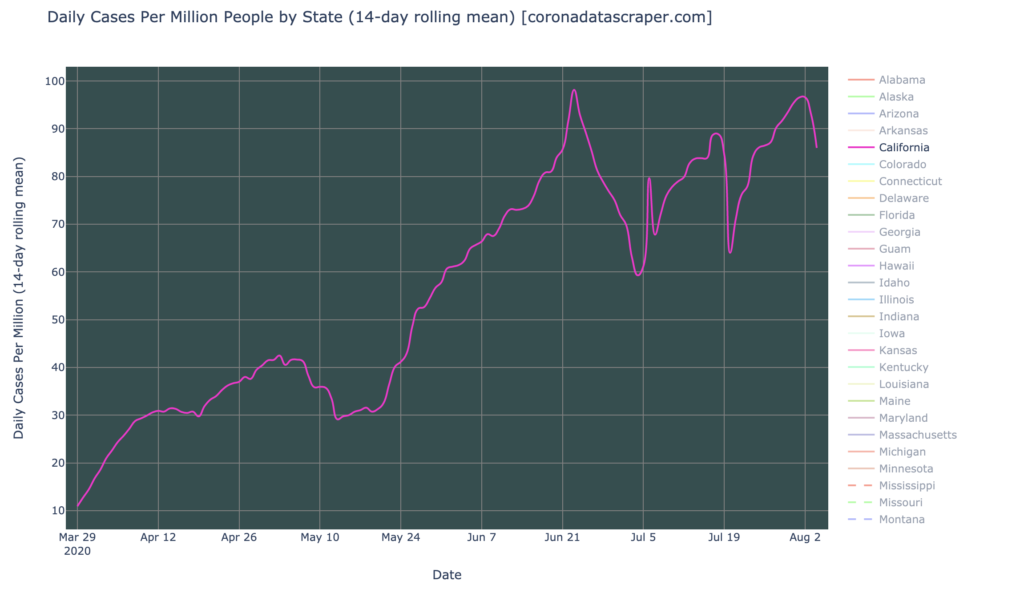
California Doesn’t Even Register
It is perhaps worth noting that California did not appear in the above graphs because it’s not even a daily-cases warmspot; though it flirts with that 100 DCPM line, it hasn’t crossed it (in 14-day moving average). A DCPM of 90 still isn’t great, but because so many other states are very severely hit, California does not even make the cut to be in the “worst 20” states graphs above.
State Deaths: The “We’re Just Not Testing Enough” Narrative
There is a narrative going around, that reported cases are only declining because of insufficient testing. The following graph of deaths by state can provide some insight into the validity of this narrative. (All states are shown here, more than fit in the legend, so it is not generally possible to tell which line is which state; use the interactive version to explore this graph yourself).

This graph (above), does not, yet, directly prove or disprove the narrative. It supports it at first glance, by showing that deaths are rising, even while cases are falling; this might indicate that underlying infections are in fact rising, and are just not being reported due to testing lags (but deaths are reported without lag).
However, I would expect death reporting to lag case reporting by a couple weeks, since deaths happen weeks (sometimes months) after an infection happens, and even with delayed testing, deaths will probably still occur days after the case is confirmed by testing.
Consider the example of Arizona, the first of the current wave, hardest-hit in DCPM, and one that has now apparently peaked in deaths. Here are the graphs of Daily Cases, and Daily Deaths. Cases peaked around July 10th. Deaths peaked around July 25th, two weeks later. It does seem that the deaths graph is offset from the cases graph by about two weeks:
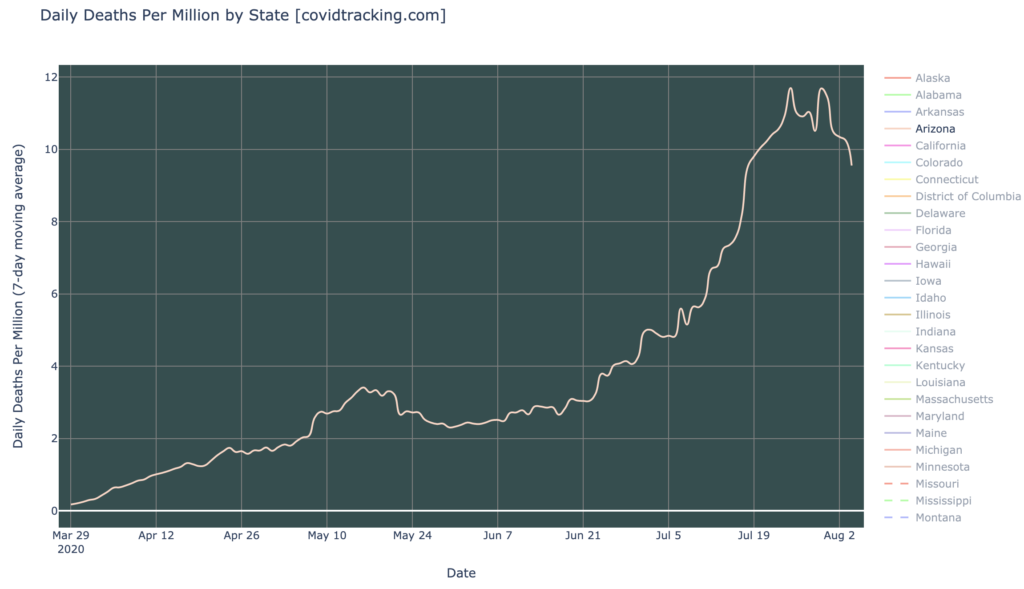
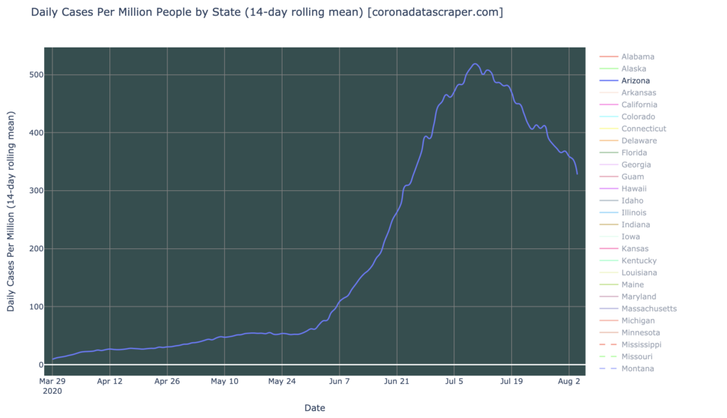
It’s too soon to say whether the other states will follow this pattern, but if they do, we’ll see a peak in deaths in most of the third-wave states (which is most of the states of the United States), in the coming week or two, since they peaked in cases about a week ago. If we see this pattern of peaking and dropping death graphs across the US, it will be evidence against the theory that we still have rising infections, but just undetected. So, it will take a couple weeks before we can see whether this narrative is true or not.
California Counties
Interactive source graphs, where you can select regions, zoom, etc., are here.
Counties Severity: Holding Steady But Not Getting Better
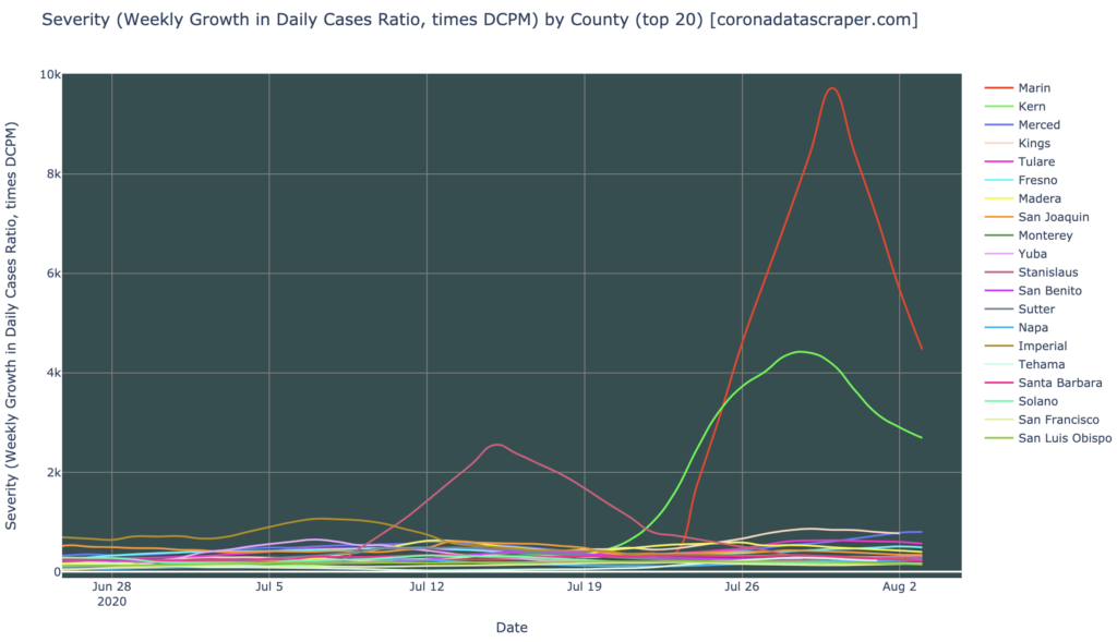
In severity, there have been three extraordinary counties in recent weeks, with severity in the thousands; recall that a Severity of 200 is a severity hotspot. These may be data outliers and “not real” in some sense, or at least not persistent, and they are not large counties, but I’ll show them briefly here before I discard them. My guess is that Kern (green) really did have a persistent spike, now recovering, while the other two (Marin and Stanislaus) were more data anomalies (from their triangular shape, indicating a single-day blip), due either to changes in reporting, or simply wrong numbers:
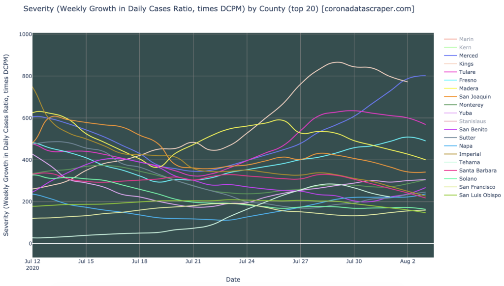
Discarding those, this is the counties severity graph. It’s pretty bad, with just about all of the top 20 counties as severity hotspots (recall that the state itself is not a hotspot, however). It’s also not clear that these counties are getting better in severity; they are perhaps horizontal, with a general trend for the worst ones to be trending a little better. None of them are accelerating strongly upward at this point:
Counties Growth: Also Holding Steady But Not Getting Better
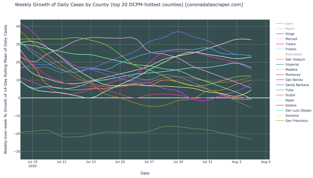
Results from the growth rate graph are similar. A few counties are shrinking—Imperial especially, which was once by far the hottest county, continues to shrink steadily at 20% per week, and is no longer in the running. None of the counties are growth hotspots; only Merced is close. But the other hottest countries are broadly horizontal in growth, not accelerating in growth rate, but not getting better, and hence almost all still growing in daily new cases:
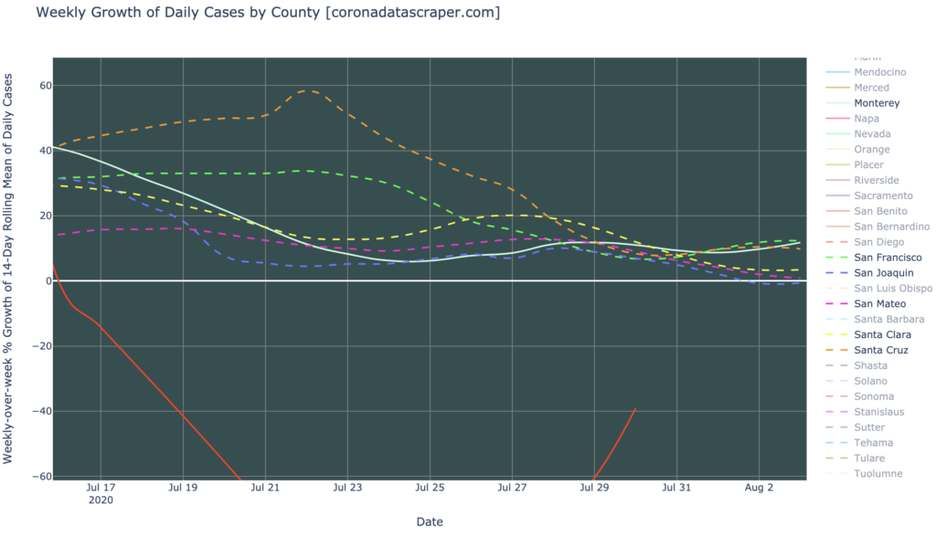
Bay Area Counties: Still Growing Slowly
In the San Francisco Bay Area, the counties are still generally growing, albeit slowly (mostly in the 0% to 20% range). Alameda (red) appears to be doing great, way down there at -40%, great enough that I wonder if the data source is accurate; if I had to guess, Alameda is really in the cluster with the others, and something has gone wrong with data reporting by the county, or collection by coronadatascraper.com. The others show a medium-term downward trend, but short-term they have leveled out, and while not accelerating in growth, they’re not obviously getting better either. So the Bay Area, like California, seems stable right now, but is not trending toward actual recovery:
Definitions
| DCPM | Daily cases per million |
| Daily-cases warmspot | >100 DCPM but <200 DCPM |
| Daily-cases hotspot | >200 DCPM |
| Growth warmspot | >1% daily (>7% weekly) growth in new cases |
| Growth hotspot | >5% daily (>35% weekly) growth in new cases |
| Severity | A metric combining DCPM with growth |
| Severity warmspot | >100 Severity but <200 Severity |
| Severity hotspot | >200 Severity |