This is summary of COVID-19 trends today, by countries, US states, and California counties.
Summary
| Daily Cases | Daily Growth | |
| World | cold (29 DCPM) | warm (2.2% and rising) |
| United States | warm (193 DCPM) | hot (5.9% and rising) |
| California | warm (150 DCPM) | hot (4.4% and rising) |
Graph of the Day
The Americas still have a problem, but it may be getting better. The graph below shows all the countries of the Americas; most of them are growing, but the general trend in growth rate is downward, suggesting that the Americas are heading toward a peak.
Countries of the World
Interactive source graphs, where you can select regions, zoom, etc., are here.
Country: Hotspots: Bahrain, Oman, Panama, and Brazil
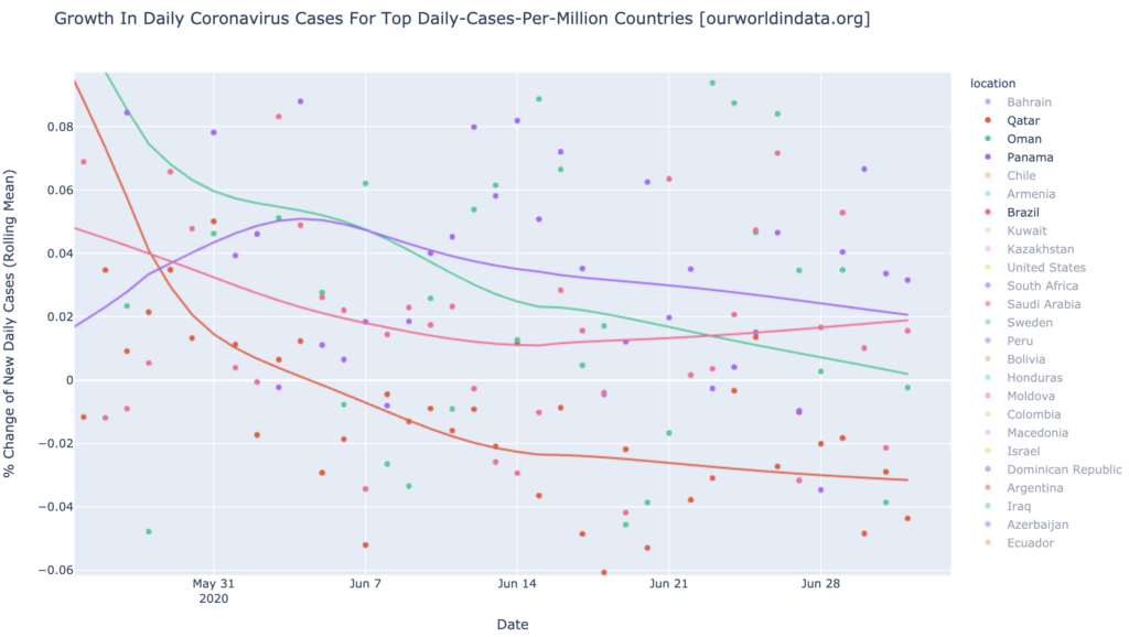
Quite a few countries are daily-cases hotspots: Bahrain, Oman, Panama, and Brazil. Qatar, shown sharply recovering on the graph below, was the worse in the world for a long time, but is no longer even a daily-cases hotspot:
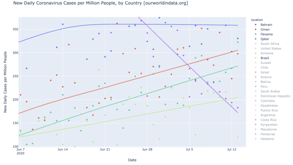
Brazil looked like it was headed for recovery a month or so ago, but faltered and has been rising slowly since. The other three are trending downward in growth rate, however. Qatar is shrinking rapidly in daily cases, and Oman is just turning the corner toward negative growth. None of the daily-cases hotspots are anywhere near being also growth hotspots:
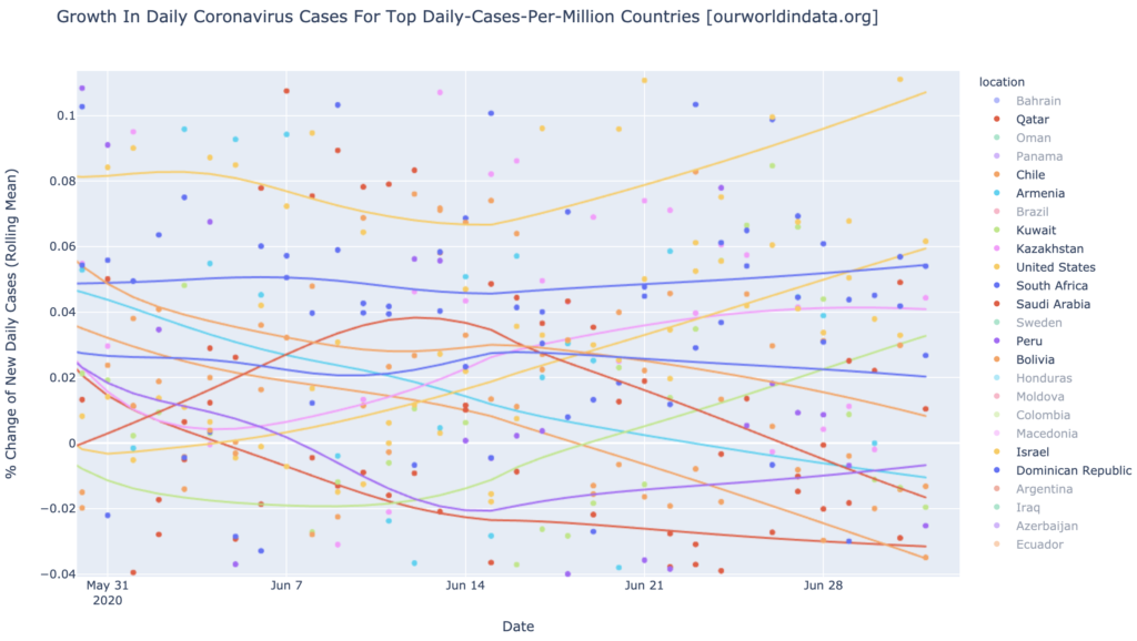
There are a lot of daily-cases warmspots (see the interactive graphs to differentiate countries in this graph):
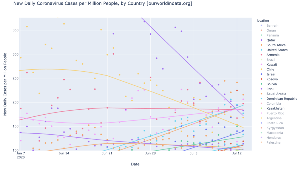
More than half of the warmspots are growing, but only two have the triple-whammy of being a daily-cases warmspot, a growth warmspot, and accelerating growth: Israel at 11% daily growth, and the United States at 6% (both yellow below; see the interactive charts to match up lines with countries):
The Americas Still Have a Problem
Here’s a graph of the growth rates of most of the countries of the Americas. I might have missed a few. This is a broad view; there are too many to list, and as always, you can look at the interactive graphs to differentiate countries (especially necessary this time since the legend is scrolled so it doesn’t even show most of them). Most are growing, and the worst are Paraguay (16%), Costa Rica (9%), Venezuela (8%), Ecuador (6%), Argentina (6%), and the United States (6%). All of these worst growth hotspots are accelerating in growth. Then there’s Cuba at the bottom, shrinking 9% a day; Chile, Haiti, and Canada are also doing well:
States of the United States
Interactive source graphs, where you can select regions, zoom, etc., are here.
The Big Picture Is Still Bad For The States
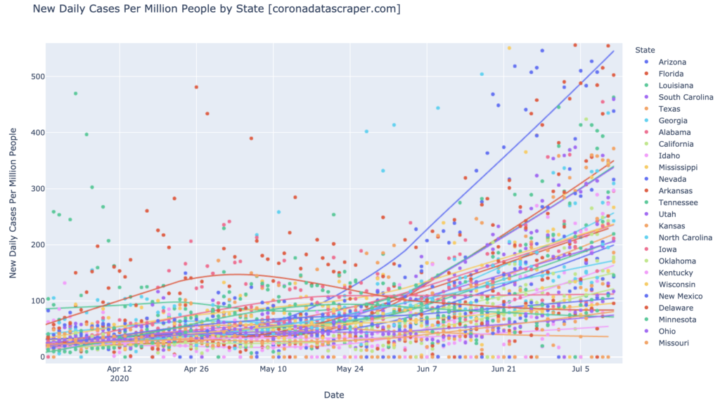
The graph below shows the top 25 states in DCPM (this is an aggregate view; use the interactive graphs to see which state is which). This is about as bad as it has ever looked: there are twelve daily-cases hotspots (Arizona, Florida, Louisiana, South Carolina, Georgia, Mississippi, Alabama, Arkansas, Texas, Tennessee, Utah, and Nevada), and eight additional daily-cases warmspots:
The rope chart for these top-25-states shows that they are all still growing, except Texas:
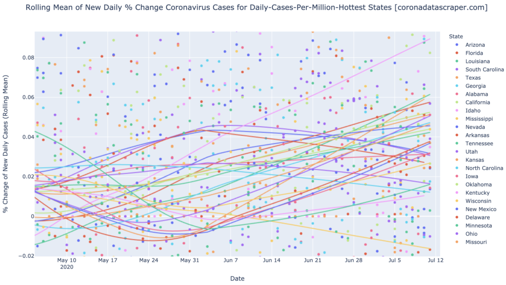
But notice the five states that are angled downward in growth, and the red line in the middle that is almost horizontal. These are the Gang of Six: Arizona, Arkansas, Alabama, North and South Carolina, and Utah. These were the big news six weeks ago, but they have all turned downward in growth rate, and are headed toward the zero line, which will mark the peak of their daily cases. The theme here, as has recently been my theme, is that states which are hard hit and accelerating, peak in daily cases in four to six weeks after they get hit, perhaps due to mitigating efforts by the residents and the governments of those hard-hit states. The Gang of Six is still strongly and unanimously indicating this trajectory; we can reasonably hope (maybe even expect) that all these other hard-hit states we see now, will follow a similar path in the next month or two.
Case Study: Florida
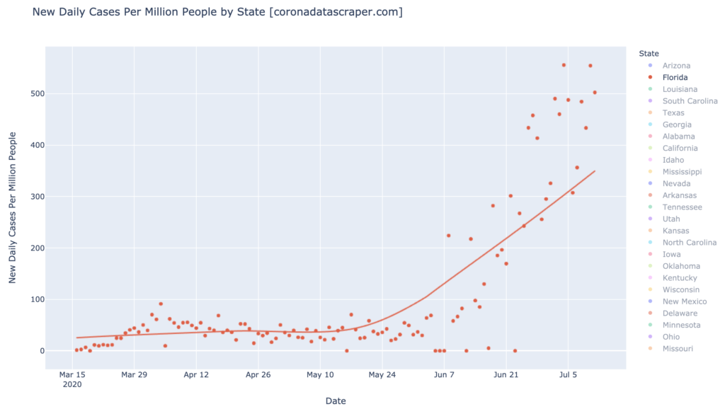
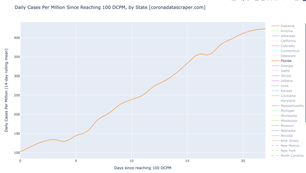
Much has been written recently about how terrible Florida is. And that’s true in many ways: Florida is showing a very troubling DCPM graph: it is a daily-cases hotspot with its trendline at 350 DCPM, and worse, almost all recent dots are above the trendline, indicating recent acceleration, and arguably an actual DCPM of about 500:
The growth graph of Florida, however, already shows signs pointing toward recovery. It is still technically a growth hotspot—its trendline is 5.8%—but all recent dots are below the trendline, most well below 5%, and couple even show significant shrinkage in daily cases (below 0%). We can see the conservative trendline bending downward already; it is likely that Florida will soon join the Gang of Six in a downward-angled trajectory of its growth rate trendline:
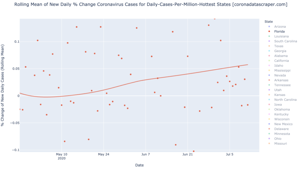
Similarly, the 14-day moving average has flattened out; given the trends we’re seeing in growth, it is also likely that this moving average will turn downward in just a few days, indicating an impending peak in DCPM for Florida. It’s early and this is speculative, but things are looking up, for this hard-hit state:
California Counties
Interactive source graphs, where you can select regions, zoom, etc., are here
Still No Good News For The Counties
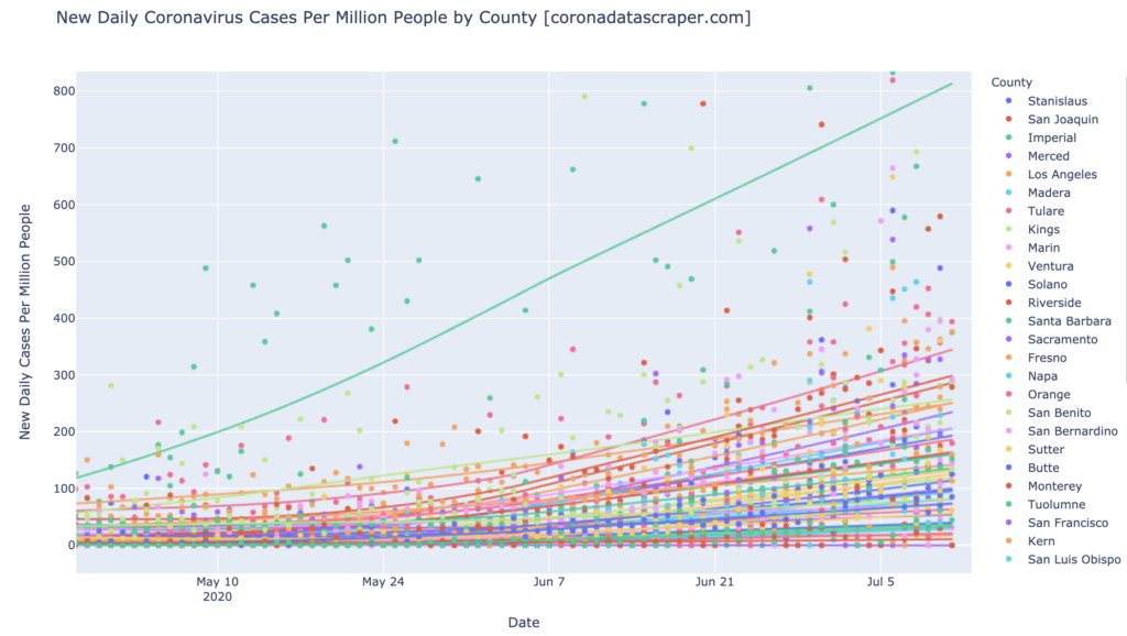
The news by DCPM is the same as last time: almost all counties are growing, and a whole mess of them are hot or warm. If you want to pick out a particular line, use the interactive version:
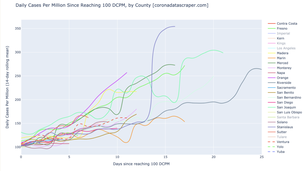
County Trajectories: Up
The Counties trajectory chart, below, which shows the trajectory of each county from when it reached 100 DCPM, shows how outsized Imperial has been and remains; no other county has half its cases, adjusted by population, and though it’s trending downward, it’s not exactly plummeting; it’s still at 700 DCPM, a height seldom seen anywhere.
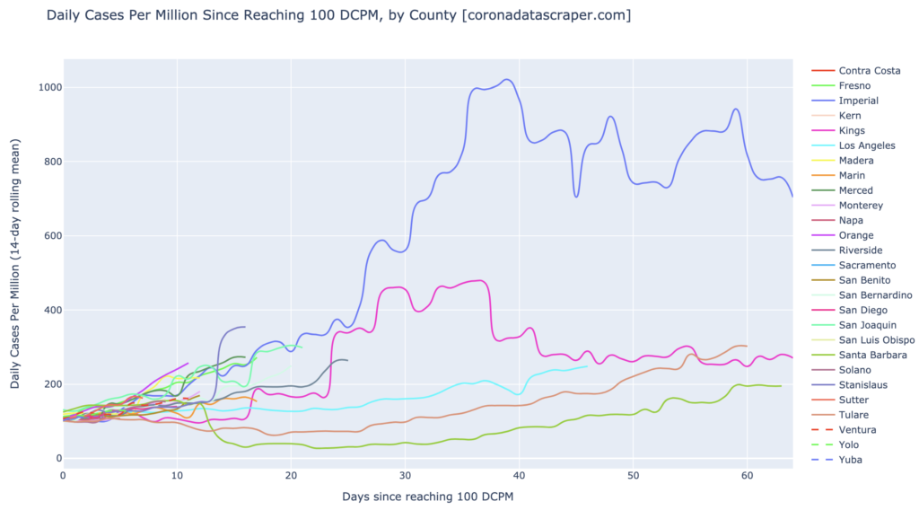
Notice that this chart above echoes the rope chart above it, by showing that there are very few counties getting better. The end of each thread marks today for that county. Kings is slightly descending, but not so much in the past week or two. All the other threads we see are poking upward: Tulare, Santa Barbara, Riverside, San Joaquin, San Bernardino, Stanislaus, Merced, Orange, and Los Angeles. And those are just the growth hotspots.
Below is another version of the Trajectories graph, but I clicked off the five longest-running warmspots. The snarl below, of the twenty remaining ones, shows how much has happened in the past month. For months and months, California sailed along in pretty good territory, with really only Imperial and Kings in trouble. But in the past month, there have been 20 new daily-cases warmspot counties. And as seen by the density at the left, there are a whole lot of counties that just entered warmspot territory in the past week or two:
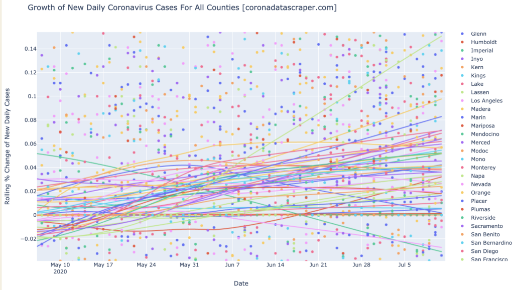
Counties Growth: Still Growing
Almost all counties are still growing: see the rope chart below (as always go to the interactive version to see which line is which), with almost all lines ending above zero. This is about what California has looked like for a month. One of these weeks, we will surely see more of these lines turning back toward zero growth, but it’s not moving that way yet:
At 150 DCPM, California is not yet a daily-cases hotspot. And at 4.4% growth in daily cases, it is not yet a growth hotspot. But it is warm, on both counts. If things turn around in the next couple weeks, it may be able to avoid either or both labels; it is certainly not yet in the company of states like Arizona or Florida. But until it stops growing and accelerating, there’s no way to say when this will end for California.
Definitions
| DCPM | Daily cases per million |
| Daily-cases warmspot | >100 DCPM but <200 DCPM |
| Daily-cases hotspot | >200 DCPM |
| Growth warmspot | >1% daily growth in new cases |
| Growth hotspot | >5% daily growth in new cases |