This is a summary of COVID-19 trends today, by countries, US states, and California counties.
Summary
| Daily Cases | Daily Growth | |
| World | cold (30 DCPM) | warm (1.4% and cooling) |
| United States | hot (220 DCPM) | warm (2.2% and cooling) |
| California | hot (220 DCPM) | warm (3.0% and slight warming) |
Graph of the Day
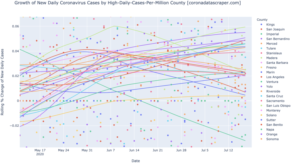
The counties of California are finally starting to show some motion toward recovery; this graph shows that many of the hottest counties in daily-cases-per-million, are now trending downward in growth rate of daily cases. This is a leading indicator of peak-and-recovery of daily cases, so we should expect some of these counties to peak in the next few weeks:
Countries of the World
Interactive source graphs, where you can select regions, zoom, etc., are here.
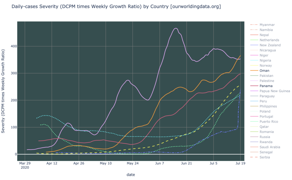
Severity Hotspots
The severity hotspots are Oman (orange), Bahrain (pink), Panama (red), South Africa (yellow), Kyrgyzstan (dark blue), Israel (green), and the United States (light blue), top to bottom below. The new “severity” metric combines DCPM with growth, to show how bad it is in each region:
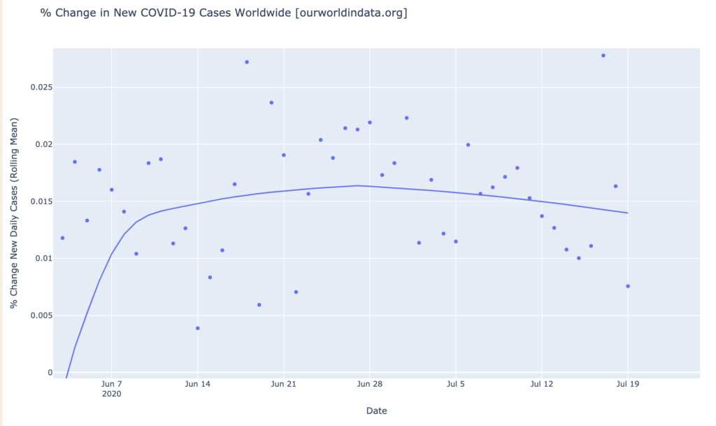
Worldwide Growth Rate is Dropping
Though cases are still rising every day worldwide (growth rate is above zero), the growth rate has finally peaked and is starting to drop. This is a leading indicator of recovery in daily cases; if the downward trajecctory of the growth graph continues, we will see total daily case ppeak worldwide in a few weeks. It doesn’t take too much squinting at that graph, in fact, to imagine that worldwide cases are now headed much more sharply downward, even than the trendline indicates:
States of the United States
Interactive source graphs, where you can select regions, zoom, etc., are here.
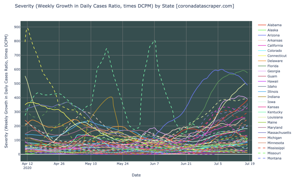
State Severity Hotspots
So many states are current severity hotspots or warmspots that it is hard to list them. A severity above 100 makes it a severity warmspot; here’s the whole tangle of states, provided to give a broad picture of how very many states we have in high severity (use the interactive graphs on a computer, to see which is which). Worst to best, we have Florida, Arizona, Louisiana, Georgia, South Carolina, Alabama, Texas, Idaho, Tennessee, Nevada, Mississippi, California, Arkansas, Virgin Islands, Utah, Utah, Oklahoma, and North Carolina.
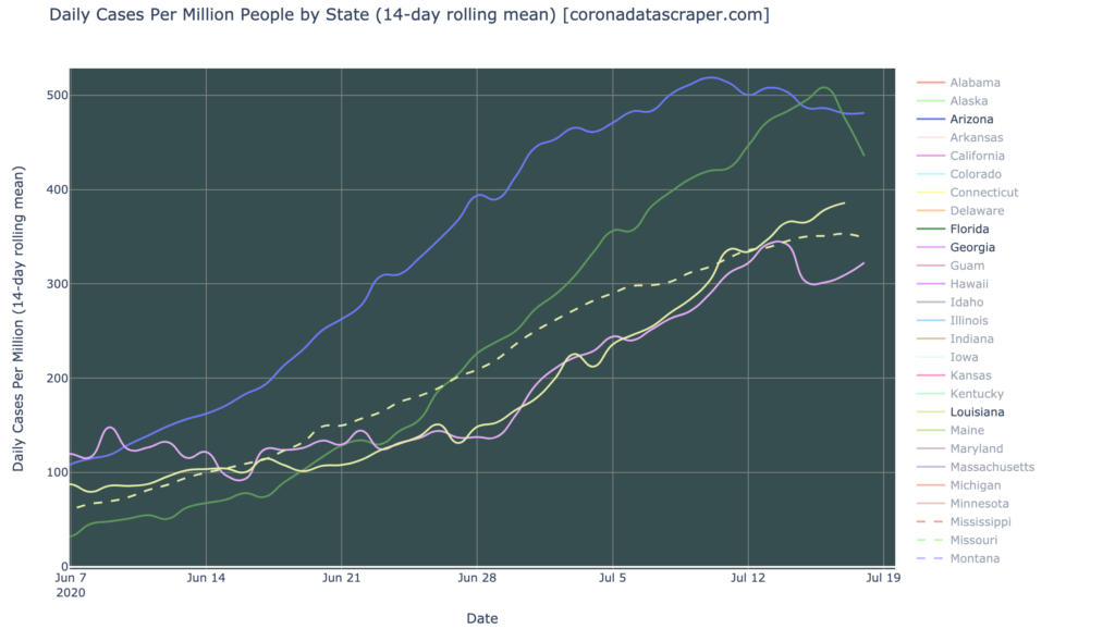
The Worst States Are Starting to Look Better
However, the five worst-hit states (yellow dashed line is South Carolina) are starting to show visible recovery even in their DCPM graphs (only Louisiana shows no clear sign of a peak):
The Gang Of Six Is Recovering; Except Alabama
The rope chart of the Gang of Six, which were the worst-hit states a month or two ago, continues to show their recovery, and indeed Arizona is turning the corner toward daily shrinkage of new cases (crossing zero to negative growth), right now. (The upper orange line is South Carolina; the lower line is North Carolina). Alabama, however, continues to diverge strongly from the other five, showing no sign of recovery:

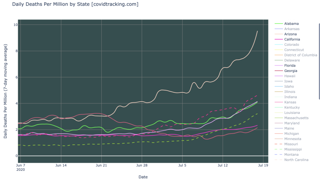
Deaths Are Not Dropping
I keep hearing a narrative that goes something like this, “Yes, cases are rising, but deaths are dropping!” The implication seems to be something like: so there isn’t as big a problem as we think. As far as I can determine, the premise is false; deaths are simply not dropping. Here are seven states I picked because they are forefront in my mind as recent or current hotspots. Top to bottom, they are Arizona, South Carolina, Florida, Alabama, Texas, California, and Georgia. In all seven cases, deaths are rising and have been for some time. If deaths trail cases by a couple weeks, as I might expect, these may start to drop in a couple weeks, since some of these states seem to be dropping in cases right now. But they are not dropping yet, and therefor this deaths graph confirms the severity of the current broad epidemic in the United States:
California Counties
Interactive source graphs, where you can select regions, zoom, etc., are here.
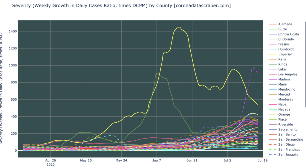
A Whole Mess Of Counties Have Severe Outbreaks
Here is the severity graph by county (use the interactive version from a computer to explore individual lines, and see which is which). Notice that most counties are above 100 severity, making them severity warmspots; and about half are severity hotspots. Stanislaus (dashed purple) is particularly extreme, and Imperial (yellow) was very high but is strongly recovering (but still very much a hotspot):
The Worst Counties are Turning Toward Recovery
At last, some good news for California. The graph below, which for a month has shown almost all California counties not just growing but accelerating, is finally showing many of them decelerating. All the downward-slanted lines indicate a trajectory toward recovery; when those lines hit zero, the counties will peak in new daily cases, and will start to see fewer and fewer cases each day.
Definitions
| DCPM | Daily cases per million |
| Daily-cases warmspot | >100 DCPM but <200 DCPM |
| Daily-cases hotspot | >200 DCPM |
| Growth warmspot | >1% daily growth in new cases |
| Growth hotspot | >5% daily growth in new cases |
| Severity | A metric combining DCPM with growth |
| Severity warmspot | >100 Severity but <200 Severity |
| Severity hotspot | >200 Severity |