This is summary of COVID-19 trends today, by countries, US states, and California counties.
Summary
| Daily Cases | Daily Growth | |
| World | cold (24 DCPM) | warm (+2.2%) |
| United States | cool (76 DCPM) | warm (+2%) |
| California | cool (90 DCPM) | warm (+2.2%) |
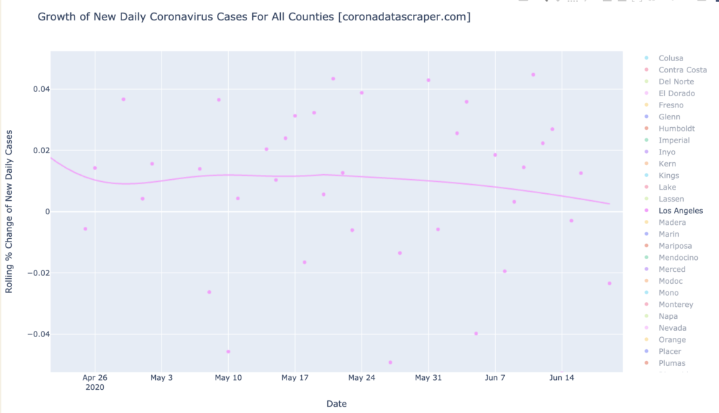
Graph of the Day: Los Angeles is Trending Toward Recovery
Los Angeles County is the major contributor of cases to California. It is now showing a downward trajectory in growth of daily new cases (it is no longer a growth warmspot). If this line crosses zero, which I would expect in a few days from this graph trend, it will start to see decreasing daily new cases, and California will be strongly pulled downward in daily new cases as well:
Countries of the World
Interactive source graphs, where you can select regions, zoom, etc., are here.
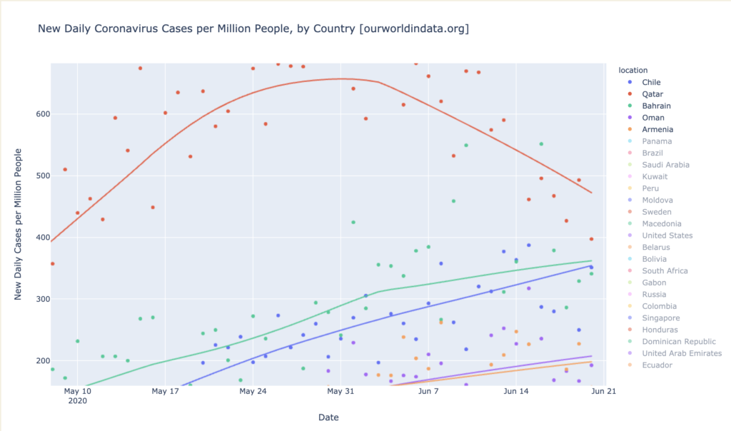
Hotspot Countries: Qatar, Barhain, Chile, Oman, and Armenia
Daily-cases hotspots Qatar and neighbor Bahrain continue to be first and second place in the world, with 470 and 360 DCPM respectively; but not for long. The cause of their exceptionally high DCPM may be their dense work camps for their oil fields, whicch have seen an epidemic of the virus. But Chile is in close pursuit, and seems likely to pass Bahrain soon. At the bottom of the graph we see Oman and Armenia, just having risen to become daily-cases hotspots:
Meanwhile, Qatar and Bahrain seem to be getting a handle on the epidemic, with Qatar having peaked weeks ago, and Bahrain peaking now. This graph brings good news: all five of the hottest countries in DCPM, are either quickly recovering, or sharply headed toward a recovery position (<0% growth):
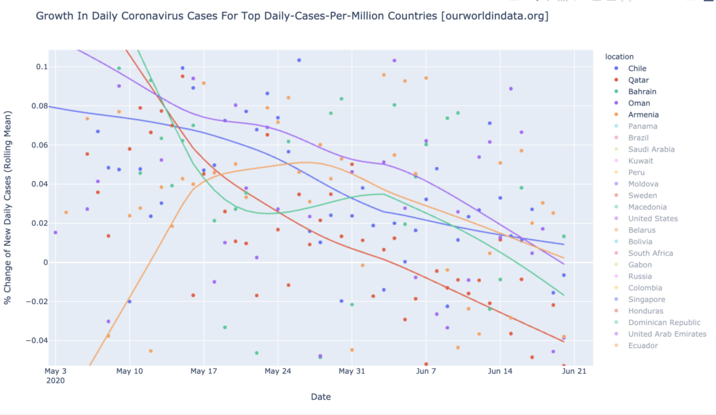
It is worth noting that all five of these countries are relatively small: Chile at 19M, Qatar at 3M, Bahrain at 2M, Oman at 5M, Armenia at 3M. Compare with India or China at over a billion; or with the United States or Brazil at 350M or 200M. So there are no large countries, which are also daily-cases hotspots.
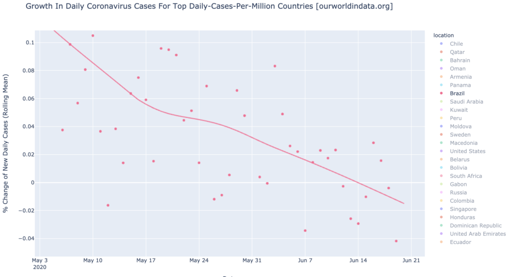
Brazil Continues Months of Steady Improvement in COVID-19 Growth Rate
One large country that might have become a daily-cases hotspot, but now probably won’t, is Brazil. Brazil is currently a daily-cases warmspot at 137 DCPM. Brazil has been making daily news in large news outlets with big headlines like Bloomberg’s, “Brazil Posts Record Daily Virus Cases as Disease Spreads Inland.” This kind of article, while factually accurate, can be written every day for any region that is growing in cases; every day will have a record number of daily cases, on average. So this kind of article, especially if repeated every few days, does not seem to me to be of much value. Worse, this headline occurred recently, during an extended downward trend in Brazil’s growth rate (daily cases still rise until the downward trendline crosses zero). To me, Brazil looks like it is doing steadily better, so I’ve written the headline I’d like to see in the news, above this section. Here’s the graph:
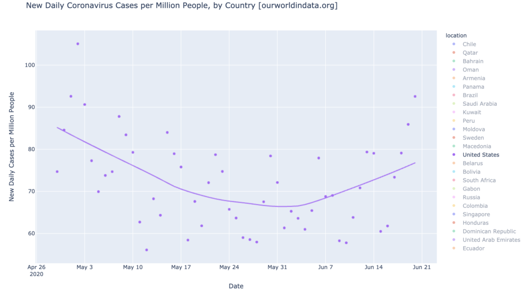
United States is Still Growing
Another country that might become a daily-cases hotspot is the United States, but it will have to become a daily-cases warmspot first. With its daily-cases trendline at 76 DCPM, the United States is well shy of the 100 that would make it a warmspot, but it is experiencing growth in daily cases (unlike, say, Brazil), and its most recent few days show an alarming sharply-upward mini-trend. That could just be noise, but even without it, the United States is not currently getting better:
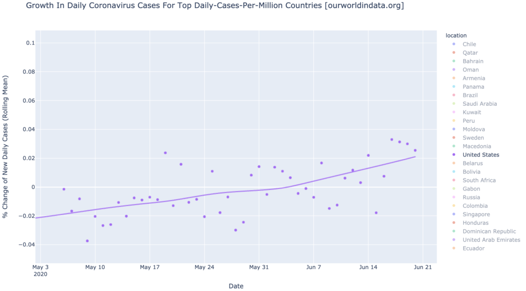
The growth chart shows the United States passing 2% growth; it is solidly a growth warmspot at this point, though it still has a long way to go to become a growth hotspot. But contrast it with Brazil’s growth curve above; this is what an undesirable growth curve looks like. Above zero and rising:
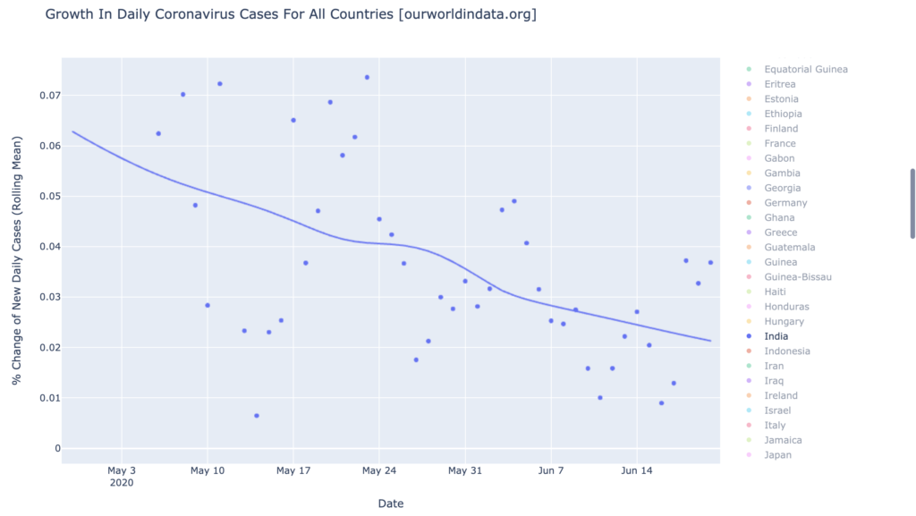
India Does Not Have A Serious Problem
Let’s briefly talk about India, just to say, we don’t really need to talk about India. It gets some press because it is fourth in the world in total cases, but that’s just because it’s huge. At 11 DCPM, it’s so small it doesn’t even register in the top-25. And its growth rate is looking fairly good: positive but descending for months now (like, say, Brazil). If these trends continue, India will never be a problem:
States of the United States
Interactive source graphs, where you can select regions, zoom, etc., are here.
Hotspots States: Just Arizona
We now have a hotspot state, barely. Arizona has risen to 210 DCPM. The rest of the Gang of Six are warm but not yet hot; see below.
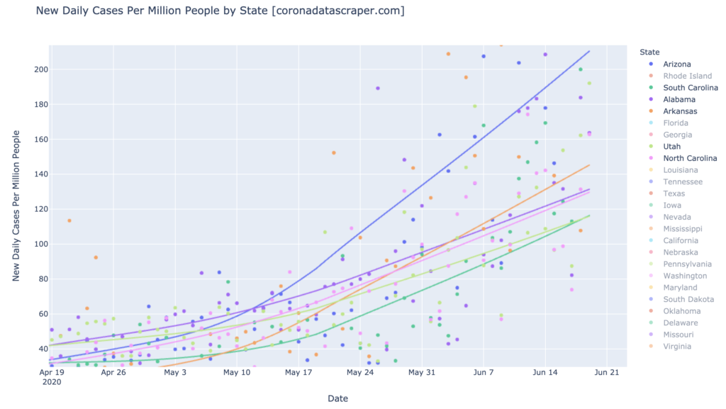
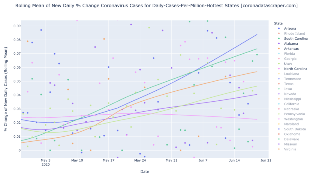
The Gang of Six: Arizona, Alabama, Arkansas, North and South Carolina, and Utah
These six states continue to be the largest in DCPM. Arizona is way ahead at 210 DCPM, but the others are all daily-cases warmspots in the 115 to 145 DCPM range. This graph is not looking good:
The growth graph is also not looking good for these six. Three of them are growth hotspots, and the other three are growth warmspots, and five of them are accelerating. So they’re not only fairly hot in daily cases, and not only getting hotter every day, but the rate at which they’re getting hotter every day is also rising (except North Carolina). This is everything we don’t want to see in a graph. North Carolina is the one ray of hope in this dark and miserable storm; its growth graph has peaked and appears to be starting downward toward recovery. Recovery is still months away at this trajectory, but from my experience with these sorts of graphs, I think it very likely that North Carolina’s growth rate will turn downward more sharply in the days to come:
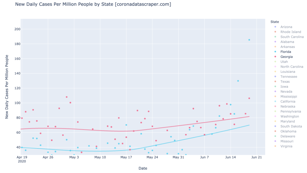
Florida and Georgia are Closing In on the Gang of Six
Behind the Gang of Six, there are a couple wannabes. Florida and Georgia are not yet daily-cases warmspots (70 and 80 DCPM), but they are rising:
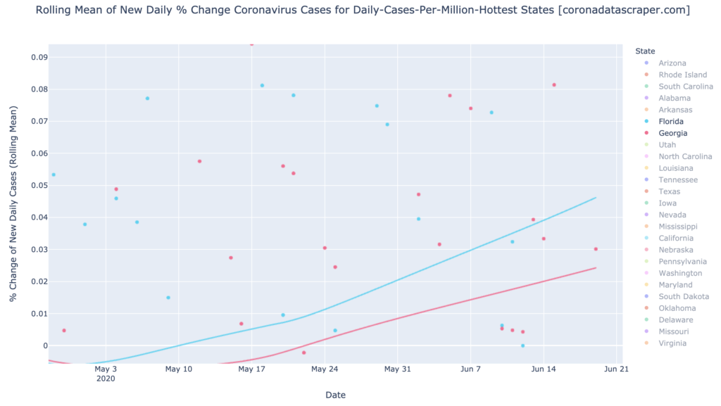
And the growth graphs for Florida and Georgia also show similarities to the Gang of Six: they are growth warmspots—Florida is nearly a growth hotspot—and accelerating. We might end up with a Gang of Eight:
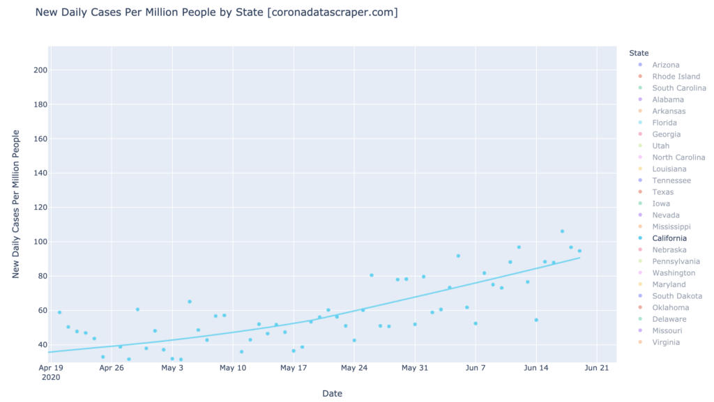
California is Still Looking Kinda Bad
California continues to rise, now approaching a daily-cases warmspot at 90 DCPM.
California’s growth rate also continues to rise; it is solidly a growth warmspot now at 2.2%:

California Counties
Interactive source graphs, where you can select regions, zoom, etc., are here.
Hotspots and Warmspots: California Counties Are Almost All Getting Worse
Imperial and Kings remain the only daily-cases hotspots, at 900 and 250 DCPM. By the way, 900 is really high. For comparison, here they are plotted with all the hottest counties; the top blue line is Imperial, the next red line is Kings:

The very busy graph below shows growth of all the hottest counties. There is little hope determining which line is which in this graph; go to the interactive one if you want to know. My purpose in showing this graph is just to show the broad pattern of the hottest counties: they are almost all rising in new cases (above the 0% line), and almost all accelerating.
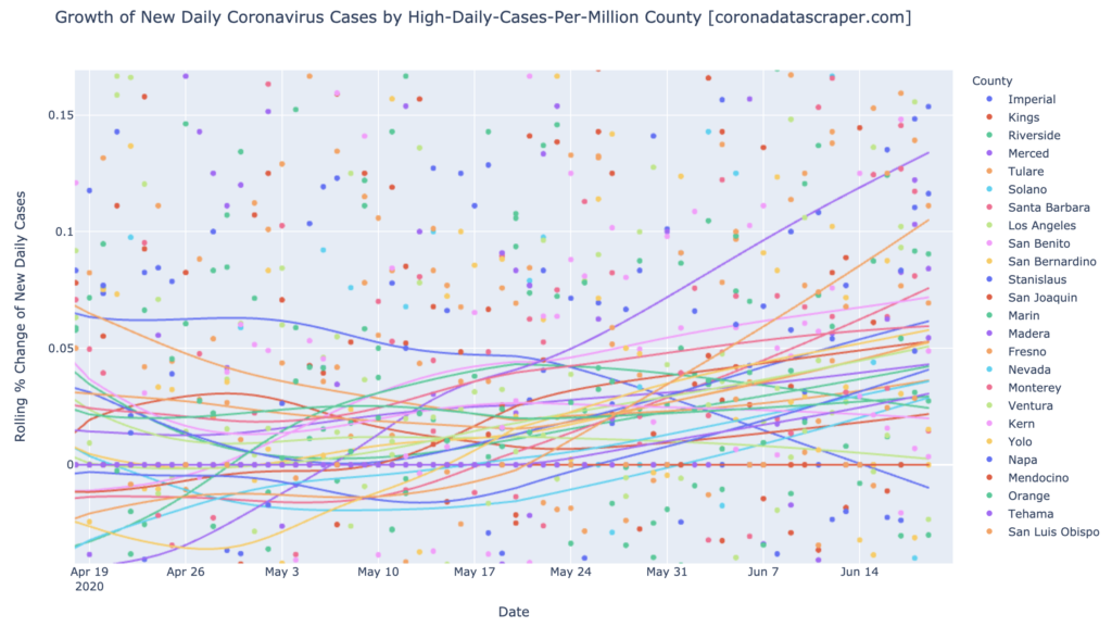
The graph for all counties is just as bad: we are seeing growth and acceleration in almost all counties of California. This is a terrible pattern, and I sure hope it shifts soon:

But, Los Angeles is Looking Better
One ray of hope is Los Angeles, which has a massive influence on the total state numbers, due to its enormous population. Though it is a warmspot at 140 DCPM, and still growing slightly daily,

it is also shrinking in growth rate. The growth curve is now angled downward, at 0.2% growth and declining, which makes it one of very few California counties seeing a downward growth trajectory (the others are Humboldt, San Mateo, Imperial, and Alameda). If Los Angeles turns the corner toward negative growth and starts declining in daily cases, as seems imminent, it will start to pull California’s numbers down very strongly:
Definitions
| DCPM | Daily cases per million |
| Daily-cases warmspot | >100 DCPM but <200 DCPM |
| Daily-cases hotspot | >200 DCPM |
| Growth warmspot | >1% daily growth in new cases |
| Growth hotspot | >5% daily growth in new cases |