This is summary of COVID-19 trends today, by countries, US states, and California counties.
Summary
| Daily Cases | Daily Growth | |
| World | cold (22 DCPM) | warm (2.2% and rising) |
| United States | warm (140 DCPM) | hot (6% and rising) |
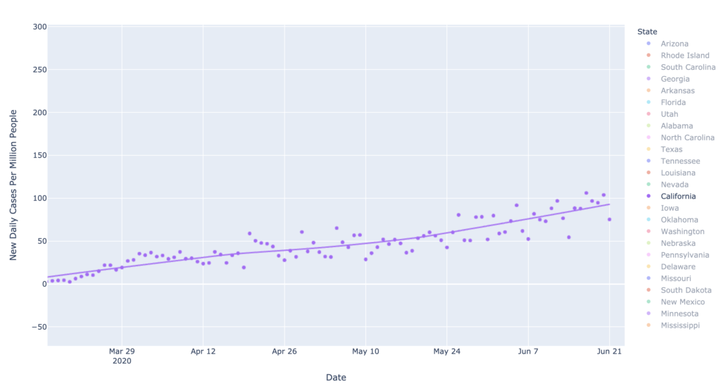
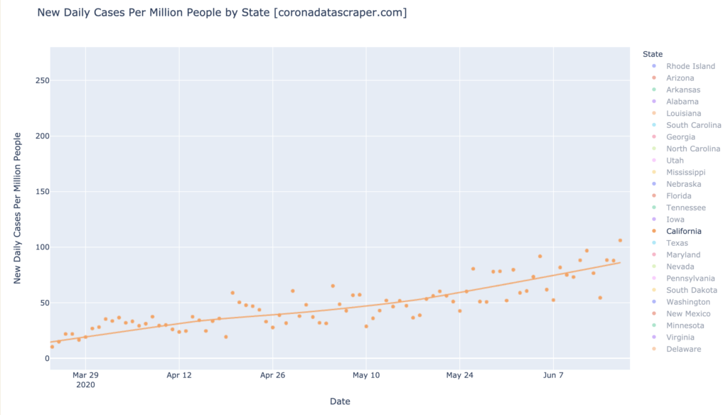
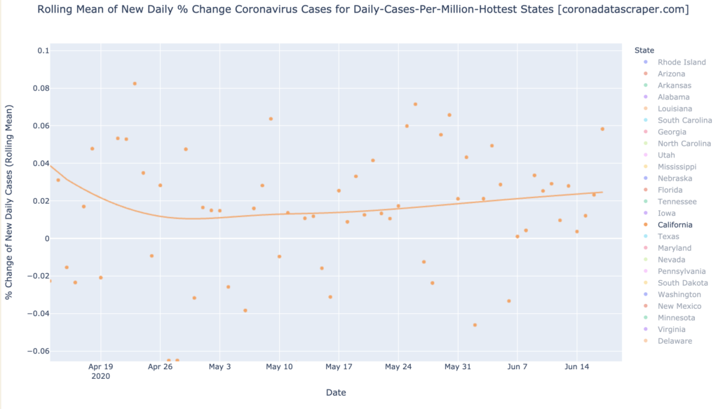
| California | warm (110 DCPM) | very warm (4.1% and rising) |
Graph of the Day
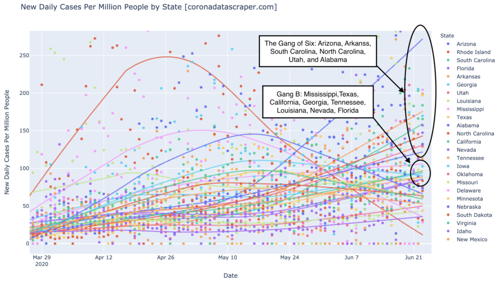
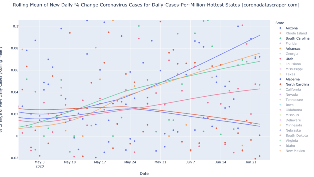
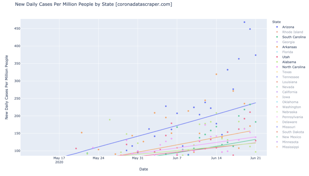
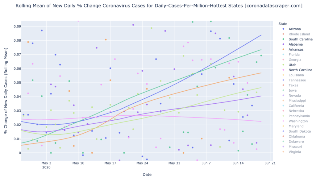
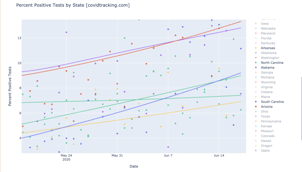
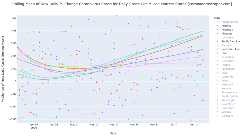
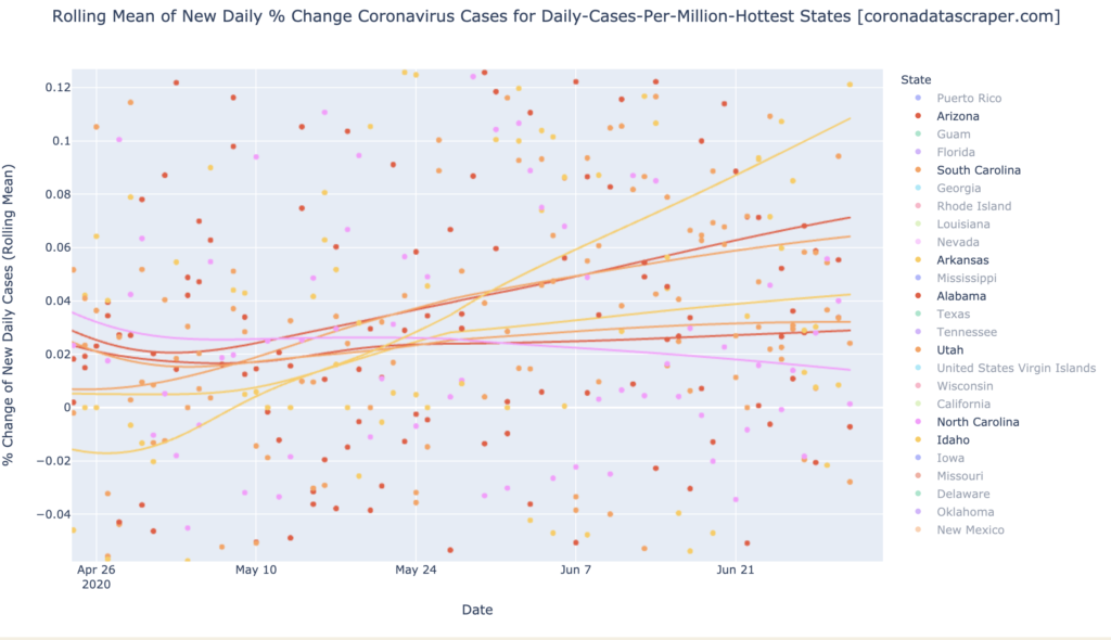
The Gang of Six (Arizona, Arkansas, Alabama, South and North Carolina, and Utah), which were the big news a couple weeks ago, show trendlines bending toward recovery in growth rate (top line Idaho shown because it is now where they used to be):
Countries of the World
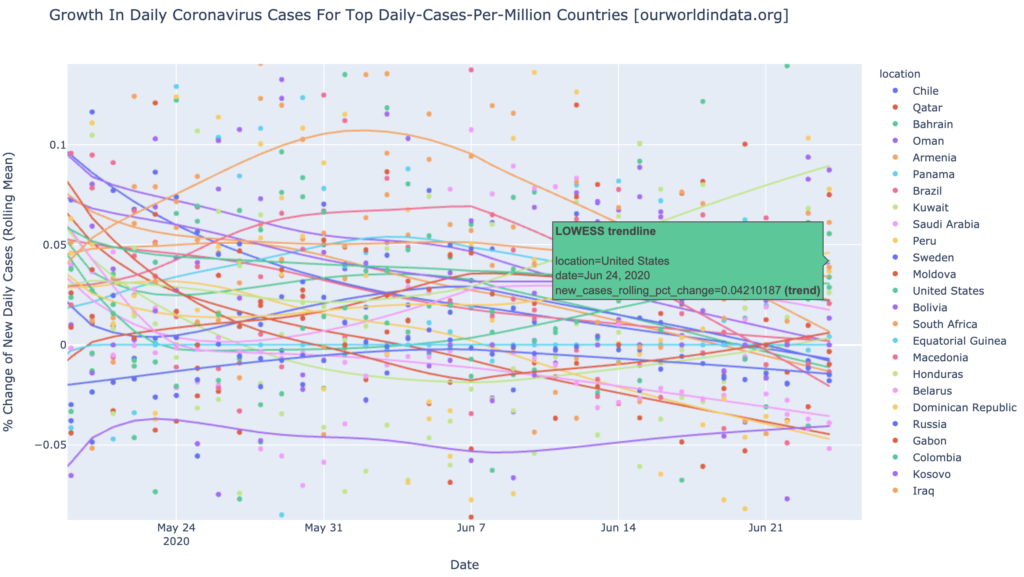
Interactive source graphs, where you can select regions, zoom, etc., are here.
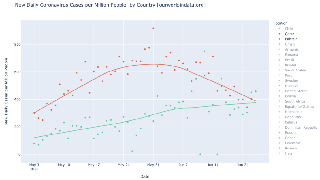
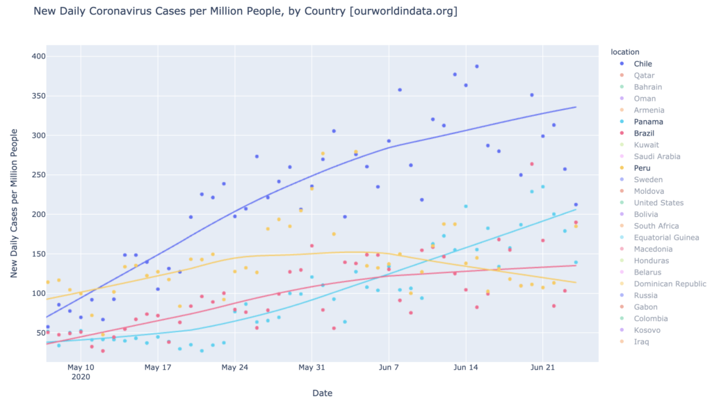
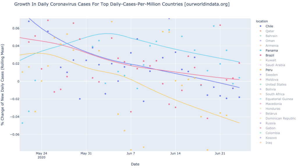
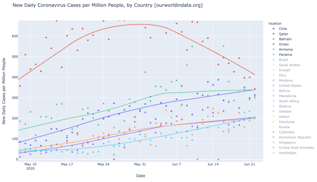
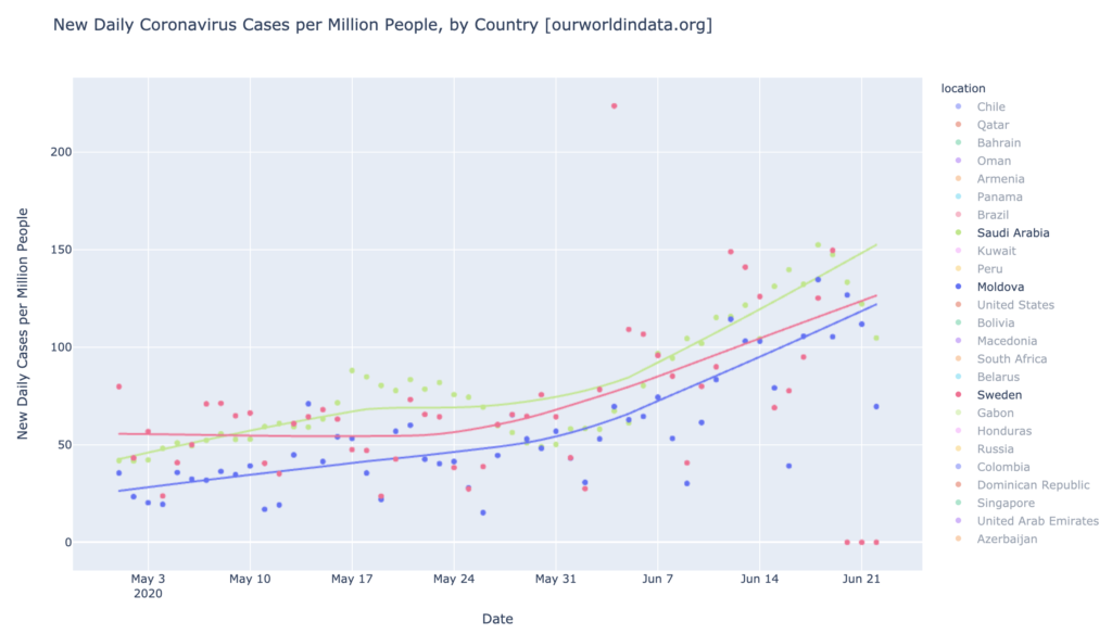
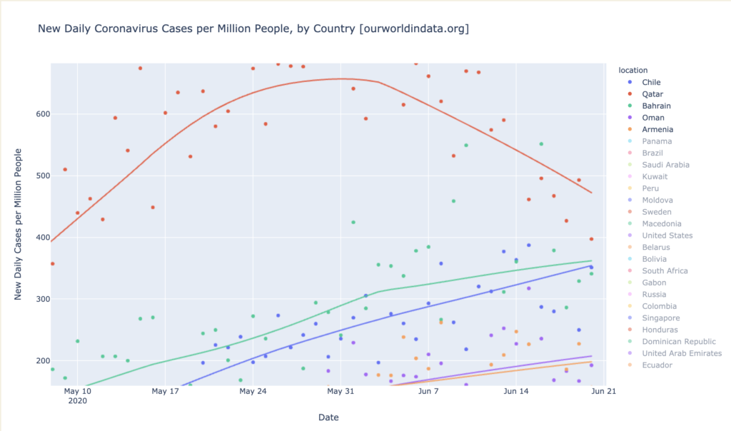
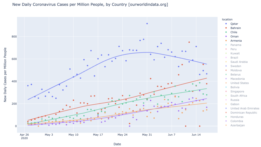
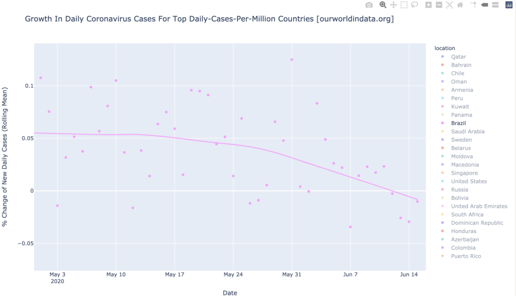
Country Hotspots: Barhain, Qatar, Oman, Panama, and Chile
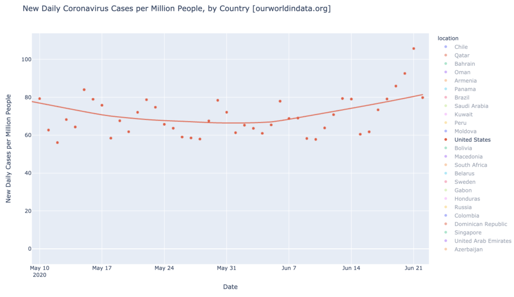
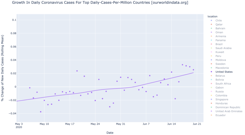
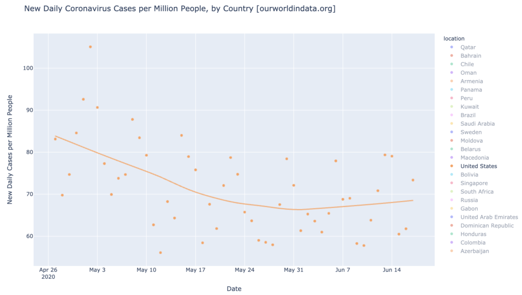
The graph below shows the daily-cases hotspot counties in DCPM, plus the largest daily-cases warmspot counties (United States and Brazil). The upper red line is Qatar, long the worst in the world but now quickly recovering. Its neighbor Bahrain came on a little later, and appears to be bending toward recovery, but is currently the leader in DCPM. The United States (lower orange) and Brazil (lower red-ping) are not daily-cases hotspots, but are warm and rising:
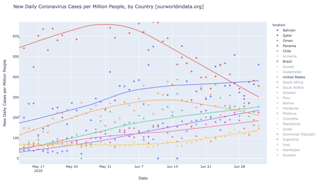
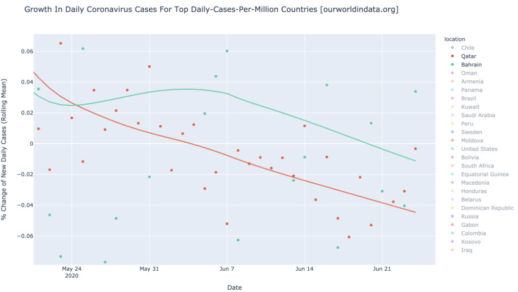
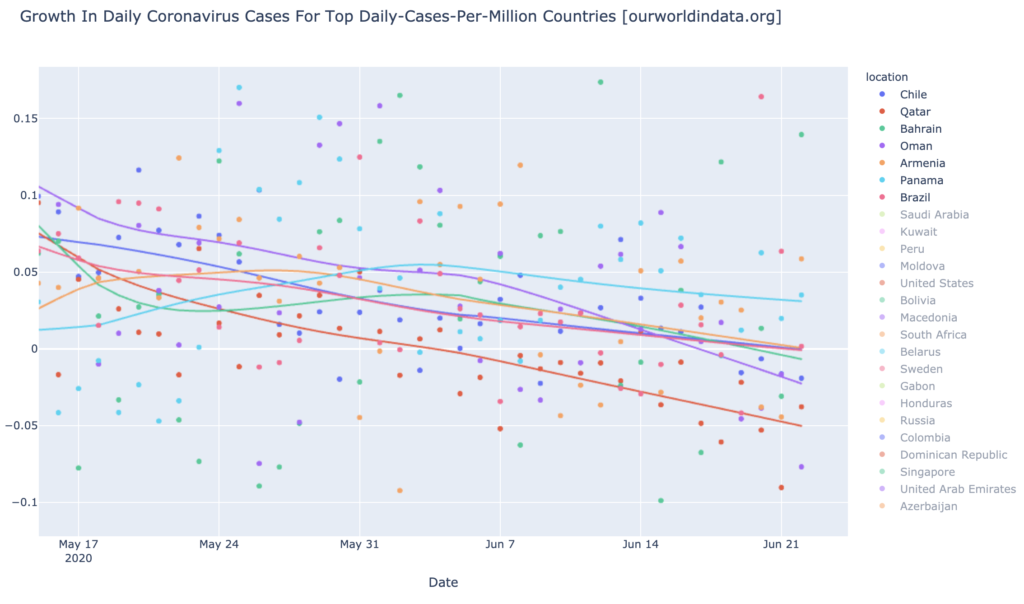
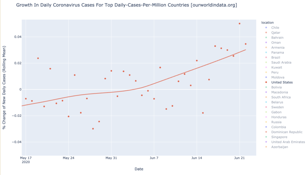
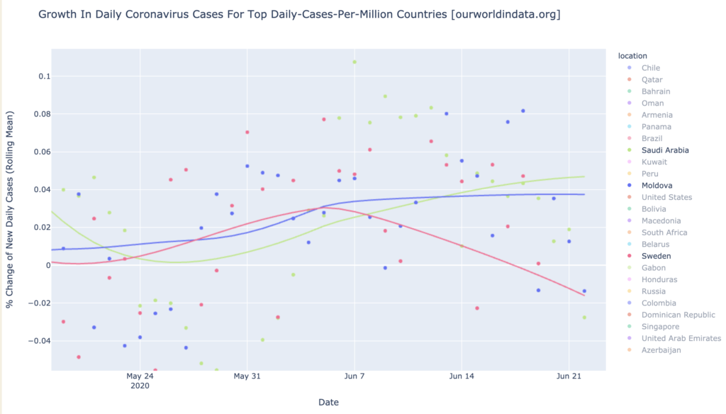
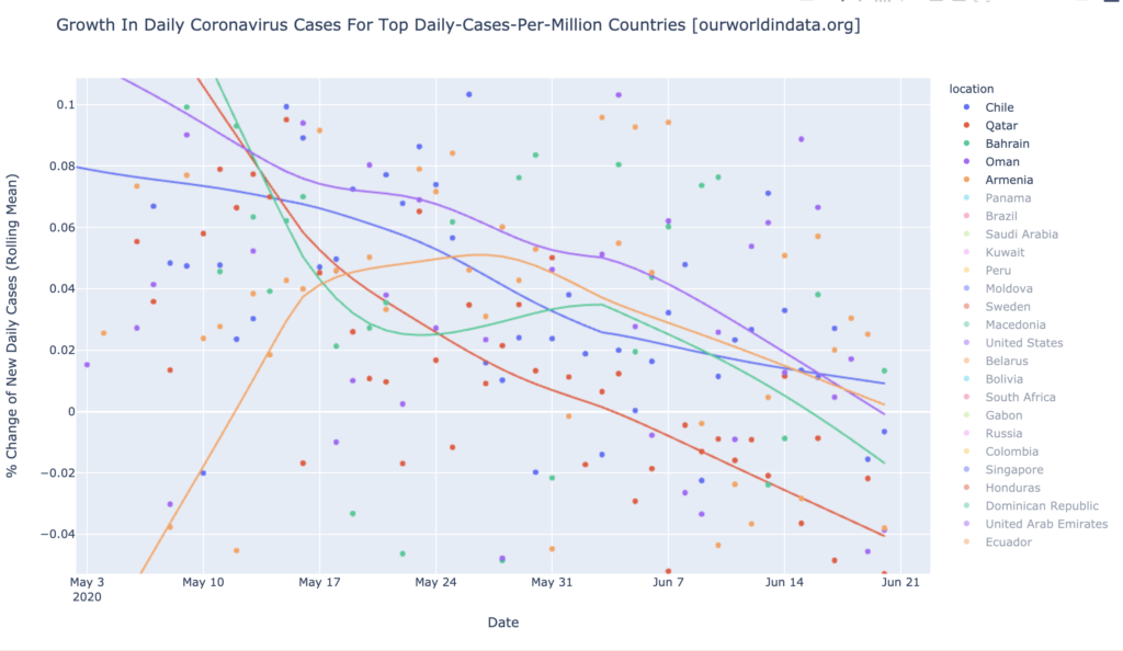
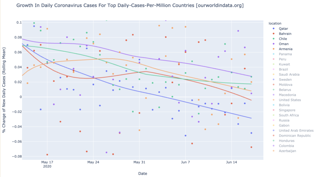
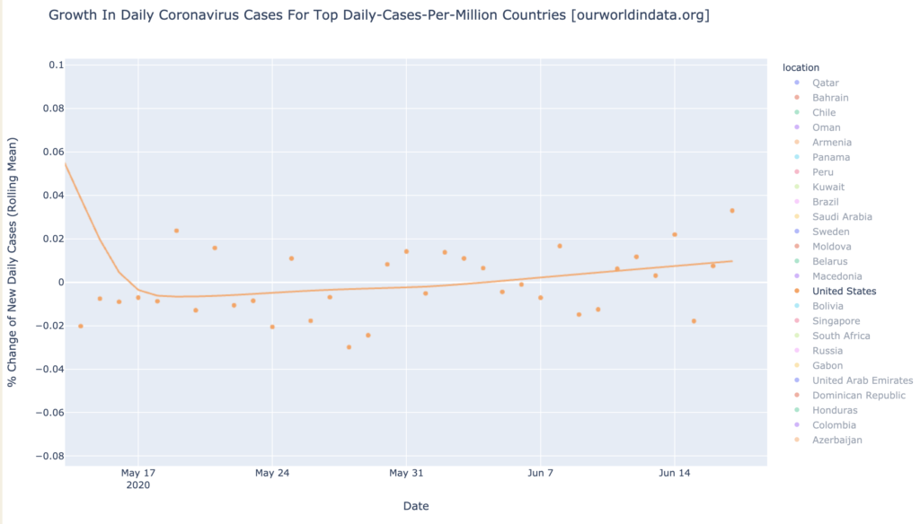
Looking at the rope chart for these same six, the news is pretty good for everyone but the United States and Brazil. All the hotspots are declining in growth rate of daily new cases, and Qatar and Chile have turned the corner toward negative daily growth in new cases. Brazil is growing in new cases at 2% per day and very slightly accelerating, so what looked like a turn toward recovery there a few weeks ago, has faltered. The United States is looking very bad at 6% growth in daily new cases and accelerating rapidly; it has become a growth hotspot:

States of the United States
Interactive source graphs, where you can select regions, zoom, etc., are here.
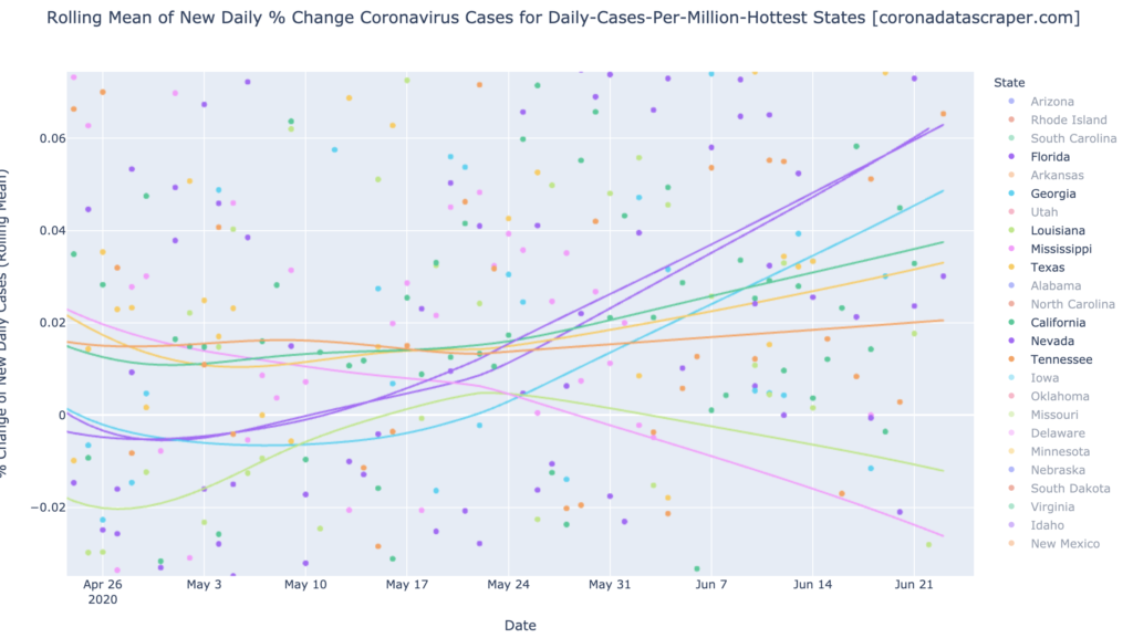
The Gang of Six Are Looking Slightly Better
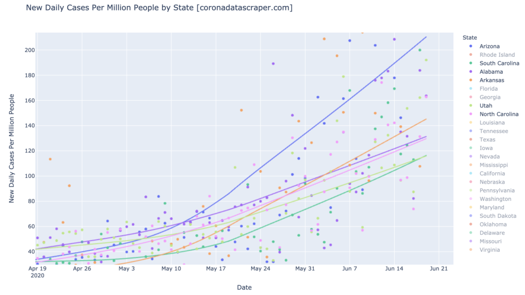
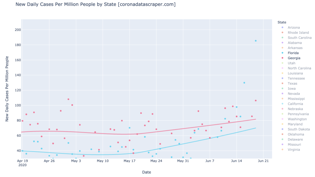
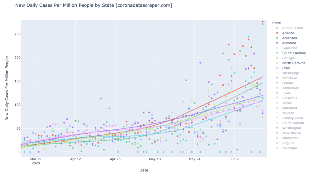
The Game of Six (Arizona, Alabama, Arkansas, North and South Carolina) were the biggest news a couple weeks ago, as they took off on a strong upward growth trajectory. These days, other states are taking off, but these six are starting to look a little better. They don’t look so great on the DCPM chart (but see growth, below):
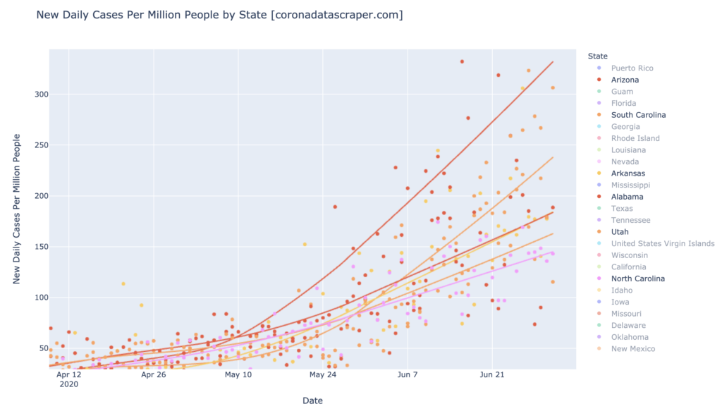
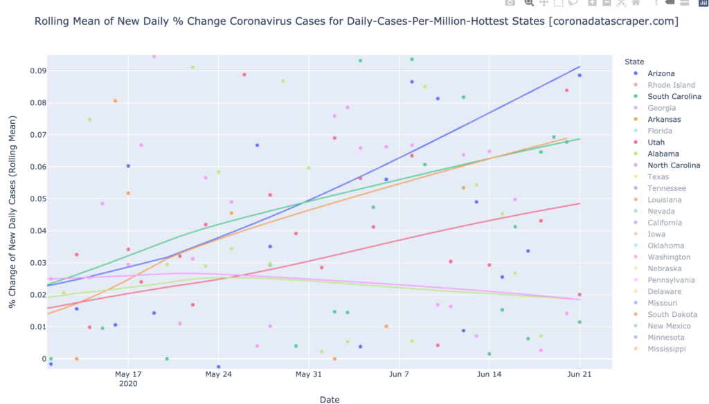
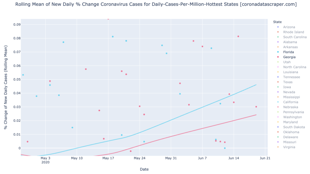
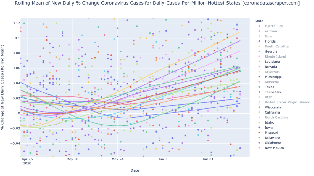
But in the growth rate “rope chart,” we are starting to see some good signs. The colors are really hard to distinguish here, but top to bottom, these are Idaho (shown for comparison; more about Idaho below), Arizona, South Carolina, Arkansas, Utah, Alabama, and North Carolina. The bottom four are either horizontal in growth or, in the case of North Carolina, clearly trending downward. None of these have yet turned the corner toward negative growth—all of them are still seeing more and more cases each day—but this is the very early sign that at least four of them are trending toward recovery. The worst two—Arizona and South Carolina—are still looking pretty bad, but they used to be more in the Idaho category, so their lines, too, are just starting to bend toward recovery:
States That Already Had It, Aren’t Getting it Again
The trend remains: states (and other regions) seem to have a metaphorical “immune system” which prevents them from getting a bad wave of the virus, after they’ve already had one. COVID-19 does not strike twice in the same place. States which have had waves, and have recovered, include Washington, New York, New Jersey, Rhode Island, Michigan, Illinois, and Louisiana, and most other northeastern states. With the possible exception of Louisiana, none of these appear in my graphs because all have recovered and appear to be staying recovered.
The Rest of the States are Getting It
It feels like most of the rest of the United States, is now getting the virus and entering epidemic trajectory. The first-wave states (above), got it and recovered; the Gang of Six got it and appear to be showing a trend toward recovery. All the rest of the top-25 warmest states in DCPM, are now growing in new cases:
A Prediction of the Broad Course of COVID-19 in the US
There’s not much good news here for the United States, but the broad ray of hope is: though every states has gotten its own wave, or appears to be on its way to getting a wave, the strong trend is that once a state gets over its wave, it doesn’t see a large wave again.
If this persists, there is an end in sight, though it’s months away. The first wave recovered; the Gang of Six will recover soonish; this new large wave has most of the remaining states in it, and will likely follow a similar trajectory to recovery in the next two or three months. After that, most states will have seen their wave, and assuming second waves really don’t happen, the disease will have run out of states to infect. The country will start its trend toward recovery. This isn’t certain—maybe there really will be major second waves—but this is my prediction based on the disease trajectory we’ve seen just about everywhere.
California Counties
Interactive source graphs, where you can select regions, zoom, etc., are here.
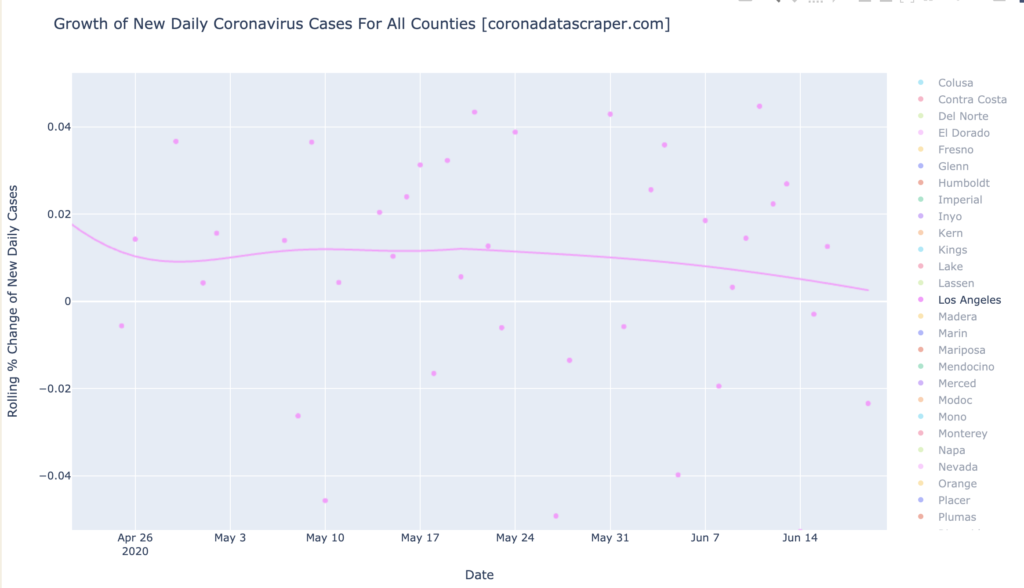
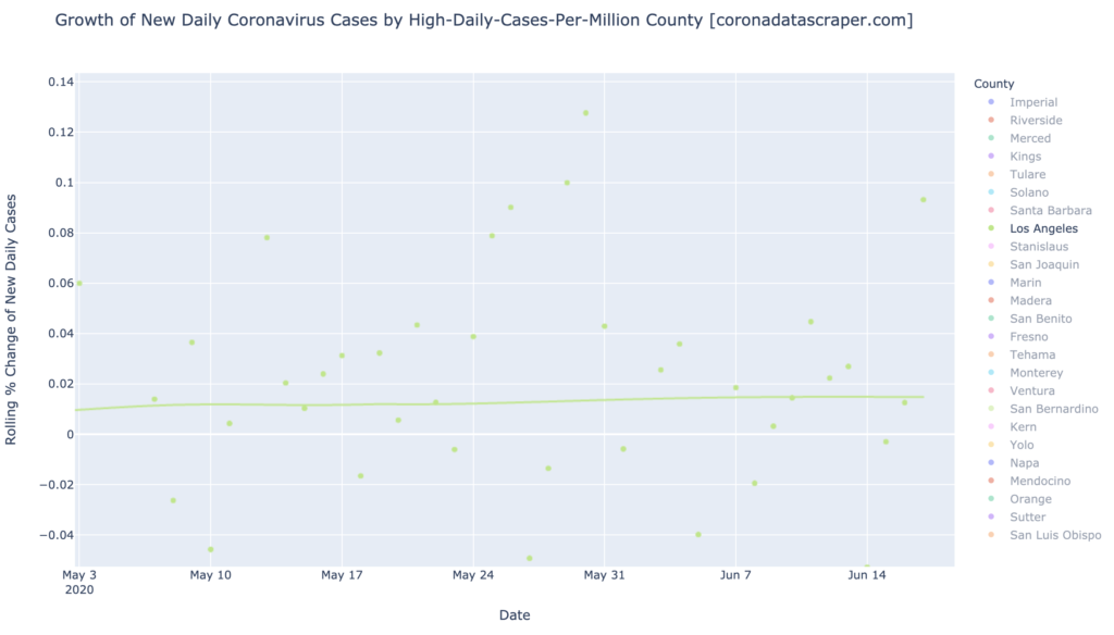
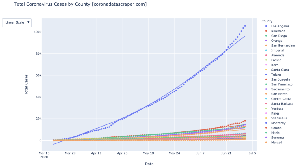
Los Angeles Still Rules in Total Cases
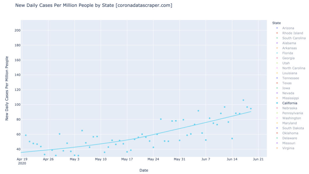
Let’s look at a graph I don’t usually focus on: the total cases graph. In it, we can see that (1) Los Angeles is still the source of COVID-19 cases in California, and (2) it’s accelerating (its recent dots are above its trendline). So for all the focus I put on other counties and their growth rates, the state totals are still all about Los Angeles:
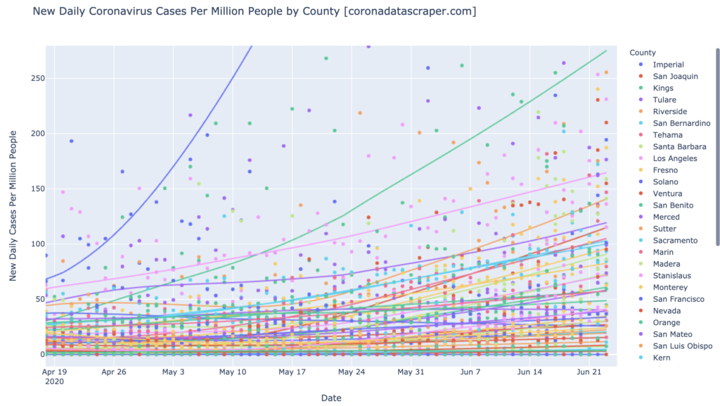
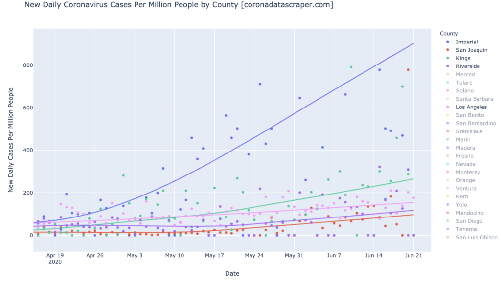
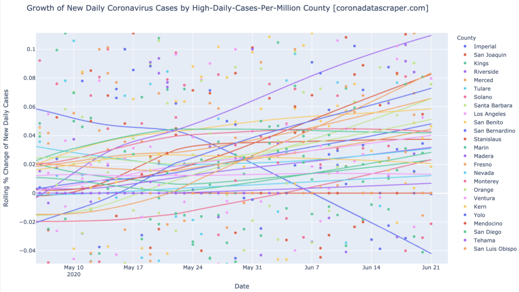
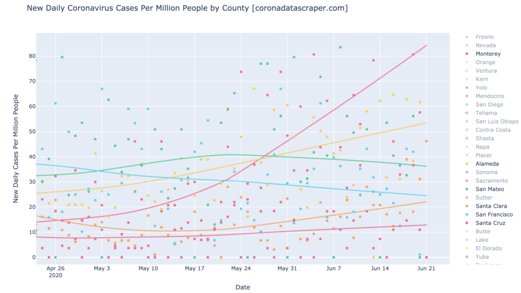
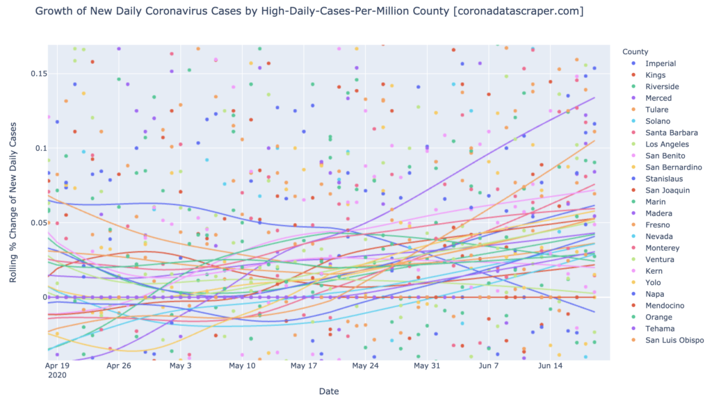
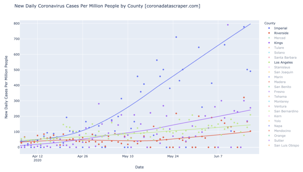
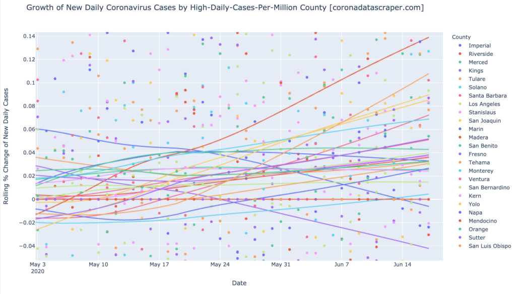
Daily-Cases Hotspots: Imperial, Kings, Tulare, Riverside, San Joaquin, Los Angeles
Imperial remains an off-the-chart daily-cases hotspot with an outrageous 900 DCPM (but recovering; see next section). The other daily-cases hotspots, still trending upward in this chart, are (downward from the top) Kings, Tulare, Riverside, San Joaquin, Los Angeles. Congratulations, Los Angeles, you’ve made it to daily-cases hotspot status:
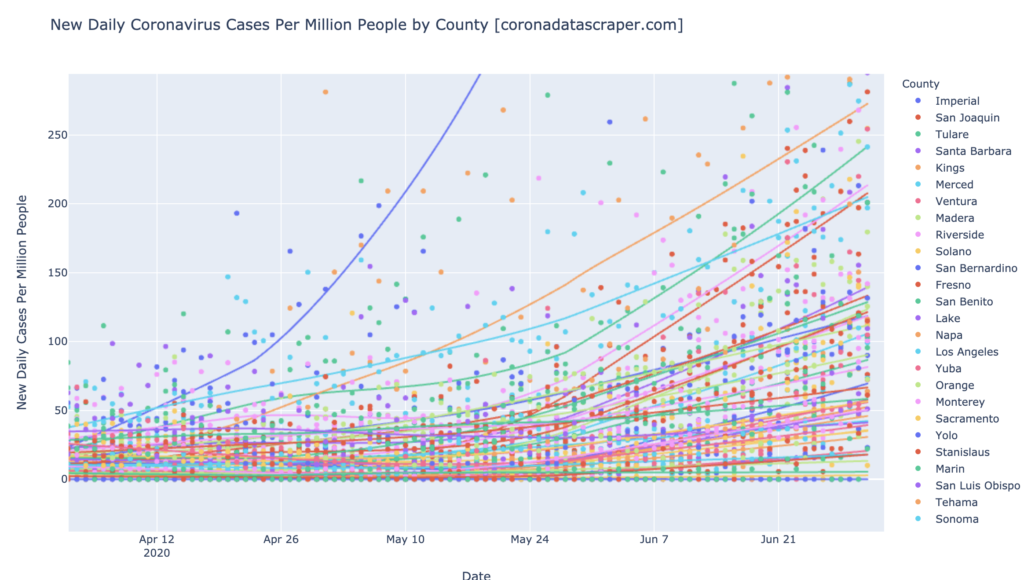
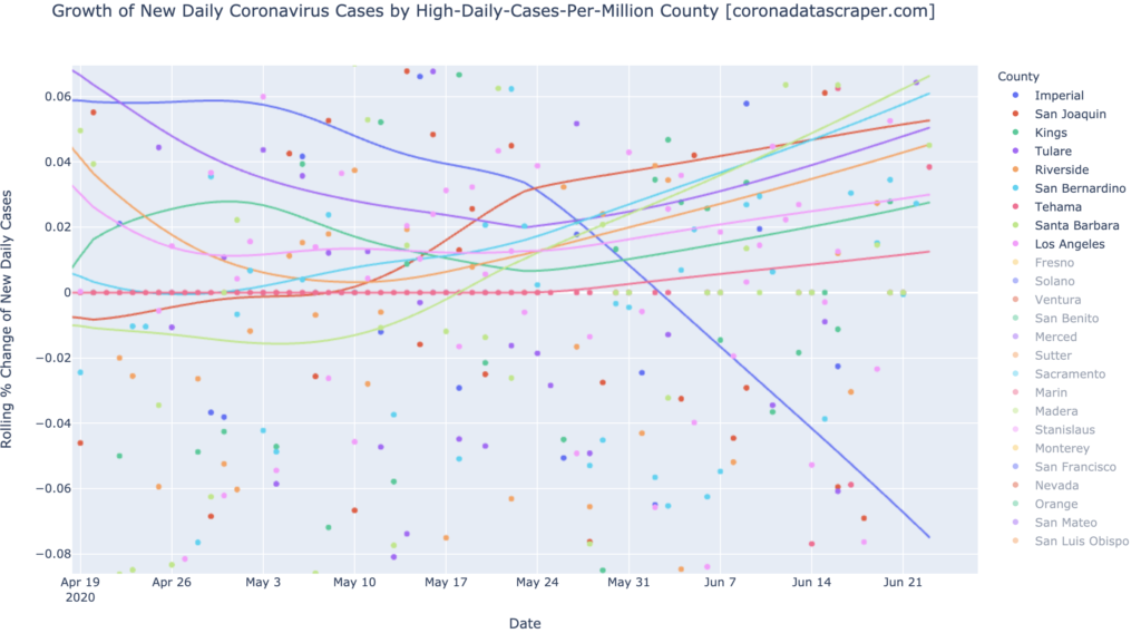
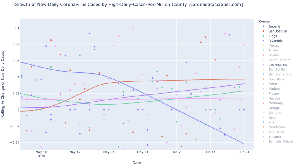
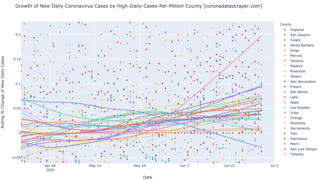
All of the warmest counties in DCPM, are still rising in daily cases, too (above the zero line in the following graph), except Imperial, which is now shrinking at 2% per day. Imperial is recovering, but everyone else is doing poorly. Almost all of these top-25-DCPM counties are growth warmspots. There are a few counties whose growth rates, though still positive, are trending downward (Monterey, San Benito), and some are holding steady near zero (Kings, Tehama), but the overall trend is toward more and more cases, and toward accelerating growth rates. By the way, that’s Yuba at the top, with a huge 20% daily growth in new cases; at least it’s smallish. (Visit the live version to see which county is which.)
Definitions
| DCPM | Daily cases per million |
| Daily-cases warmspot | >100 DCPM but <200 DCPM |
| Daily-cases hotspot | >200 DCPM |
| Growth warmspot | >1% daily growth in new cases |
| Growth hotspot | >5% daily growth in new cases |